You want a cozy camper that looks cute and feels like your own tiny home. This article shows 17 retro color palettes that help you pick tones that match your style and make your space warm and fun. Each palette gives you a clear idea of which colors work together so you can decorate with confidence.
Would you like to save this article?
You’ll find combinations from soft pastels to bold vintage mixes that suit fabrics, curtains, cushions, and exterior accents. Use these palettes to make quick choices, mix and match, or spark new ideas for a fresh camper look.
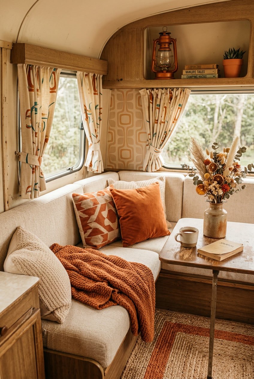
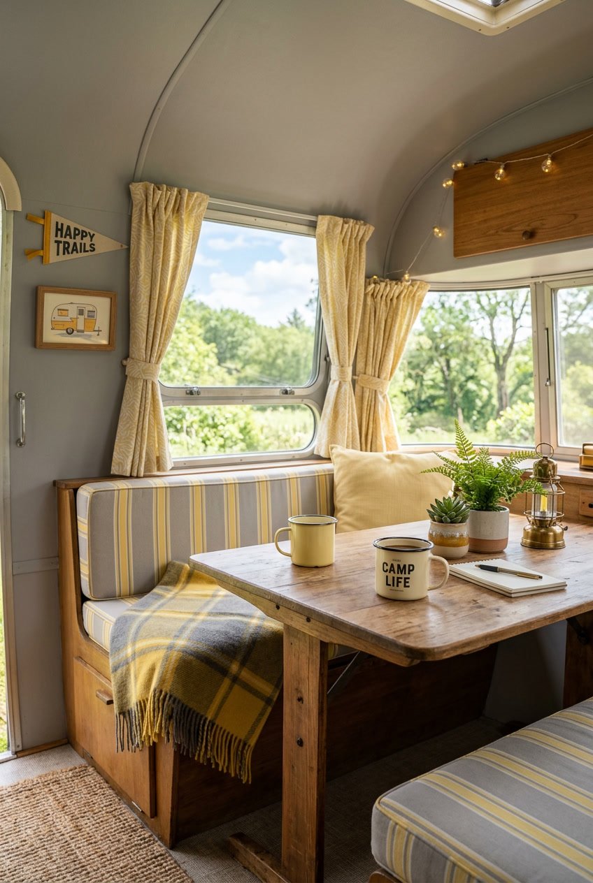
1) Sunset Orange and Mustard Yellow
This pairing feels warm and cheerful. You can use sunset orange as the main color and mustard yellow for accents to create a cozy, retro vibe.
Add orange cushions, curtains, or a painted cabinet front for instant warmth. Use mustard yellow on throw pillows, a small rug, or wall hooks to keep the look balanced.
These colors work well with natural wood and cream tones. They brighten small spaces without feeling overwhelming.
PRO TIP
Keep patterns simple. A striped or geometric fabric in both colors ties the room together without making it too busy.
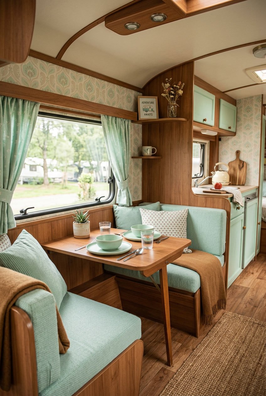
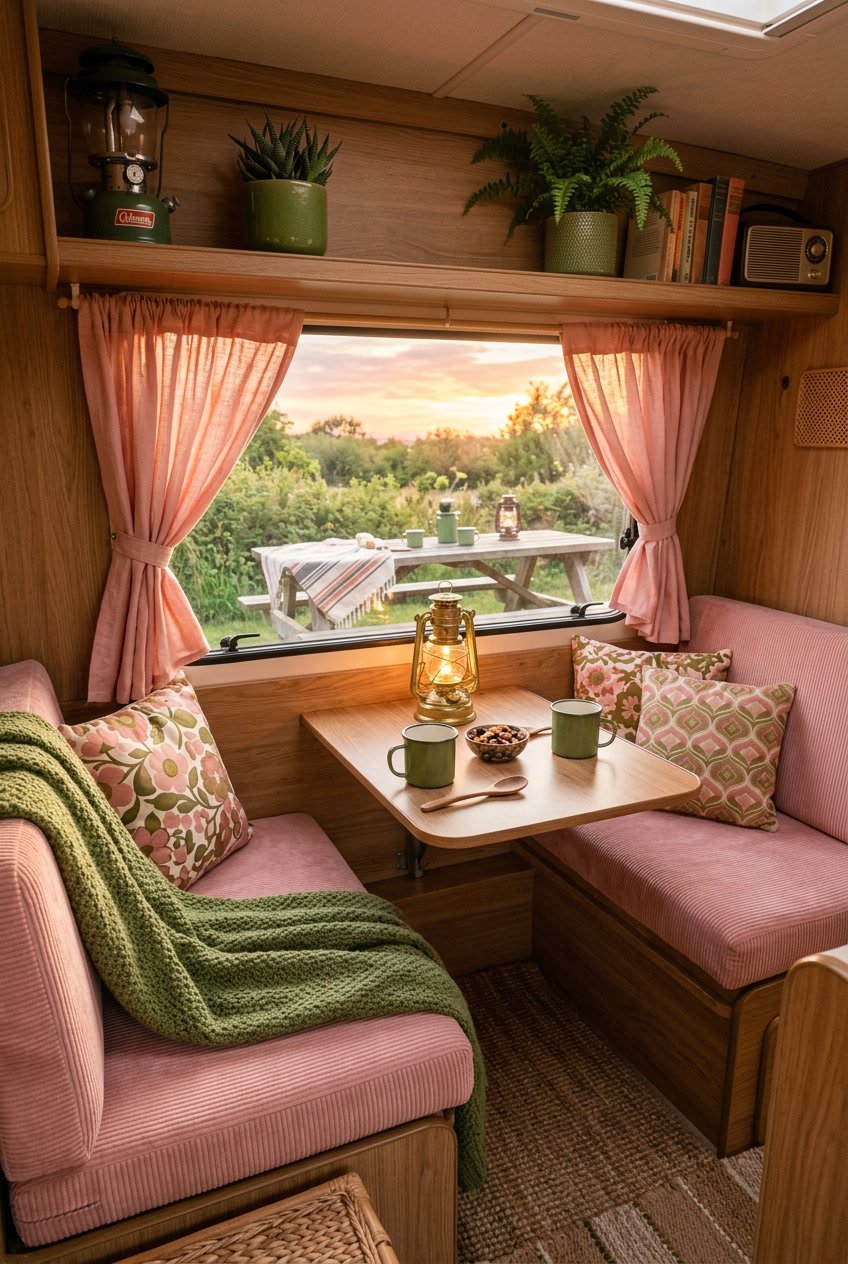
2) Mint Green and Coral Pink
Mint green and coral pink make your camper feel fresh and cheerful. The cool mint soothes the eye, while coral adds a warm, playful pop. Together they create a balanced, vintage-inspired look without feeling too bright.
Use mint on larger surfaces like cabinets or walls to keep the space open. Add coral in cushions, curtains, or small accessories to draw attention and add personality. A few patterned pillows that mix both colors tie everything together without clutter.
PRO TIP
Keep metal finishes simple, like brushed or matte, so the colors stand out. Limit the coral to a few focal points to avoid overwhelming the mint.
3) Powder Blue and Cream
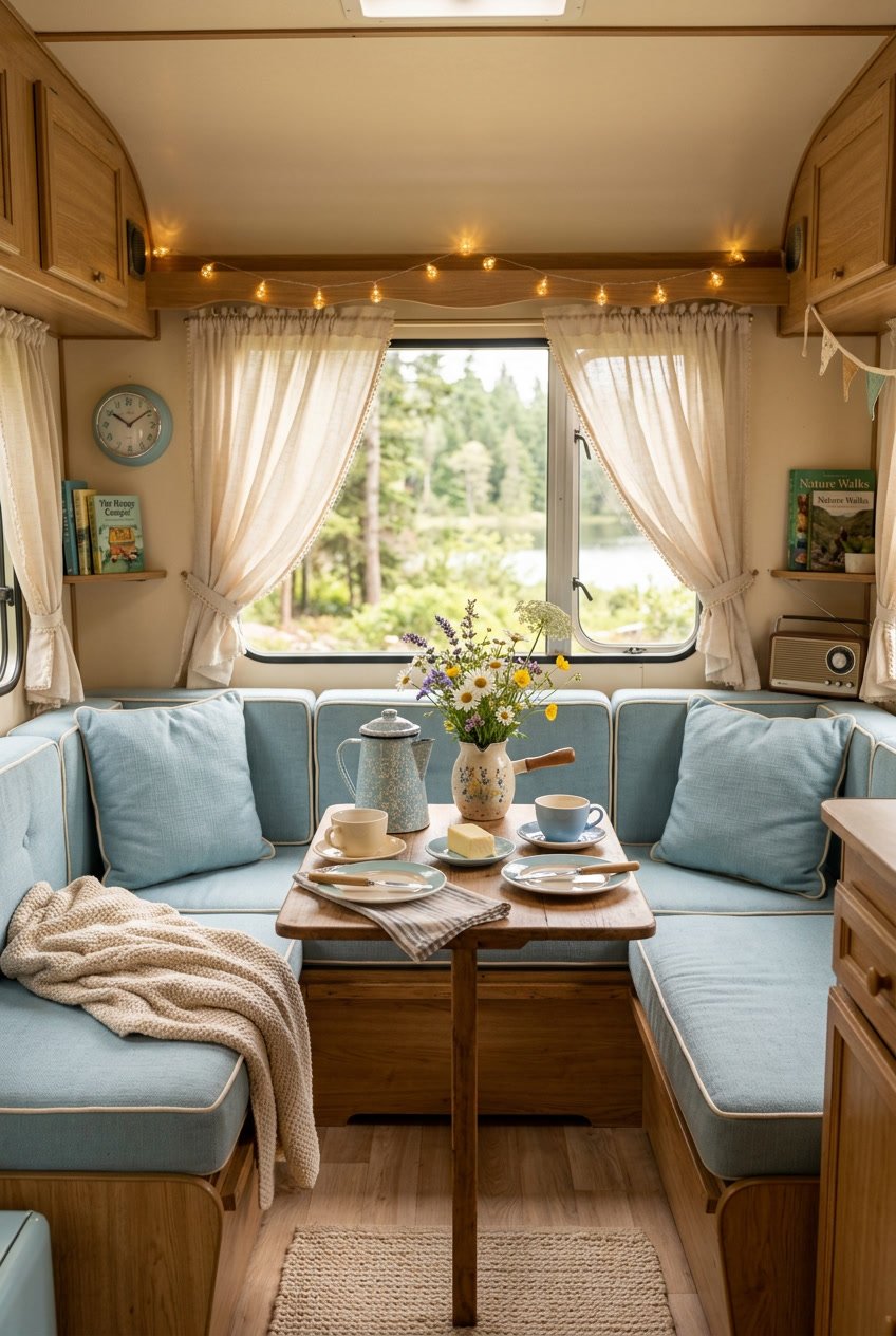
Powder blue and cream make a soft, calm palette that fits well in a camper. You can use powder blue on walls or cushions and cream for cabinets or curtains to keep things light.
This pairing helps small spaces feel open without looking cold. Add wood tones or woven textures to bring warmth and a cozy feel.
For accents, choose simple patterns like thin stripes or small dots. You can also add brass or matte black hardware for a little contrast without overwhelming the gentle colors.
PRO TIP
Use washable fabrics and removable covers so you can keep your camper fresh. Small pops of coral or sage green lift the palette when you want more color.
4) Burnt Sienna and Turquoise
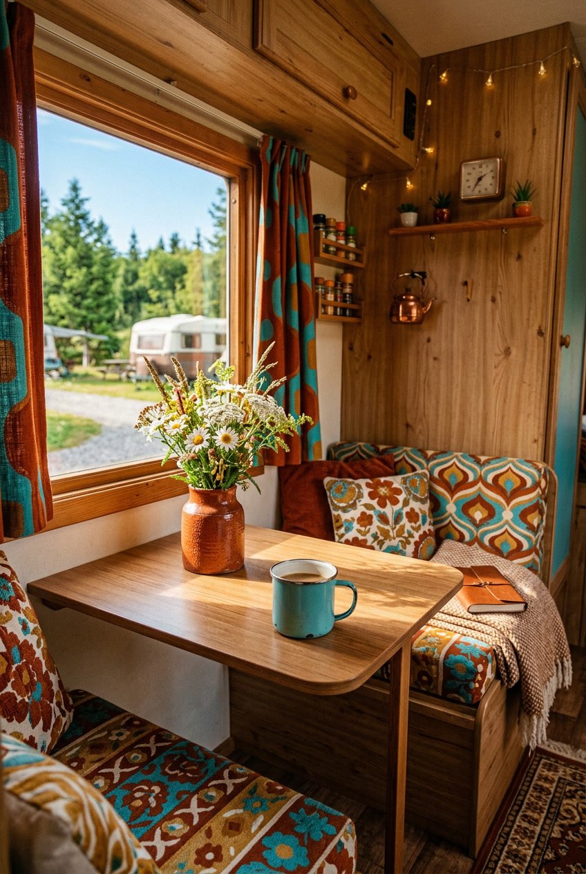
This warm-and-cool pairing gives your camper a cozy, vintage feel. Burnt sienna brings earthy warmth, while turquoise adds a bright, cheerful contrast that keeps the space lively.
Use burnt sienna on larger surfaces like cabinets or wood trim to ground the room. Paint accents, cushions, or curtains in turquoise to draw the eye and make the space feel open.
Mix in neutral creams or soft greys to balance the colors and prevent them from competing. Small metal or woven textures work well with this palette and add a handcrafted touch.
PRO TIP
Test paint samples on different walls and check them in daylight and evening light. That way you can see how the colors shift and choose the right shades for your camper.
5) Peach and Olive Green
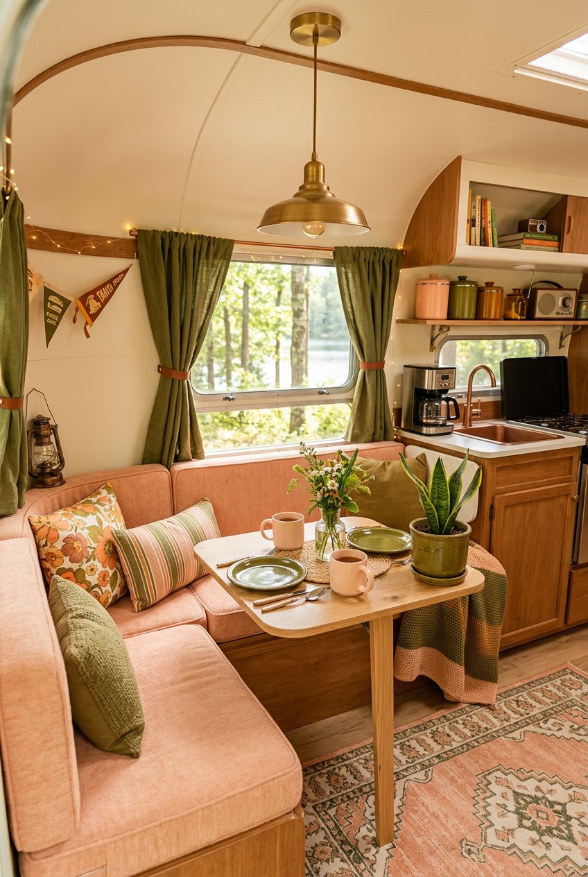
Peach brings soft warmth while olive green adds grounded calm. Together they make a cozy, slightly vintage look that feels friendly and lived-in.
Use peach for cushions, curtains, or small accents to keep the space light. Paint a cupboard or add olive throw blankets and rugs to anchor the palette.
You can balance the pair with off-white or light wood tones to avoid a heavy feel. Keep patterns simple—stripes or small florals work well.
PRO TIP
Place peach near natural light to keep it bright. Use olive in lower areas like seat covers or the base of cabinets so the room feels stable and inviting.
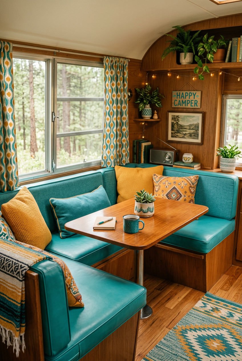
6) Goldenrod and Teal
Goldenrod adds warm cheer while teal brings a cool, calm balance. You can use goldenrod for accent pillows, curtains, or a painted cabinet door to make the space feel sunny.
Teal works well on larger surfaces like walls or upholstery. It helps ground the bright yellow and keeps the camper feeling cozy instead of overstimulating.
Mix in natural wood tones and soft whites to tie the palette together. Small teal stripes or goldenrod trim create playful detail without crowding the space.
PRO TIP
Choose one dominant color and one accent color to keep the look simple. Swap small items seasonally to refresh the vibe without a big redo.
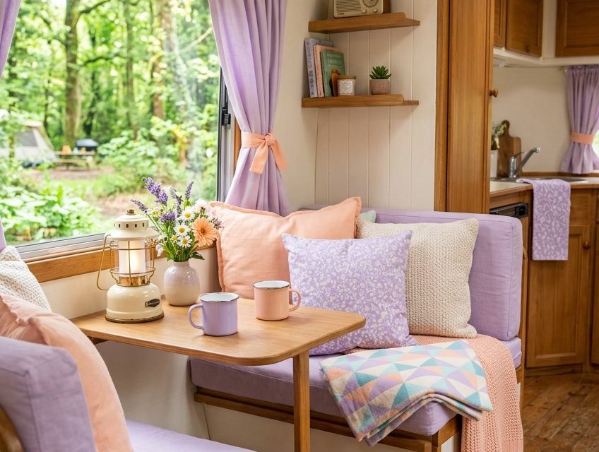
7) Pastel Lavender and Soft Peach
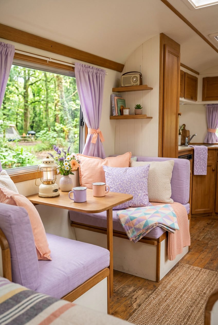
Pastel lavender and soft peach create a calm, cozy vibe for your camper. The lavender brings a gentle coolness, while the peach adds warm, cheerful contrast.
Use lavender on walls or textiles and peach on cushions, curtains, or small accents. This mix keeps the space light and airy without feeling plain.
Add textures like knits, linen, or woven baskets to make the colors feel homey. A few small plants or dried flowers will brighten the palette and add life.
PRO TIP
Balance the colors by using one as the main shade and the other as an accent. Keep most surfaces neutral to let the pastel tones stand out.
8) Rust Red and Sage Green
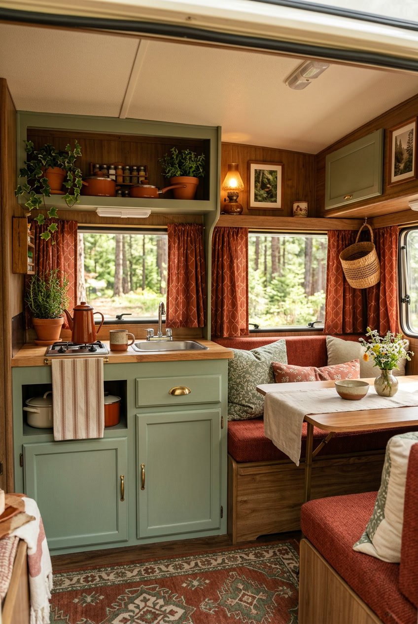
This pairing feels cozy and grounded. Rust red brings warmth, while sage green adds calm and a soft natural touch.
Use rust on textiles like cushions or a small throw. Paint cabinet doors or an accent wall in sage to keep the space light and fresh.
Mix in cream or warm beige to balance the contrast. Natural wood tones link the two colors and make the camper feel more connected to the outdoors.
PRO TIP
Use small metal accents in matte finishes to tie the palette together. Swap one bold piece at a time so you can see how the colors change the mood.
9) Warm Brown and Pastel Mint
Warm brown brings a cozy, grounded feel to your camper. It works well on wood trim, shelves, or a feature wall to make the space feel snug.
Pastel mint adds a soft, fresh contrast that keeps the look light and cheerful. Use it on cushions, curtains, or small appliances to brighten corners without overpowering the brown.
Pair these colors with cream or off-white for balance. That keeps the palette calm and helps the mint pop.
PRO TIP
Use textured fabrics like woven throws or linen to add depth. A few mint accents against rich brown wood create a charming, vintage-inspired vibe without feeling fussy.
10) Dusty Rose and Sky Blue
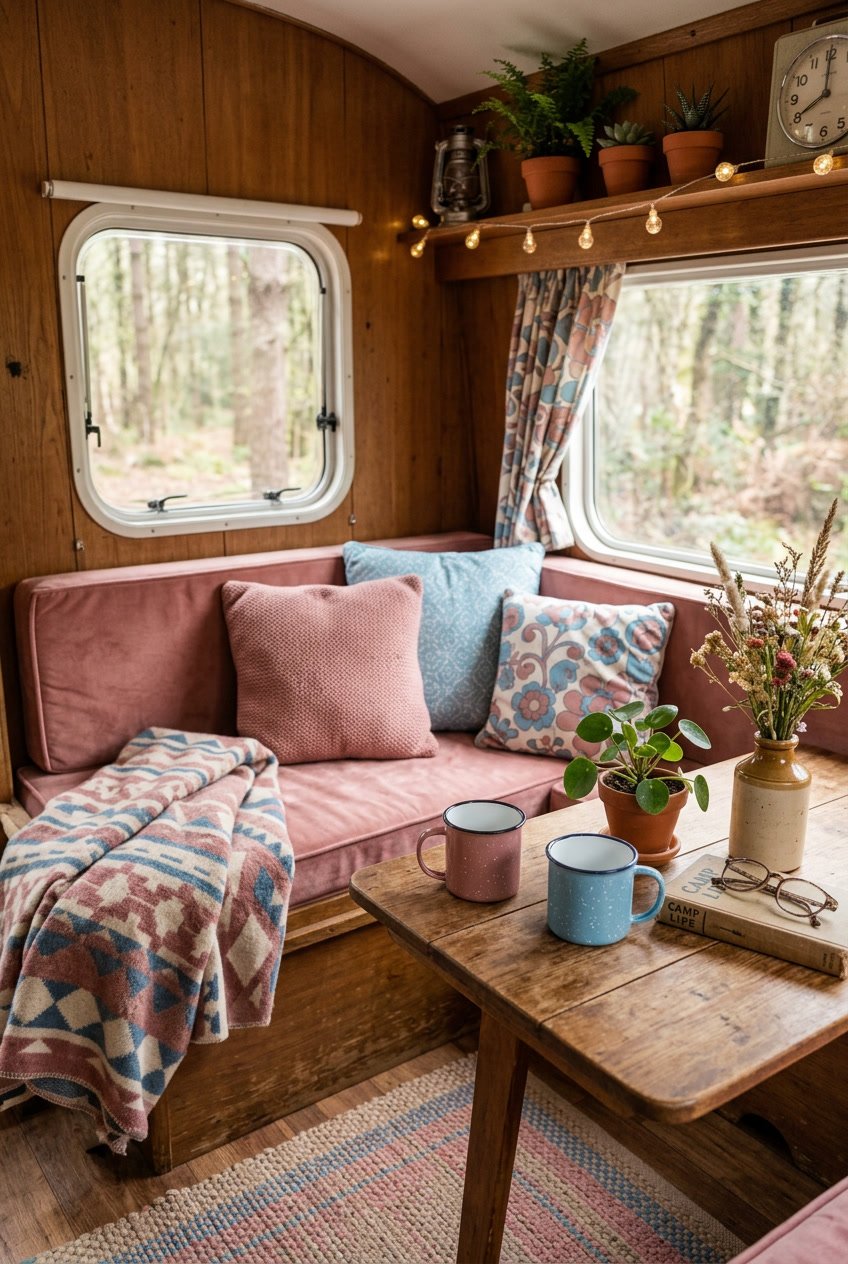
Dusty rose and sky blue make a soft, friendly pair for camper décor. You get warmth from the rose and a light, airy feel from the blue.
Use dusty rose for cushions, curtains, or a small accent wall. Sky blue works well on cabinets, trim, or bedding to keep the space feeling open.
Mix in crisp white or light wood to balance the colors and avoid a heavy look. Small patterns like stripes or tiny florals tie the two shades together without overwhelming the space.
PRO TIP
Swap one large item in a neutral color for a dusty rose piece to test the palette. Then add sky blue accents slowly so you can see how the colors change the mood.
11) Creamy Beige and Burnt Orange
Creamy beige brings a soft, warm base that makes small camper spaces feel open. It pairs well with natural wood and simple patterns to keep your decor calm.
Burnt orange adds a cozy pop without overwhelming the space. Use it on throw pillows, a small rug, or a trim to create focal points that draw the eye.
Mix textures like cotton, woven baskets, and matte ceramics to add depth. Keep most surfaces neutral so the orange accents stand out and feel intentional.
PRO TIP
Add a few small plants or dried grasses to tie the palette to the outdoors. Rotate orange accents seasonally to keep the look fresh without a full redo.
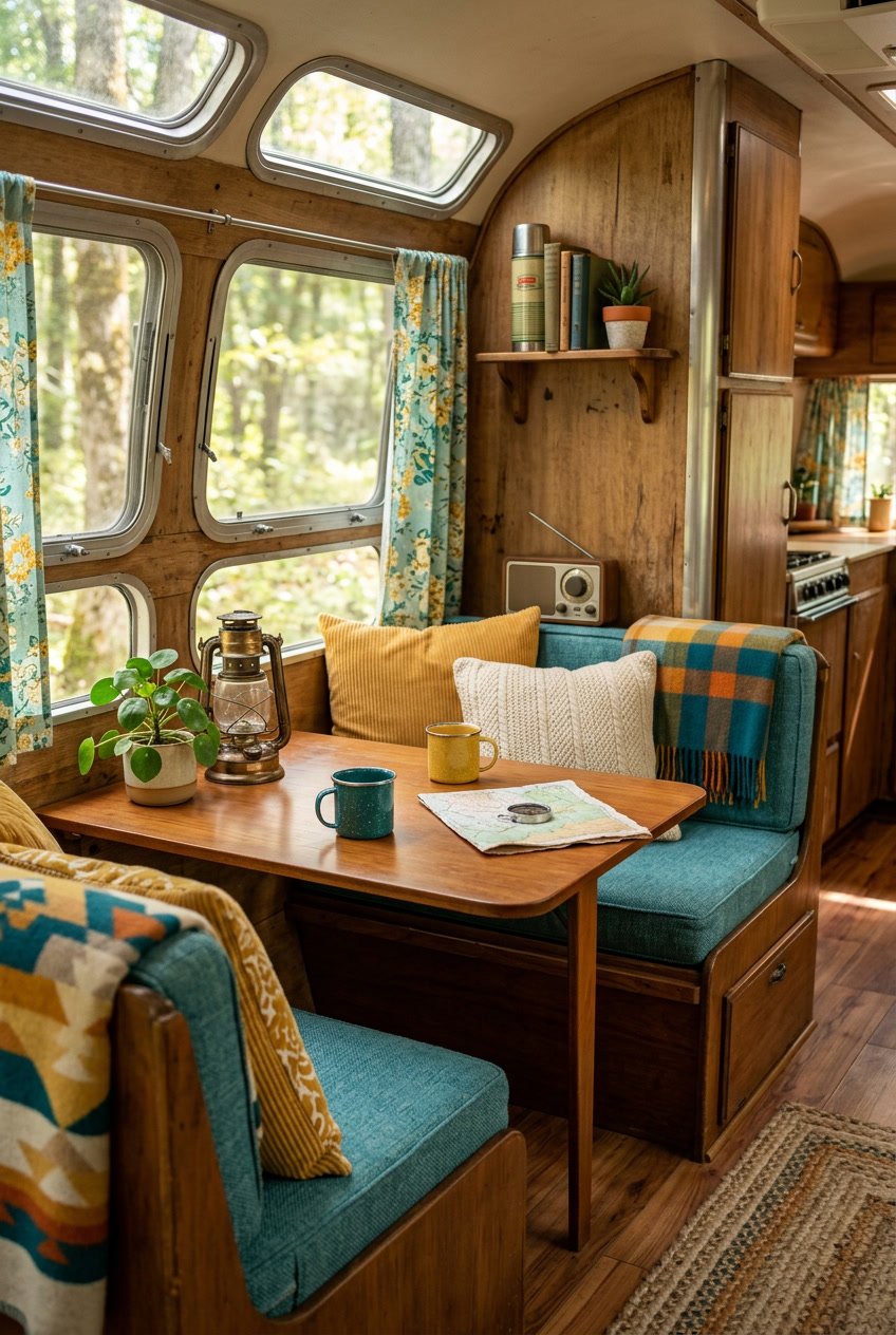
12) Teal and Marigold
Teal and marigold make a bright, cozy combo for camper decor. Teal gives a cool, calm base while marigold adds a warm pop that feels cheerful without being loud.
Use teal on larger surfaces like cushions or curtains to keep the space grounded. Add marigold as accents — throw pillows, a small rug, or wall art — to draw the eye and lift mood.
Mix in natural textures like wood and woven fibers to balance the two colors. You’ll get a vintage-cute vibe that still feels fresh and inviting.
PRO TIP
Choose one shade of teal and one shade of marigold and repeat them around the camper. This keeps the look cohesive and simple to maintain.
13) Soft Mauve and Butter Yellow
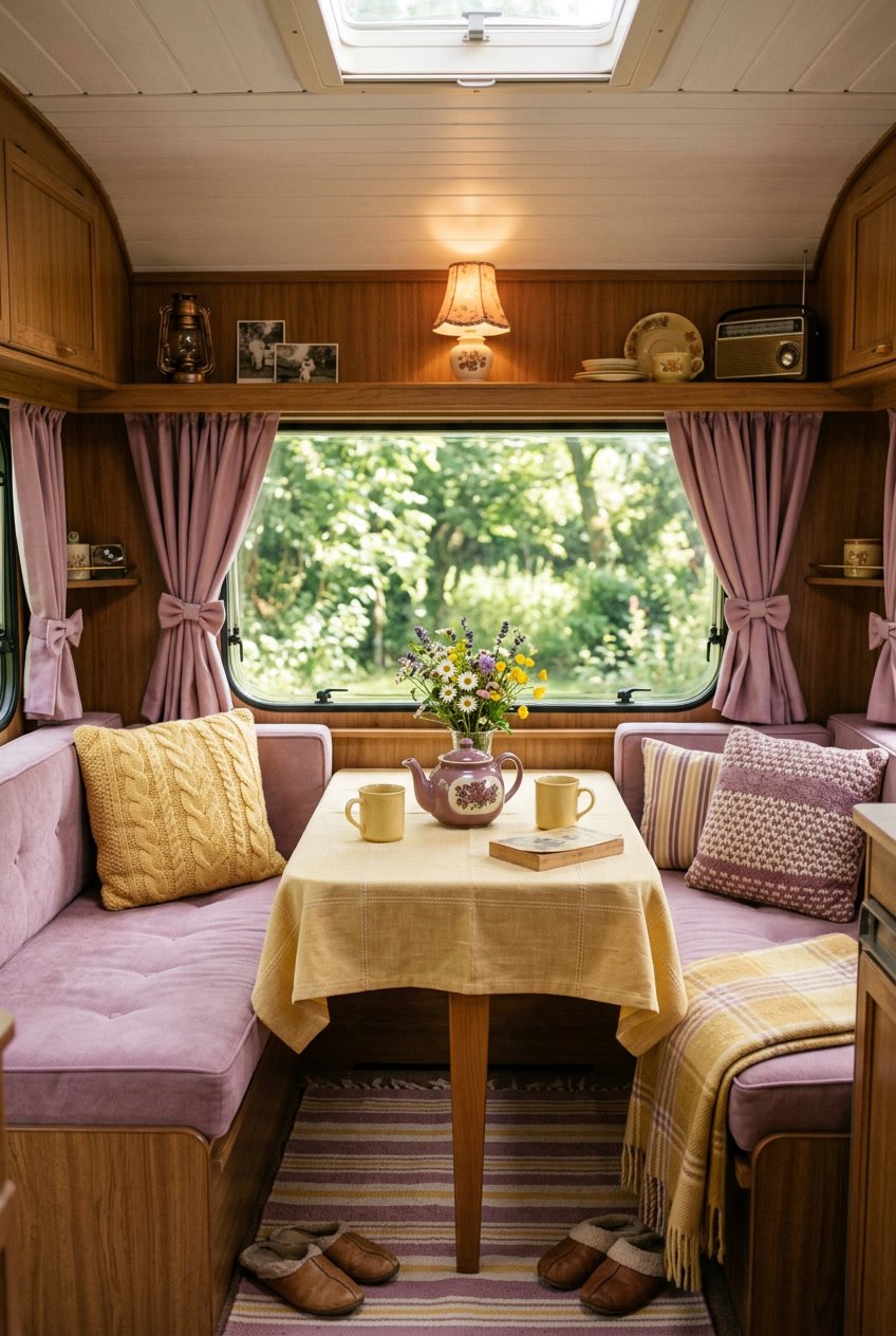
Soft mauve gives your camper a calm, cozy feel. Pairing it with butter yellow adds a sunny, cheerful touch without feeling loud.
Use mauve for larger surfaces like curtains or a bedspread. Then add butter yellow in small accents — throw pillows, a lamp, or dishware — to brighten the space.
Mix patterns that include both colors to make the look more interesting. Stripes or small florals work well and keep things playful.
PRO TIP
Choose muted, warm shades so the colors blend smoothly. Keep most items in neutral tones to avoid overwhelming the small space.
14) Olive and Coral
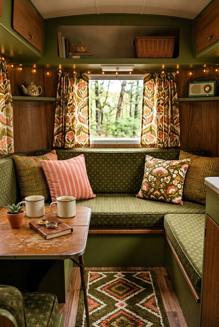
Olive green brings a calm, earthy base that feels warm and lived-in. Pair it with coral to add a bright, cheerful pop without feeling too bold.
Use olive on larger surfaces like cabinets or seat cushions. Then add coral through throw pillows, curtains, or small wall art to lift the mood.
Mix in natural textures like woven rugs or wood grain to tie the colors together. Metallic accents in warm tones can add subtle shine and keep the palette from feeling flat.
PRO TIP
Balance the tones by using more olive than coral so the space stays relaxed. Add one or two coral accents in each area to guide the eye and keep the camper feeling cozy and fun.
15) Pale Yellow and Soft Gray
Pale yellow brings a warm, sunny feel without being too bright. Pair it with soft gray to keep the space calm and cozy.
Use pale yellow on fabrics like curtains or throw pillows. Paint cabinets or trim in soft gray to ground the look and add a modern touch.
Add small accents in white or light wood to keep the palette fresh. These help the yellow and gray breathe and prevent the space from feeling flat.
PRO TIP
Use a pale yellow with low saturation so it reads gentle, not neon. Swap one gray item for a slightly textured piece to add depth and interest.
16) Sunset Pink and Moss Green
This palette pairs soft sunset pink with deep moss green for a warm, nature-inspired look. You get a cozy, gentle contrast that feels both playful and grounded.
Use pink on cushions, curtains, or small accents to add light and charm. Let moss green cover larger areas like cabinets or a feature wall to bring balance and calm.
Mix in natural textures like wood and woven fibers to tie the colors to outdoor vibes. Small brass or matte black fixtures add a simple, modern touch without stealing focus.
PRO TIP
Keep pink tones muted to avoid feeling too bright. Swap in plants or green textiles to echo the moss color and make the space feel alive.
17) Vintage Navy and Blush Pink
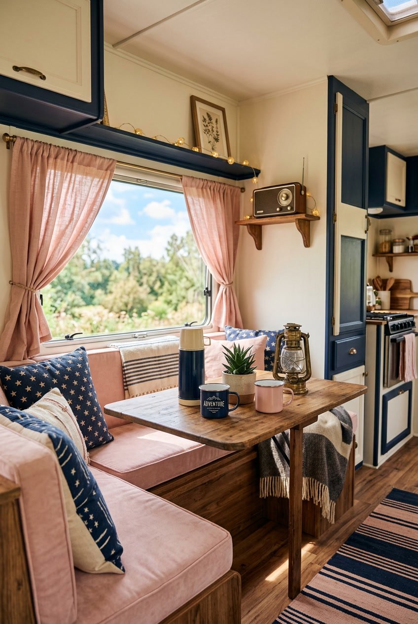
This palette pairs deep navy with soft blush pink for a cozy, vintage camper look. The navy grounds your space and hides dirt, while the blush adds lightness and a gentle, retro feel.
Use navy for larger surfaces like a bench or cabinetry. Add blush in cushions, curtains, or small accessories to soften the space and keep it from feeling heavy.
Mix in warm neutrals such as cream or tan to balance contrast. Wood tones and brass-like finishes fit well and bring a lived-in charm.
PRO TIP
Keep most surfaces navy and use blush as an accent so the pink feels intentional, not overpowering. Add patterned textiles that combine both colors for a pulled-together look.


