25 RV Color Scheme Ideas to Inspire Your Next Remodel
Remodeling your RV is an exciting opportunity to transform your mobile home into a personalized sanctuary that reflects your style and enhances your travel experience. Choosing the right color scheme is perhaps the most crucial decision you’ll make during this process, as it sets the tone for the entire space and can dramatically affect how spacious and inviting your RV feels. When selecting colors for your RV interior, consider how different hues interact with natural light throughout the day, as the limited window space in most RVs means maximizing brightness is essential. Think about the psychological impact of your chosen palette—cool tones like blues and greens create calming retreats perfect for relaxation after long drives, while warm colors like oranges and yellows energize the space and create a cozy, welcoming atmosphere. Additionally, consider the practical aspects: lighter colors make small spaces feel larger and are easier to keep looking clean, while darker accent walls can add depth and sophistication without overwhelming the limited square footage. Remember that your RV is a reflection of your personality and travel lifestyle, so don’t be afraid to experiment with bold combinations or stick with timeless neutrals—the key is creating a space where you’ll love spending time, whether you’re parked by the ocean, nestled in the mountains, or anywhere in between.
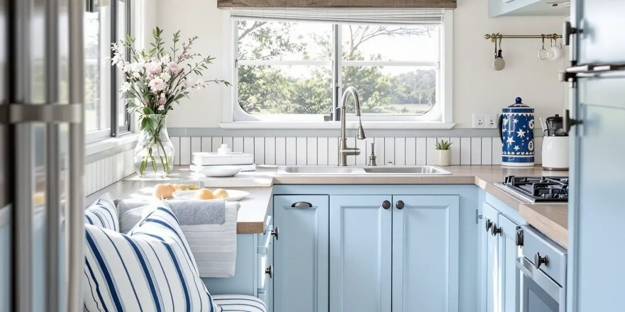
1. Coastal Blue and White

Would you like to save this article?
Transform your RV into a breezy beach house on wheels with this refreshing coastal blue and white color scheme. This classic combination evokes the serenity of ocean waves and sandy shores, creating an atmosphere that feels both relaxing and invigorating. The light blue cabinets paired with crisp white walls reflect natural light beautifully, making even the smallest RV feel more spacious and airy. Nautical striped cushions and whitewashed wood accents complete the look, bringing a touch of maritime charm that never goes out of style.
This color scheme works exceptionally well in RVs because it visually expands the space while maintaining a cohesive, polished appearance. The blue tones have a calming psychological effect, perfect for unwinding after a day of adventure, while the white keeps everything feeling fresh and clean. Consider adding rope details, brass hardware with a weathered finish, and natural fiber rugs to enhance the coastal aesthetic. This palette also pairs beautifully with natural wood tones, so you can keep existing wooden elements and simply update your soft furnishings and paint colors for a quick transformation.
PRO TIP: When working with blue and white in an RV, use different shades of blue to create depth and visual interest. Try a soft powder blue for upper cabinets, a deeper navy for accent pillows, and aqua accessories. This layering technique prevents the space from feeling flat while maintaining the cohesive coastal theme. Also, incorporate plenty of textures—think linen, cotton, jute, and weathered wood—to keep the white from feeling too stark or clinical.
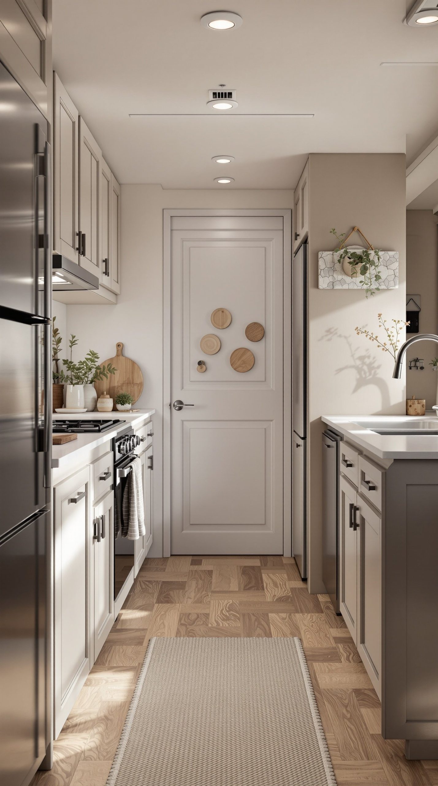
2. Modern Minimalist White and Gray
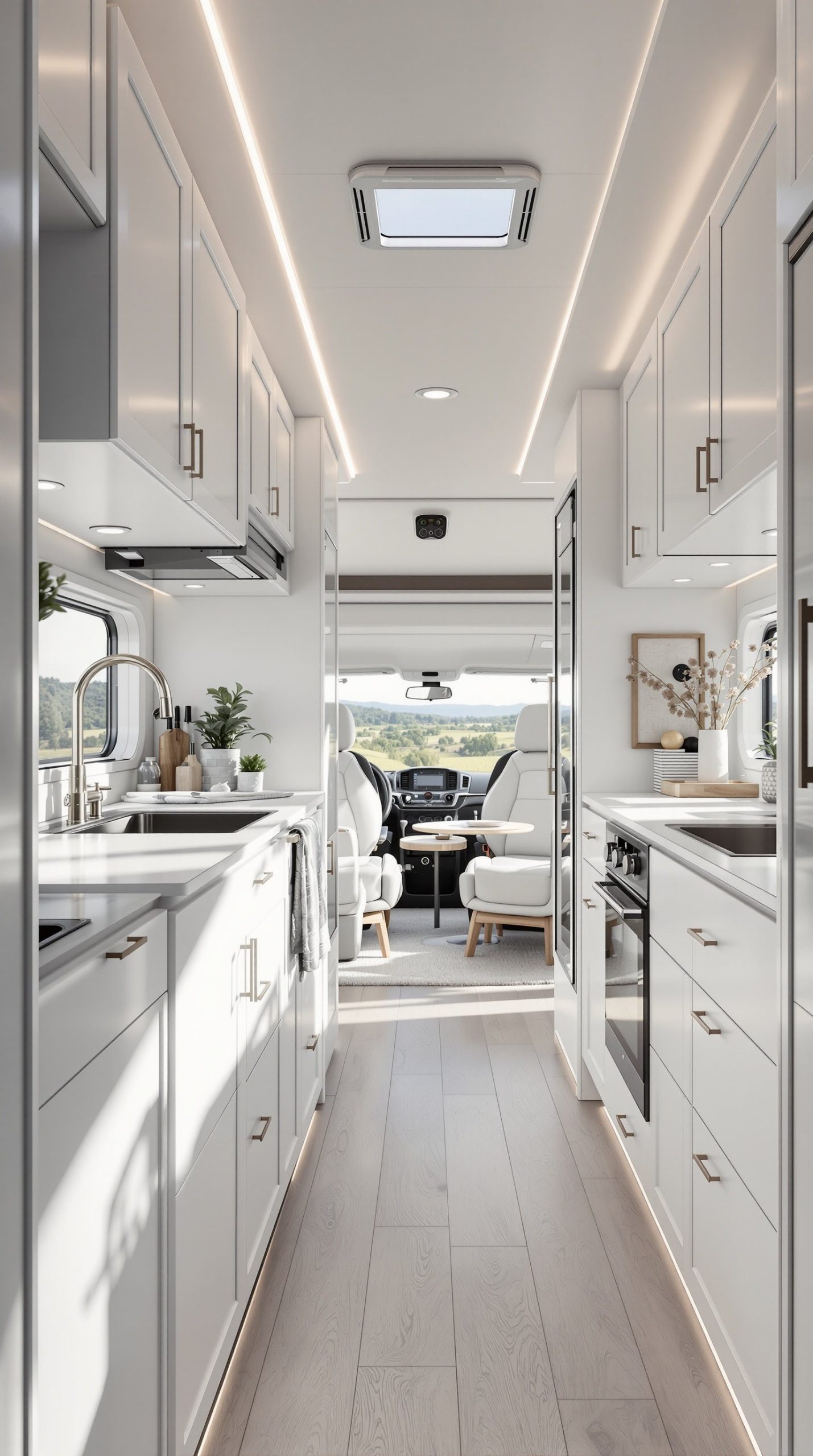
Embrace the beauty of simplicity with a modern minimalist approach featuring all-white walls and light gray cabinets. This sophisticated color scheme creates a clean, contemporary canvas that makes your RV feel like a high-end apartment on wheels. The monochromatic palette with subtle gray variations provides just enough contrast to define different areas without creating visual clutter. Chrome fixtures and clean lines throughout emphasize the modern aesthetic, while the abundance of white reflects maximum light, crucial for smaller RV interiors.
The Scandinavian-inspired minimalist design isn’t just about aesthetics—it’s incredibly practical for RV living. The neutral palette makes it easy to add pops of color through easily changeable accessories like throw pillows, blankets, and artwork, allowing you to refresh your space seasonally without major renovations. White and gray surfaces are also forgiving when it comes to color matching, making repairs and touch-ups much simpler. Natural light streaming through windows becomes a design feature itself, creating beautiful shadows and highlights that add dimension to the space throughout the day.
PRO TIP: In a minimalist white and gray RV, storage becomes decor. Invest in matching white or gray storage boxes, baskets, and containers to keep items organized while maintaining the clean aesthetic. Use hidden LED strip lighting under cabinets and along toe kicks to add ambiance and functionality without cluttering surfaces with lamps. The key to making minimalism work in an RV is ruthless organization—every item should have its designated place, keeping surfaces clear and maintaining that serene, uncluttered feeling.
3. Earthy Desert Tones
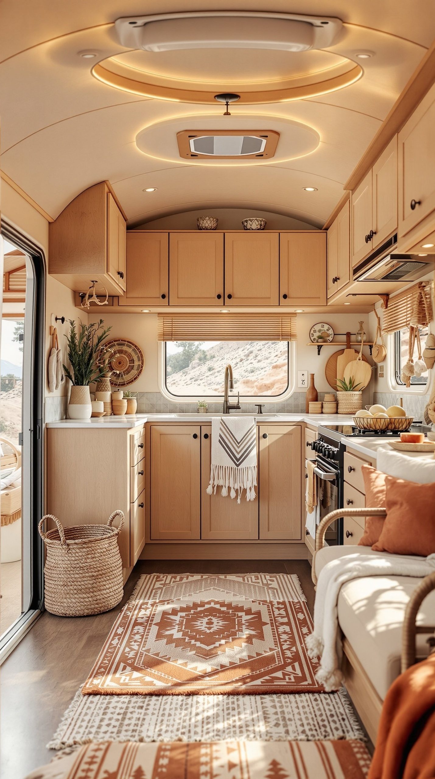
Bring the warmth and richness of the desert landscape into your RV with earthy tones of terracotta, beige, and natural wood. This color scheme creates a cozy, bohemian atmosphere that feels grounded and inviting, perfect for travelers who love exploring arid landscapes and southwestern regions. The terracotta orange accents add vibrant warmth without overwhelming the space, while beige walls provide a neutral backdrop that makes the RV feel larger. Natural wood cabinets in honey or medium tones tie everything together, creating a harmonious connection to nature.
Desert-inspired textiles featuring geometric patterns, woven baskets for storage, and ceramic accents in rust and clay tones complete this aesthetic beautifully. This color scheme particularly shines in RVs with abundant natural light, as the warm tones seem to glow in afternoon sun. The earthy palette is also incredibly versatile—it pairs well with houseplants, leather accents, and both modern and vintage decor pieces. The warm, enveloping quality of these colors makes your RV feel like a comfortable retreat even in harsh outdoor conditions.
PRO TIP: Layer your desert tones from light to dark, with the lightest shades on walls and ceilings, medium tones on cabinets and large furniture pieces, and the richest terracotta and burnt orange as accents in pillows, throws, and artwork. This creates depth and prevents the space from feeling too uniform. Add texture through macramé wall hangings, woven rugs, and raw wood shelving to capture that authentic southwestern, bohemian vibe. Consider installing warm-toned LED bulbs (2700-3000K) to enhance the cozy, golden atmosphere, especially during evening hours.
4. Sage Green and Cream
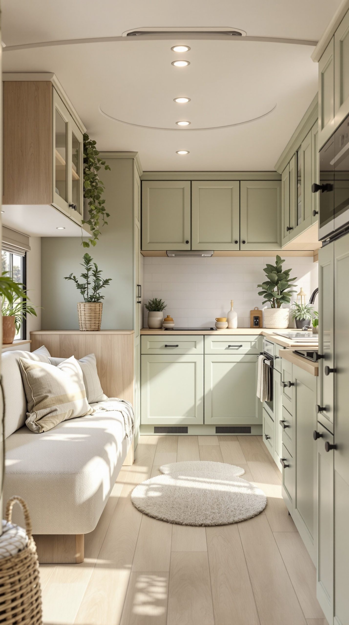
Create a tranquil, nature-inspired retreat with the soothing combination of sage green and cream. This organic modern color scheme has surged in popularity for good reason—it brings the calming essence of nature indoors while maintaining a sophisticated, contemporary feel. Soft sage green cabinets provide a gentle pop of color that’s interesting without being overwhelming, while cream upholstery and walls keep the space feeling light and open. The muted green tone works beautifully with natural wood elements, creating a cohesive, earthy aesthetic.
This color palette is particularly effective in RVs because sage green has been shown to reduce stress and promote relaxation—ideal qualities for your home away from home. The combination feels fresh and modern yet timeless, meaning it won’t look dated in a few years. Potted plants and natural fiber accessories complement this scheme perfectly, blurring the line between your indoor space and the outdoor environments you’re exploring. The cream keeps things feeling airy and spacious, while the sage provides just enough color to create visual interest and a distinct personality.
PRO TIP: Sage green can vary significantly in undertone—some lean more blue (cooler) while others lean more yellow (warmer). Choose a sage with undertones that complement your RV’s existing wood tones and lighting conditions. Test paint samples on different walls and observe them at various times of day before committing. Enhance this color scheme with brass or gold-toned hardware and fixtures, which warm up the cool green beautifully. Add plenty of live plants in cream-colored ceramic pots to reinforce the organic, nature-inspired theme and improve your RV’s air quality.
5. Navy Blue and Gold Luxury

Elevate your RV to luxury status with the rich, sophisticated combination of navy blue and gold accents. This elegant color scheme transforms even a modest RV into a space that feels upscale and intentionally designed. Dark navy cabinets create dramatic visual impact while surprisingly not making the space feel smaller—instead, they add depth and sophistication. Gold hardware, brass fixtures, and metallic accents catch the light and provide warm contrast against the cool navy, creating a balanced, glamorous aesthetic.
This color scheme works particularly well for RVers who want their mobile space to feel more like a boutique hotel than a utilitarian vehicle. The navy provides a bold backdrop that makes lighter elements pop, while the gold adds just the right amount of opulence without crossing into gaudy territory. Elegant upholstery in cream, tan, or even rich jewel tones complements this base beautifully. The dramatic lighting created by the darker walls actually makes the space feel more intimate and cozy—perfect for evening relaxation. This scheme also hides dirt and wear better than lighter colors, a practical consideration for frequent travelers.
PRO TIP: When going bold with dark navy, balance is crucial. Paint only the lower cabinets navy while keeping upper cabinets or walls in a lighter cream or white to prevent the space from feeling too enclosed. Use multiple light sources—LED strips, recessed lighting, and strategic task lighting—to ensure the darker surfaces don’t absorb too much light. Invest in high-quality gold-toned finishes (brushed brass or champagne bronze work particularly well) that won’t tarnish or look cheap. Add mirrors strategically to reflect light and make the space feel larger while enhancing the luxurious atmosphere.
6. Rustic Farmhouse White
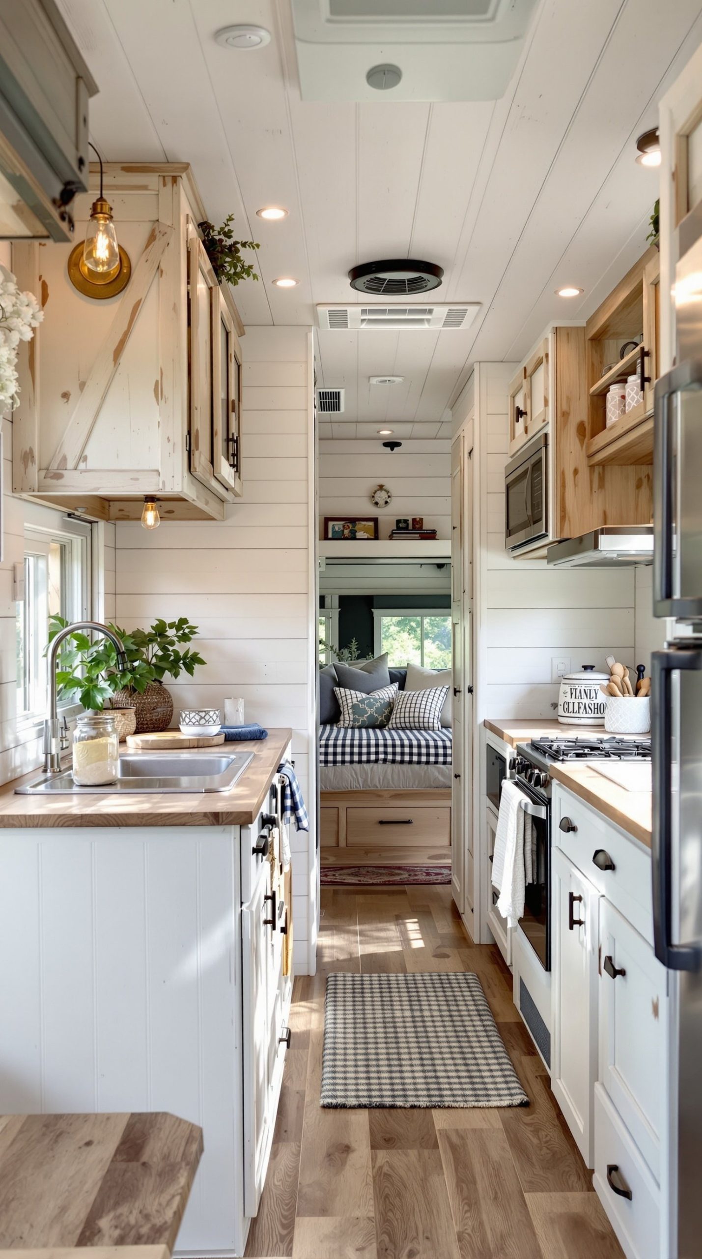
Channel the cozy charm of a countryside farmhouse with shiplap white walls, distressed wood cabinets, and vintage-inspired details. This rustic farmhouse style has become incredibly popular for RV remodels because it creates a warm, welcoming atmosphere that feels both timeless and on-trend. The shiplap texture adds visual interest to white walls without introducing new colors, while distressed wood cabinets in weathered finishes provide character and hide the inevitable wear that comes with RV travel. Vintage hardware in oil-rubbed bronze or matte black adds authentic farmhouse detail.
Mason jar lighting fixtures, gingham textiles, and apron-front sinks (if space allows) complete this cozy country aesthetic. The beauty of farmhouse style in an RV is that it embraces imperfection—scratches, dings, and worn spots just add to the authentic rustic charm rather than detracting from the overall look. This forgiving quality makes it perfect for a traveling home. The predominantly white palette keeps everything feeling fresh and spacious while the wood tones and vintage details add warmth and personality. Open shelving with farmhouse-style brackets can replace some upper cabinets, making the space feel more open while displaying charming dishware and decor.
PRO TIP: Authentic farmhouse style is all about mixing old and new elements. Scour antique shops, flea markets, and estate sales for genuine vintage pieces like old signs, glass bottles, enamelware, and wooden crates that you can incorporate into your RV decor. DIY some shiplap accent walls using lightweight pine boards or even peel-and-stick shiplap wallpaper to save weight—a crucial consideration in RVs. Use chalk paint on cabinets for that perfectly imperfect matte finish, and don’t be afraid to sand edges and corners to create an authentically distressed look. Add sliding barn door hardware for cabinet doors or as room dividers to reinforce the farmhouse aesthetic.
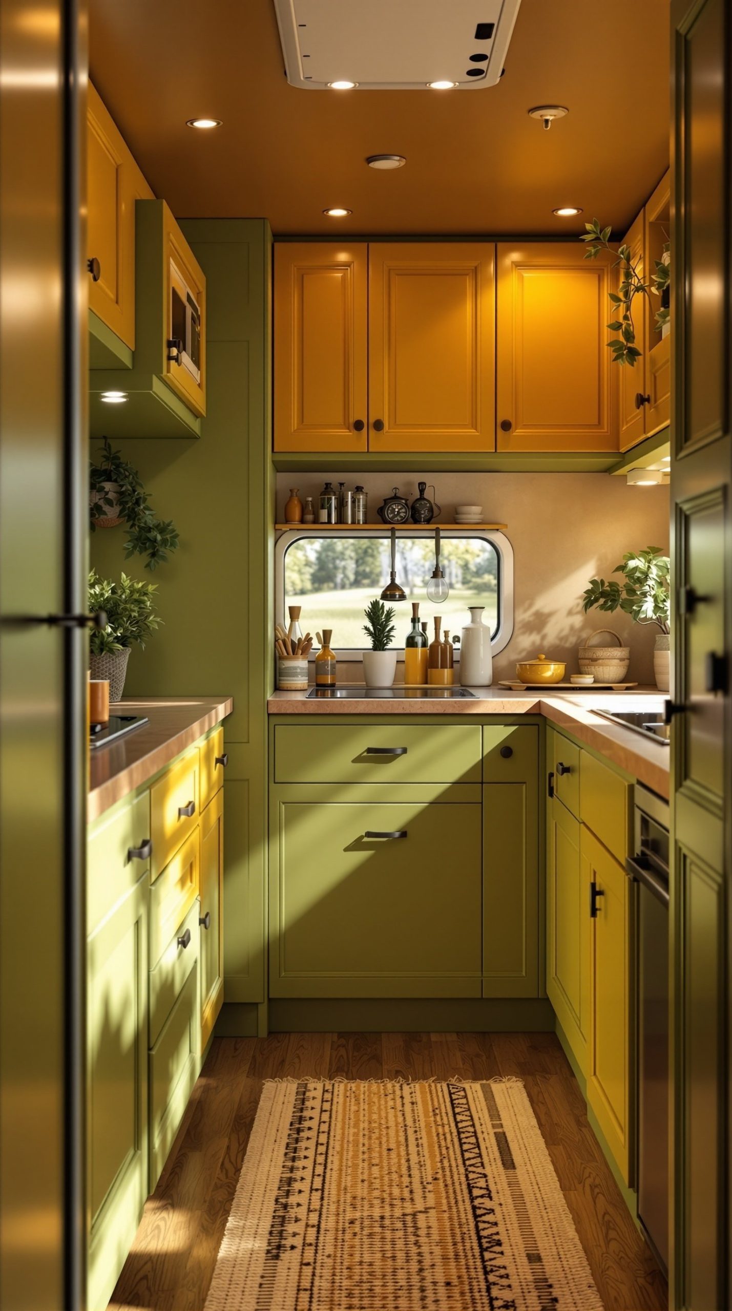
7. Gray and Yellow Modern Pop

Inject energy and personality into your RV with the dynamic combination of charcoal gray and bright yellow accents. This modern color scheme strikes the perfect balance between sophisticated neutrals and playful pops of color. Dark gray cabinets provide a contemporary, urban foundation that feels substantial and well-designed, while white countertops keep the space feeling bright and clean. Bright yellow throw pillows, curtains, and decorative accessories bring cheerful energy without requiring major commitment—you can easily swap them out if you tire of the bold color.
This scheme works particularly well in RVs with modern, industrial-style elements like metal fixtures, concrete-look countertops, or exposed hardware. The gray provides a neutral backdrop that makes the yellow really pop, creating focal points that draw the eye and add visual interest. Yellow is psychologically associated with happiness and optimism—perfect for a space dedicated to adventure and exploration. The combination also photographs beautifully, making your RV Instagram-worthy if you’re documenting your travels. The neutral gray base means you can experiment with different accent colors over time without needing to repaint.
PRO TIP: Choose your yellow carefully—bright lemon yellows can feel too harsh in a small space, while mustard yellows might clash with the gray. A sunny golden yellow or soft marigold tends to work best. Use the 60-30-10 rule: 60% gray (cabinets, larger furniture), 30% white/neutral (walls, countertops), and 10% yellow (accents, accessories). This prevents color overload while maintaining impact. Add geometric patterns in your yellow textiles to enhance the modern vibe. Consider installing dimmer switches so you can adjust lighting levels—yellow can feel different under various lighting conditions, and dimmers give you control over the ambiance.
8. Sunset-Inspired Coral and Peach
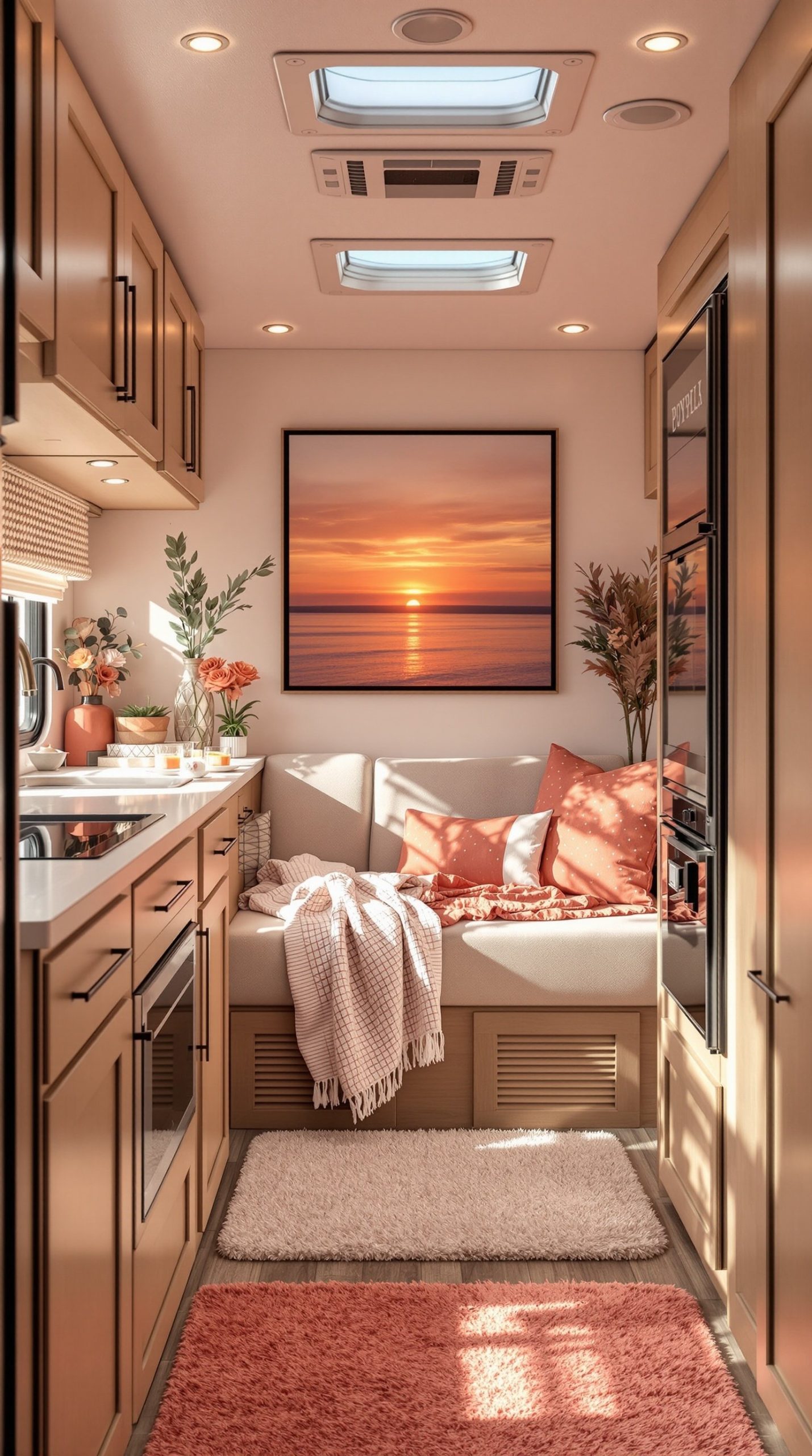
Capture the breathtaking beauty of golden hour with a sunset-inspired palette of coral pink, peach, and soft orange tones. This warm, romantic color scheme fills your RV with the cozy glow of a perpetual sunset, creating an atmosphere that’s both energizing and soothing. Warm wood cabinets in honey or golden tones provide the perfect base for these peachy hues, while cream or soft white walls prevent the colors from overwhelming the space. Cozy textiles in various shades from pale peach to deep coral add depth and visual interest.
This color scheme is particularly magical in the late afternoon when natural light streams through windows, making the coral and peach tones seem to glow from within. It’s an excellent choice for RVers who frequently camp in desert or western regions where spectacular sunsets are part of the daily experience. The warm tones create an immediately welcoming atmosphere that makes your RV feel like a comfortable retreat. Consider adding a sunset photograph or painting as a focal point to anchor the color scheme. Metallic accents in copper or rose gold complement these warm tones beautifully, adding a touch of elegance.
PRO TIP: Coral and peach can read very differently depending on your RV’s lighting. These colors often appear more orange in cool LED lighting and more pink in warm lighting. Install warm-toned LED bulbs (2700K or lower) to bring out the soft, romantic quality of the colors rather than making them look too orange or harsh. Create an ombre effect by using the deepest coral tones on lower cabinets or accent walls, transitioning to peach in mid-level areas, and keeping upper walls and ceilings in the palest peachy-cream. This gradient effect mimics an actual sunset and creates beautiful visual flow through your space.
9. Forest Green Cabin Style
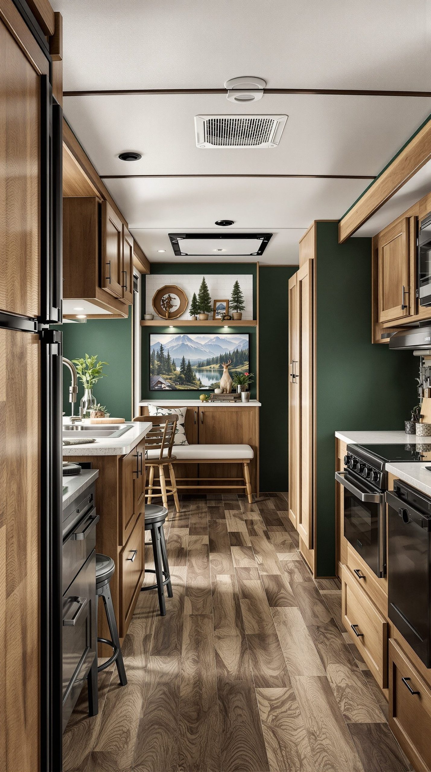
Bring the serene beauty of the forest into your RV with deep forest green walls and rich natural wood cabinets. This cabin-inspired color scheme creates an immersive, nature-connected atmosphere that makes you feel surrounded by woodland beauty even when you’re parked in a campground. Deep green walls might seem like a bold choice for a small space, but they actually create a cozy, cocoon-like feeling that’s incredibly inviting. Rich wood cabinets in walnut, cherry, or dark oak tones complement the green perfectly, creating a harmonious natural palette.
Leather accents in tan, brown, or even darker green add to the rustic cabin aesthetic while providing durability—important for a mobile home. This color scheme works exceptionally well if you frequently camp in forested areas or mountain regions, as it creates continuity between your indoor and outdoor environments. The dark, rich tones create an intimate, comfortable atmosphere that’s perfect for cooler weather camping. Plaid patterns, antler decor (real or faux), and warm wool textiles complete the look. The green provides a sophisticated alternative to the typical brown-and-tan cabin aesthetic while maintaining that outdoor-inspired feel.
PRO TIP: Forest green can make a space feel smaller if not balanced properly. Use it on one accent wall or lower cabinets only, keeping ceilings and upper walls in cream or soft gray to maintain a sense of height. Incorporate plenty of warm lighting to prevent the space from feeling too dark or cave-like—Edison bulb fixtures and warm LED strips work particularly well. Add natural elements like pinecones, river rocks, and small branches in decorative displays to reinforce the forest theme. Install a small live plant wall or hanging planters with trailing vines to bring actual nature indoors and lighten the visual weight of the dark green.
10. Turquoise and Coral Beach Theme
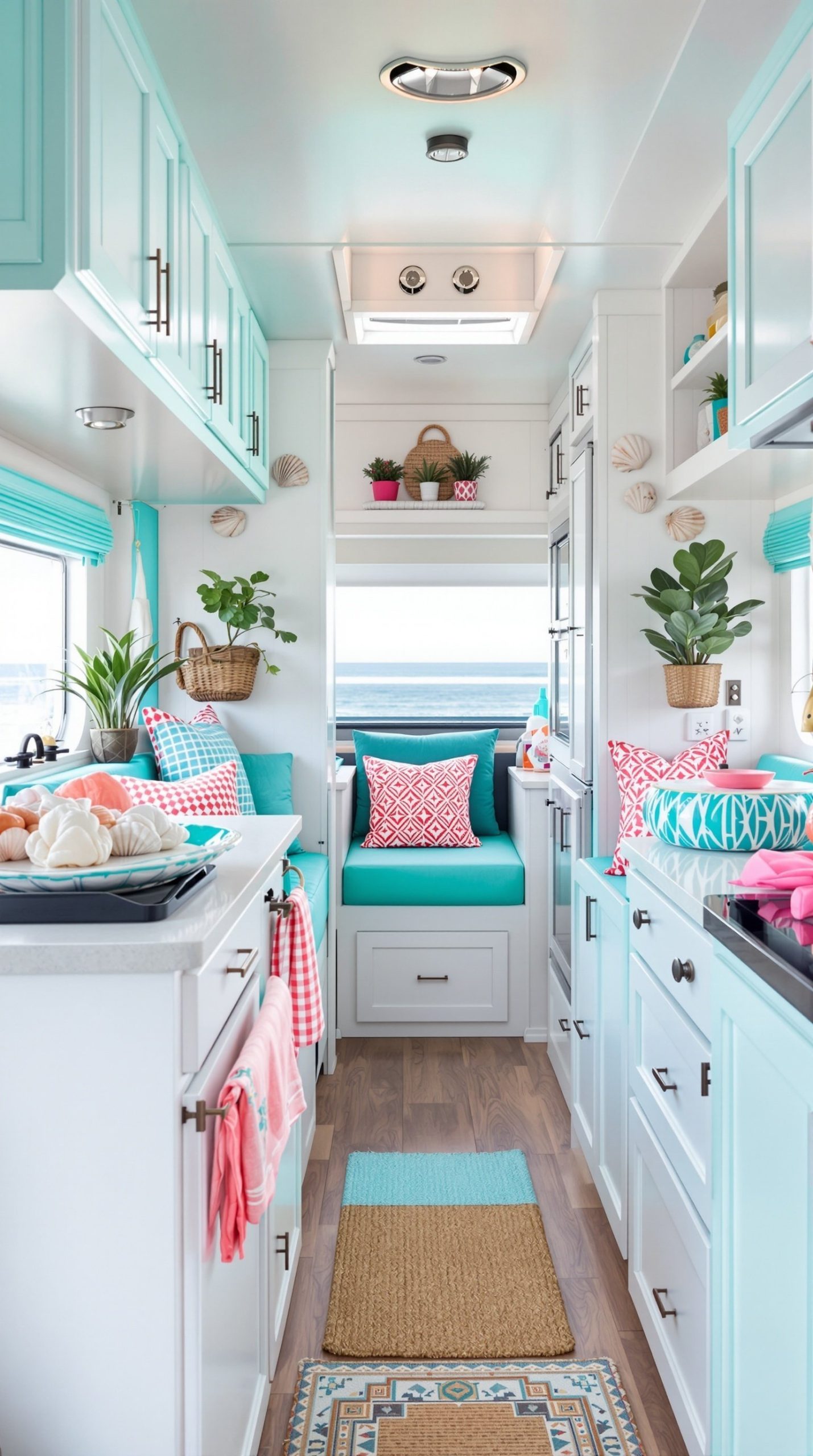
Create a vibrant, tropical paradise with the energetic combination of bright turquoise and coral pink on a crisp white base. This cheerful beach theme brings the joy and relaxation of a coastal vacation into your RV year-round. Bright turquoise accents in cabinet hardware, decorative accessories, or even a painted accent wall provide a bold pop of color that immediately catches the eye, while coral pink cushions and textiles add warmth and balance the cool turquoise. The white base keeps everything feeling fresh, bright, and beachy rather than overwhelming.
Seashell decorations, rope details, and weathered wood accents complete this tropical vibe. This color scheme is perfect for RVers who spend time near beaches, lakes, or coastal areas, as it captures that carefree vacation feeling. The combination is bold enough to make a statement but balanced enough to not feel childish or overly themed. The vibrant colors also photograph beautifully, making your RV stand out in campground photos and social media posts. Both turquoise and coral are associated with joy, creativity, and energy—perfect qualities for a space dedicated to adventure and exploration.
PRO TIP: Bold colors like turquoise and coral can be overwhelming in large doses in a small space. Use them as 20-30% of your overall color scheme, with white or cream making up the majority. This prevents color fatigue while maintaining the cheerful beach vibe. Choose one color to dominate (typically turquoise) and use the other as a secondary accent to create hierarchy and prevent visual chaos. Natural elements like jute rugs, bamboo shades, and driftwood decorations help ground the bright colors and add texture. Consider adding aqua or mint green as transitional shades between the turquoise and coral to create a more cohesive, blended color story.
11. Monochromatic Black and White
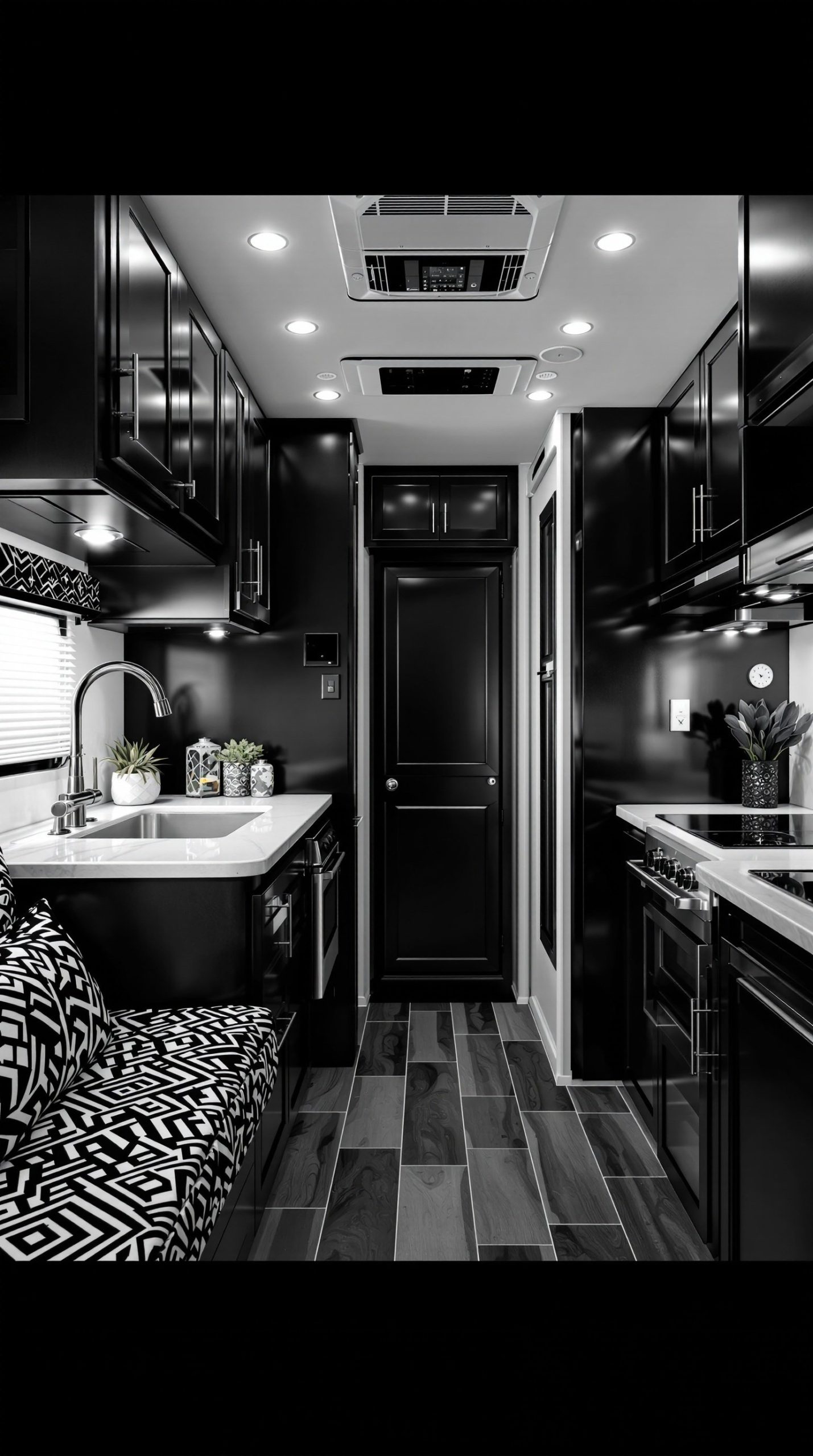
Make a bold, sophisticated statement with a monochromatic black and white color scheme that’s both timeless and dramatic. Black cabinets create striking visual impact and unexpected elegance in an RV setting, while white walls provide essential contrast and keep the space from feeling too enclosed. Black and white patterned textiles—geometric, striped, or graphic prints—add visual interest and tie the two contrasting colors together. Chrome accents provide the perfect neutral metallic that enhances the modern, contemporary design.
This bold color scheme works particularly well for RVers with modern aesthetic sensibilities who appreciate clean lines and strong contrasts. The monochromatic palette creates a cohesive, intentional look that feels thoughtfully designed rather than haphazard. Black surfaces are excellent at hiding dirt, scratches, and wear—a practical advantage for a traveling home. The high-contrast scheme also makes it easy to keep the space organized, as everything stands out clearly against the black-and-white backdrop. This color combination never goes out of style, ensuring your RV will look current for years to come.
PRO TIP: Success with black and white depends on getting the ratio right. Aim for 70% white and 30% black to prevent the space from feeling too dark. Use black on lower cabinets, accent walls, or one statement piece of furniture, and keep most surfaces white. Incorporate various textures to add depth and prevent the space from feeling flat—think glossy black cabinets paired with matte white walls, or smooth white countertops with textured black hardware. Add one metallic tone (silver, chrome, or brushed nickel) consistently throughout as a unifying third element. Good lighting is crucial—install plenty of light sources including under-cabinet strips, recessed lights, and task lighting to ensure the black elements don’t absorb too much light.
12. Lavender and Silver Elegance
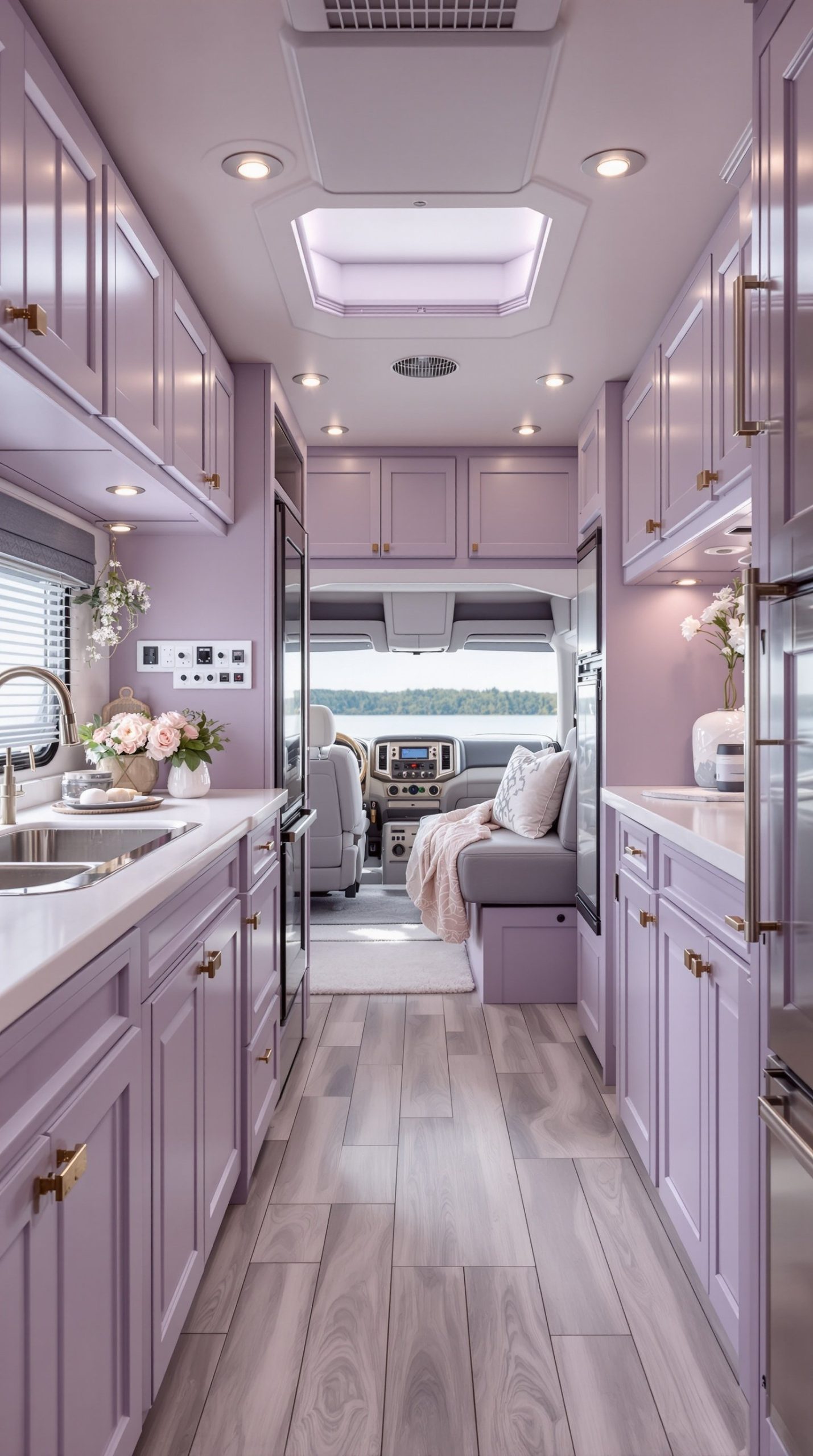
Create a romantic, elegant retreat with the soft, sophisticated combination of lavender and silver accents. This color scheme brings a feminine, dreamy quality to your RV without feeling overly delicate or impractical. Soft purple walls in a muted lavender shade provide gentle color that’s interesting without being overwhelming, creating a calming atmosphere perfect for relaxation. Silver hardware, fixtures, and decorative accents add cool metallic elegance that elevates the space, while gray upholstery bridges the gap between the lavender walls and silver details.
This color palette works beautifully for creating a serene, spa-like atmosphere in your RV. Lavender has been shown to reduce stress and promote better sleep—ideal qualities for a bedroom area or overall living space. The combination feels romantic and elegant without being overly traditional or fussy. Silver accents reflect light beautifully, making the space feel brighter and more spacious. This scheme pairs wonderfully with white or cream as a base color, allowing the lavender and silver to shine without overwhelming the limited space. Soft, flowing textiles in white, gray, and lavender complete the ethereal, feminine aesthetic.
PRO TIP: Lavender can vary significantly from cool purple-grays to warmer pink-purples. Choose a lavender with gray undertones rather than pink undertones to keep the space feeling sophisticated rather than overly sweet. Test paint samples extensively, as lavender can look very different in natural versus artificial light. Use lavender on accent walls rather than all walls to prevent color fatigue—a soft lavender feature wall behind the bed or seating area makes a beautiful focal point. Balance the feminine lavender with industrial or modern elements like geometric patterns, metal hardware, and clean lines to prevent the space from feeling too romantic or dated. Add natural elements like eucalyptus branches or lavender plants to reinforce the color story while bringing fresh scents into your space.
13. Warm Honey Wood Scandinavian
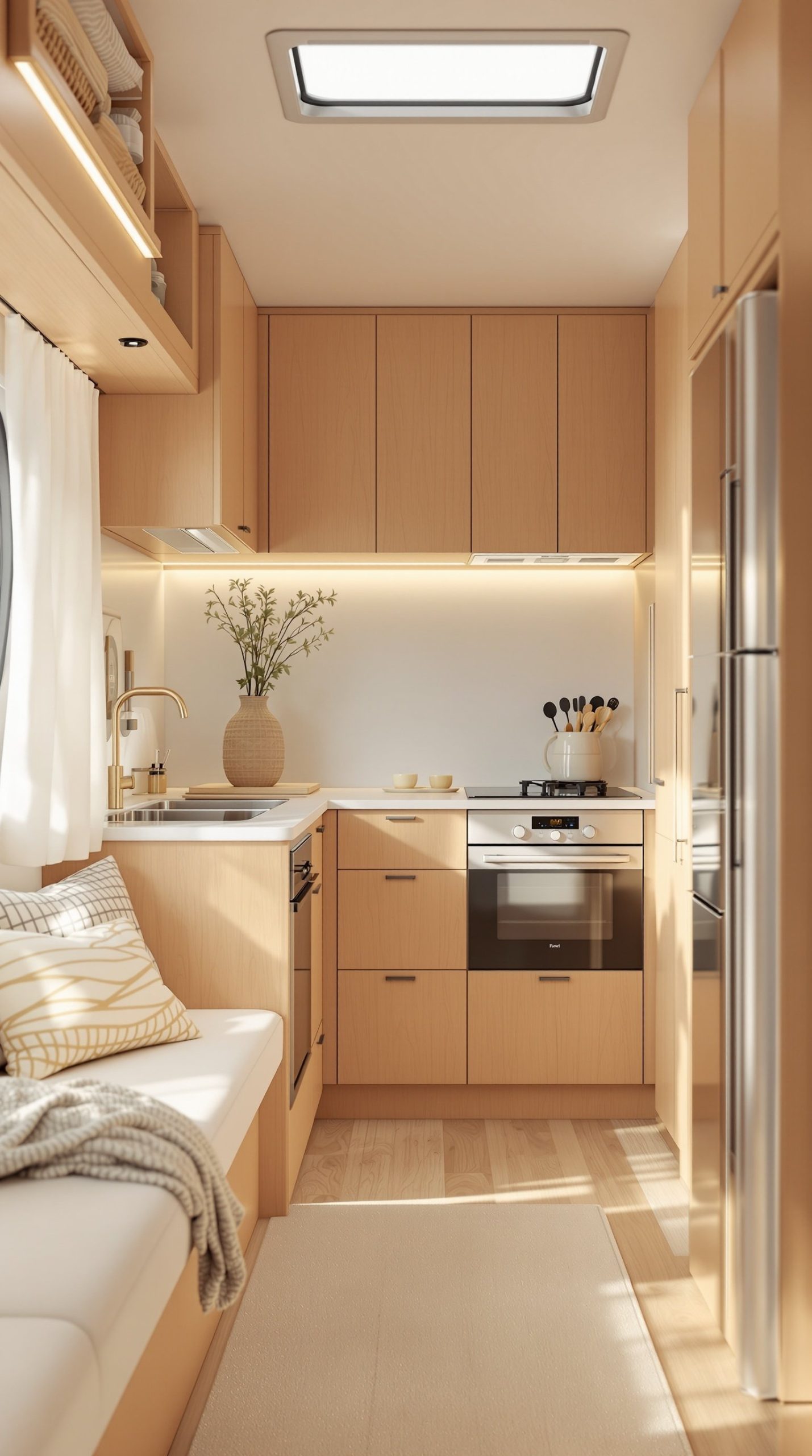
Embrace the warm, inviting aesthetic of Scandinavian design with natural honey-toned wood throughout your RV. This color scheme showcases beautiful natural maple cabinets, honey-colored wood paneling, and warm wood accents that create a cohesive, nature-inspired space. Paired with cream textiles and plenty of white, the honey wood tones take center stage without feeling overwhelming. This Scandinavian minimalist approach celebrates the natural beauty of wood grain while maintaining the clean, uncluttered aesthetic that defines Nordic design.
The warm honey tones create an immediately welcoming, cozy atmosphere—the Danish concept of “hygge” brought to life in your RV. Unlike darker woods that can make small spaces feel cramped, honey-toned wood actually reflects light and makes spaces feel larger and more open. This color scheme works beautifully with abundant natural light, creating a bright, inviting space that changes character throughout the day as sunlight shifts. The natural wood aesthetic also never goes out of style, ensuring your remodel will look current for years to come. Simple, functional furniture in light woods with clean lines completes the Scandinavian look.
PRO TIP: When working with honey-toned wood, consistency is key. Try to match all wood elements to similar tones—mixing light maple with medium oak can look disjointed in a small space. If replacing all wood isn’t feasible, consider using wood stain or tinted polyurethane to bring mismatched pieces into the same color family. Balance the warmth of honey wood with plenty of cool whites and soft grays to prevent the space from feeling too yellow or orange. Add black accents sparingly—in light fixtures, hardware, or small decor items—to provide contrast and definition while maintaining the light, airy Scandinavian aesthetic. Incorporate natural textiles like wool, linen, and cotton in cream, white, and soft gray to soften the space and add texture.
14. Western Red and Tan
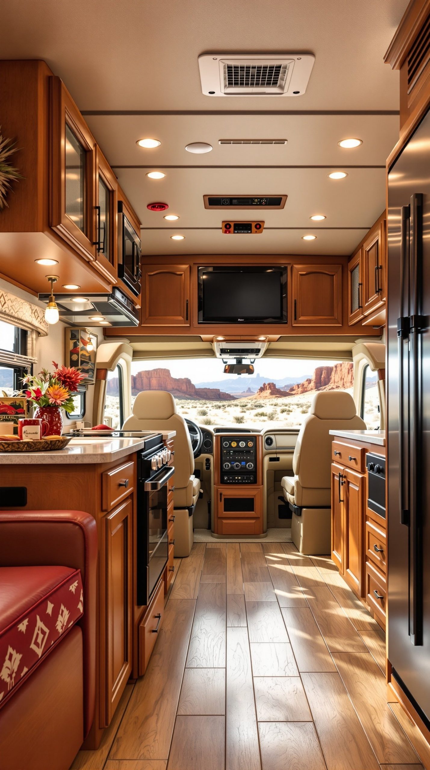
Channel the spirit of the American Southwest with a warm Western-inspired palette of burnt red accents and tan leather. This color scheme brings the rugged beauty and rich cultural heritage of western regions into your RV. Burnt red accents—whether in textiles, painted furniture, or decorative elements—provide bold pops of color that capture the essence of desert landscapes and southwestern sunsets. Tan leather upholstery or leather accents add authentic western character while providing durable, easy-to-clean surfaces perfect for RV living. Rustic wood cabinets in medium to dark tones complete the foundation.
Southwestern patterns in textiles—geometric designs, Native American-inspired prints, and desert motifs—add visual interest and cultural richness. Cowboy-inspired decor elements like horseshoes, rope details, vintage western signs, or Navajo-style rugs complete the authentic western atmosphere. This color scheme creates a warm, desert-inspired environment that feels particularly appropriate if you’re traveling through western states, desert regions, or southwestern landscapes. The red and tan combination is both energizing and comfortable, creating a space that feels adventurous yet homey. Natural materials like rawhide, turquoise stones, and weathered wood add to the authentic western aesthetic.
PRO TIP: Western style can quickly veer into theme park territory if overdone. Keep it sophisticated by using burnt red sparingly—as accent pillows, a throw blanket, or decorative accessories rather than painting entire walls red. Invest in one or two authentic pieces like a genuine Navajo rug or quality leather furniture rather than filling your space with mass-produced “western” decor. Balance the rustic elements with some modern touches like sleek light fixtures or contemporary art to keep the look from feeling dated. Consider a subtle western influence in patterns and textures rather than obvious cowboy motifs—geometric southwest patterns in textiles are more sophisticated than horseshoe prints. Add some greenery like cacti or succulents to reinforce the desert theme while bringing life into your space.
15. Retro Mint Green Vintage
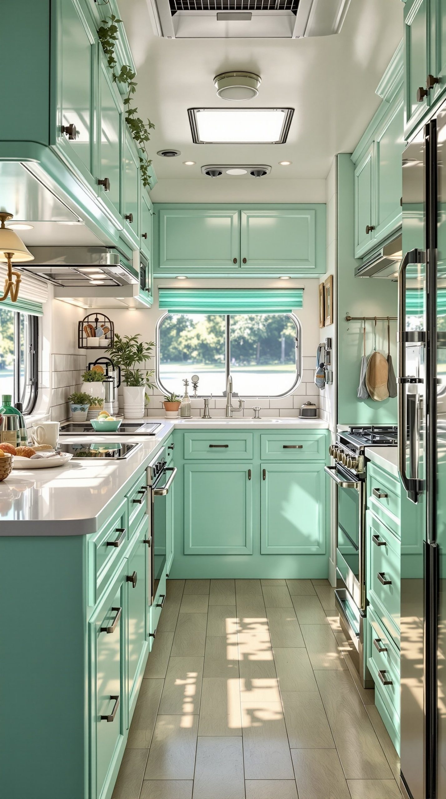
Step back in time with a cheerful retro-inspired design featuring pastel mint green cabinets and classic 1950s diner style. This playful, nostalgic color scheme brings the fun and optimism of mid-century design to your RV. Mint green cabinets provide a distinctive vintage look that’s enjoying a major resurgence in popularity, while white countertops keep the aesthetic clean and classic. Chrome accents—from drawer pulls to faucets to appliances—add authentic retro shine. Retro-style appliances in matching mint or classic white complete the nostalgic diner aesthetic.
This color scheme is perfect for vintage RV enthusiasts or anyone who loves the cheerful, optimistic aesthetic of the 1950s. The mint green is refreshing and cheerful without being overwhelming, creating a happy, upbeat atmosphere. White and chrome keep the color balanced and prevent it from feeling too sweet or childish. Consider adding a checkerboard floor pattern, vinyl booth seating, or vintage-style signage to enhance the retro diner vibe. The nostalgic atmosphere created by this color scheme makes your RV a unique, memorable space that stands out from typical modern designs. Period-appropriate decorative elements like old Coca-Cola signs, vintage radios, or retro canisters complete the look.
PRO TIP: Authentic vintage style requires attention to details. Source genuine vintage or reproduction hardware, light fixtures, and accessories to maintain period accuracy—modern pieces will look out of place. Balance the sweetness of mint green with some edgier elements like black accents or industrial-style lighting to keep it from feeling too precious. Consider other 1950s pastel colors like pale pink, butter yellow, or baby blue as secondary accents to create that authentic retro palette. Mint green can look different depending on undertones—some lean more blue (aqua), others more yellow (spring green). Choose one that complements your RV’s lighting and stick with it consistently throughout. Add vintage-style window treatments like café curtains in gingham or polka dots to complete the retro diner aesthetic.
16. Burgundy and Cream Classic
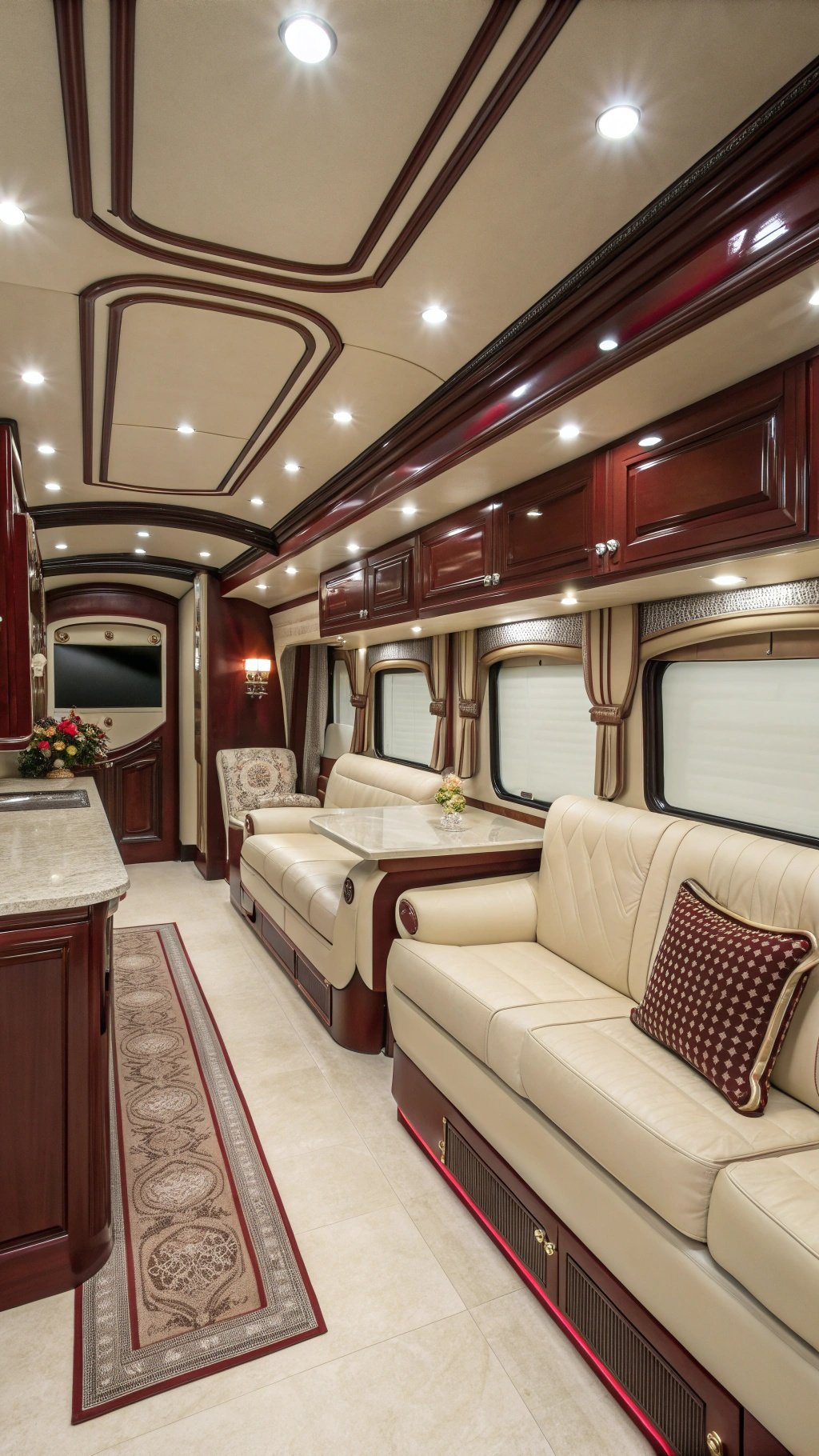
Create a sophisticated, traditional atmosphere with the elegant combination of deep burgundy accents and cream walls. This classic color scheme brings timeless refinement to your RV, creating a space that feels more like a well-appointed study or traditional library than a recreational vehicle. Deep burgundy accents—in upholstery, curtains, or accent walls—provide rich, luxurious color that adds depth and warmth. Cream walls keep the space feeling light and open while providing the perfect backdrop for the deeper burgundy tones. Mahogany wood cabinets in rich, dark tones complete the traditional, sophisticated aesthetic.
This color scheme works particularly well for RVers who appreciate classic, traditional design and want their mobile home to have a timeless, elegant quality. The burgundy and cream combination has been popular for centuries in traditional interiors because it creates a warm, welcoming, sophisticated atmosphere. Traditional elegant furniture with classic lines, brass or gold-toned hardware, and refined fabrics like velvet or damask complete the look. This palette is excellent at hiding wear and maintaining a polished appearance—burgundy upholstery shows far less dirt than lighter colors. The rich, warm tones create a cozy, intimate atmosphere perfect for cooler weather camping.
PRO TIP: Burgundy can make a small space feel smaller if overused. Apply the 60-30-10 rule: 60% cream (walls, larger surfaces), 30% wood tones (cabinets, furniture), and 10% burgundy (accent upholstery, pillows, curtains). This maintains the sophisticated color story without overwhelming the limited space. Choose burgundy with brown undertones rather than purple undertones to keep the look classic rather than dated. Balance the traditional color palette with adequate lighting—traditional colors absorb more light than pastels, so install plenty of warm-toned light sources. Add metallic accents in brass, bronze, or gold to enhance the luxurious feeling. Consider burgundy and cream in patterns like paisley, damask, or toile for visual interest while maintaining the classic aesthetic.
17. Aqua Blue and Sandy Beige Beach House
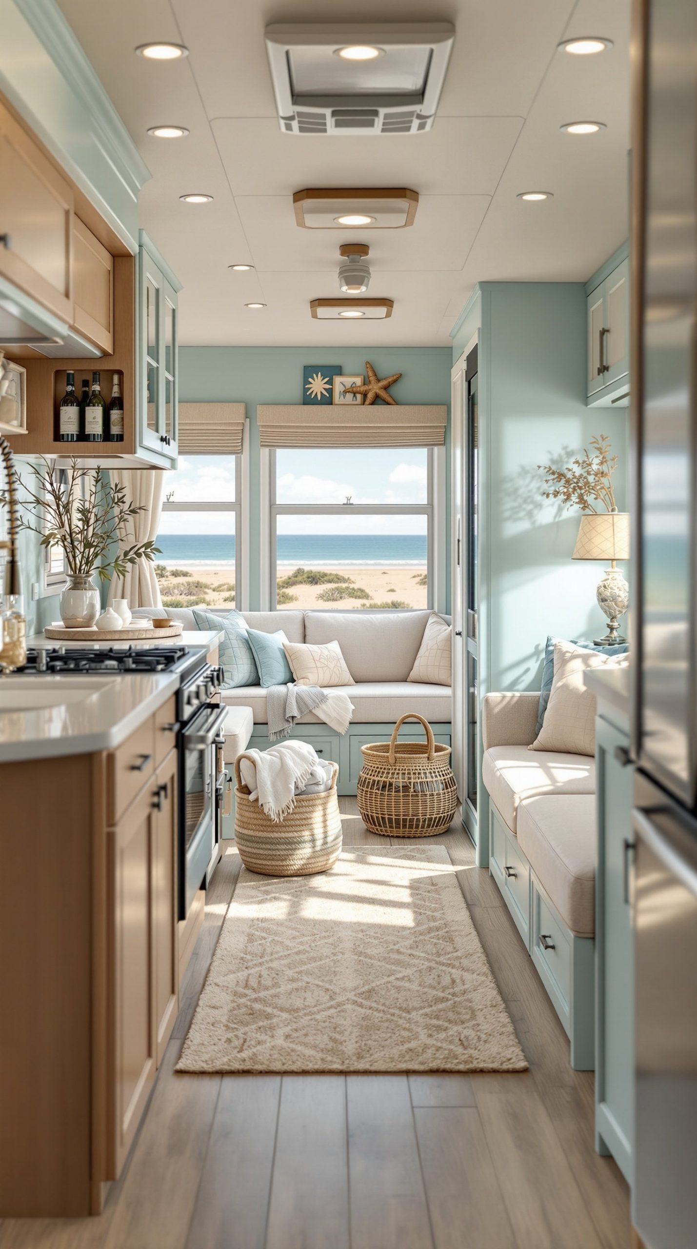
Transform your RV into a breezy beach cottage with the perfect pairing of light aqua blue walls and sandy beige upholstery. This beach house theme captures the relaxed, casual elegance of coastal living. Light aqua walls evoke the color of shallow tropical waters, creating a refreshing, serene atmosphere that makes you feel like you’re always on vacation. Sandy beige upholstery in natural fabrics like linen or cotton provides neutral grounding that prevents the aqua from feeling too bold, while also calling to mind beach sand and natural coastal elements.
Driftwood accents, whether as decorative pieces, shelving, or furniture details, add authentic beach house character and bring the organic beauty of the coast indoors. Coastal decor like starfish, coral (faux, please!), glass bottles, and rope details complete the beach cottage aesthetic. This color scheme is particularly effective for creating a light, airy atmosphere—both colors reflect light beautifully and make spaces feel larger. The relaxed, casual vibe makes your RV feel like a permanent vacation home. Whitewashed wood, natural fiber rugs, and gauzy curtains complete the breezy beach cottage style.
PRO TIP: Beach house style should feel collected and casual rather than overly coordinated. Mix different shades of aqua and blue—from pale sky blue to deeper turquoise—for a layered, authentic coastal look. Incorporate plenty of white to keep everything feeling fresh and bright; a white ceiling is particularly important for maintaining the airy, open feeling. Texture is crucial in beach house style—combine smooth surfaces with rough, natural elements like jute, sisal, driftwood, and linen. Avoid overly matched sets; instead, create an eclectic, collected-over-time feeling with varied but complementary pieces. Add vintage or weathered elements that look like they might have been found at a beach flea market to enhance the authentic coastal cottage vibe.
18. Slate Blue and Copper Industrial Farmhouse
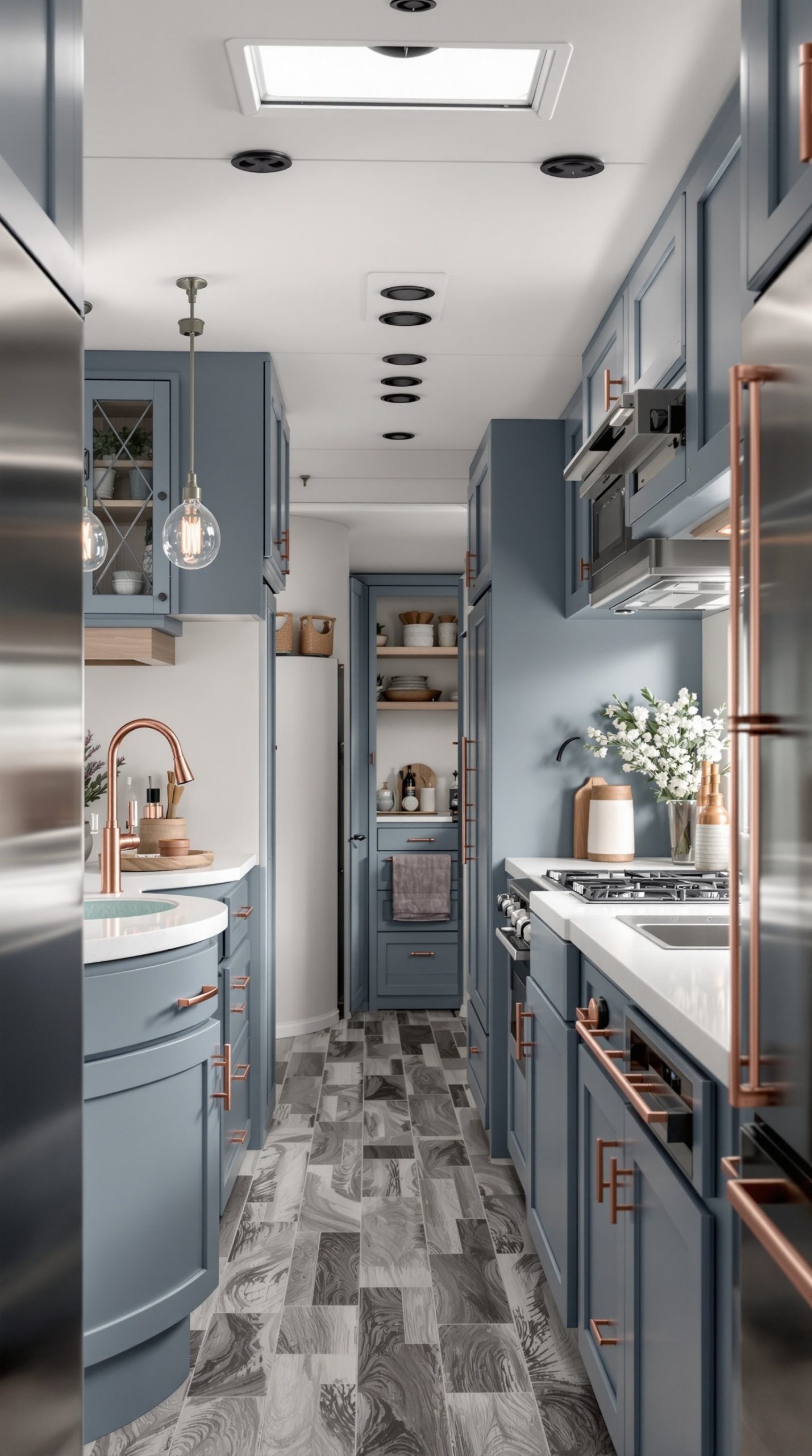
Bridge the gap between rustic and modern with this sophisticated blend of slate blue and copper accents. This modern industrial farmhouse color scheme combines the best of several popular design trends into one cohesive, unique look. Muted slate blue cabinets provide cool, sophisticated color that’s more interesting than gray but just as versatile. Copper hardware and fixtures add warmth and a touch of industrial elegance—the warm metallic tones create beautiful contrast against the cool blue. The combination feels both contemporary and timeless, with just enough edge to be interesting.
This color scheme works exceptionally well in RVs because it combines the practicality of darker colors (which hide wear) with the sophistication of a carefully curated palette. The industrial farmhouse blend means you can incorporate both rustic elements like wood and weathered finishes alongside modern touches like metal hardware and clean lines. Copper is having a major moment in interior design, and using it consistently throughout your RV creates a cohesive, upscale look. The slate blue provides a contemporary alternative to the overused gray while maintaining that cool, neutral quality. Warm metallic touches throughout—in light fixtures, cabinet hardware, faucets, and decorative accessories—unify the space.
PRO TIP: Copper can be used in different finishes for varied effects. Brushed or satin copper provides subtle warmth and sophistication, while shiny polished copper makes more of a statement. For consistency, choose one copper finish and use it throughout your RV. Balance the cool slate blue with warm elements—copper, natural wood, warm lighting—to prevent the space from feeling too cold. Consider leaving some copper pieces unlacquered so they develop a natural patina over time, adding authentic character. Slate blue can vary from purple-toned to green-toned grays; choose one with slight green undertones to complement copper’s warm orange tones. Add some open shelving with copper brackets or copper pipe accents to reinforce the industrial farmhouse aesthetic.
19. Olive Green and Mustard Yellow Retro
Embrace the warm, earthy palette of the 1970s with this nostalgic combination of olive green and mustard yellow. This vintage color scheme brings the cozy, comfortable vibe of mid-century modern and 1970s design into your RV. Retro olive cabinets provide a distinctive, period-appropriate base color that’s enjoying renewed popularity among design enthusiasts. Mustard yellow accents in textiles, decorative accessories, or painted furniture add vibrant warmth and cheerful energy. The combination creates a warm, inviting, nostalgic atmosphere that feels both retro-cool and surprisingly contemporary.
This color scheme works particularly well for vintage RV enthusiasts or those who appreciate the quirky charm of 1970s design. Both colors are warm and earthy, creating a cohesive, harmonious palette that’s comfortable and enveloping. The combination pairs beautifully with natural wood tones, brass fixtures, and organic textures. Macramé wall hangings, houseplants in ceramic pots, and geometric patterns complete the authentic 1970s vibe. The warm, earthy tones create a cozy, cocoon-like atmosphere perfect for relaxing after a day of adventure. This distinctive color palette ensures your RV stands out from the sea of gray-and-white modern interiors.
PRO TIP: The 1970s palette can look dated if not executed thoughtfully. Keep it sophisticated by using muted, complex tones rather than bright, primary versions—think dusty olive and golden mustard rather than bright army green and school bus yellow. Balance the vintage colors with modern elements like sleek lighting, contemporary art, or minimalist furniture to create an eclectic, intentional look rather than a time capsule. Add some black or charcoal accents to ground the warm colors and provide definition. Incorporate natural elements like plants, wooden bowls, and woven textiles to reinforce the organic, earthy vibe. Choose one color to dominate (typically olive) and use the other as a vibrant accent to prevent color overload in the small space.
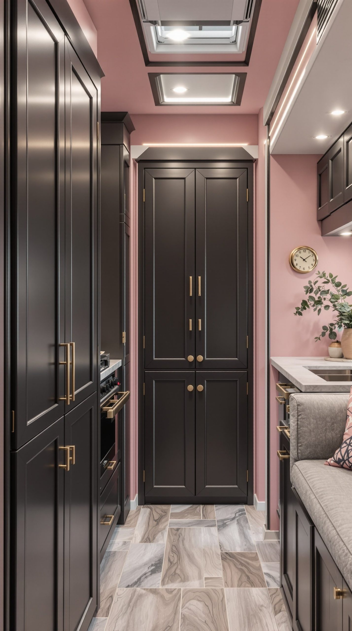
20. Blush Pink and Gray Contemporary
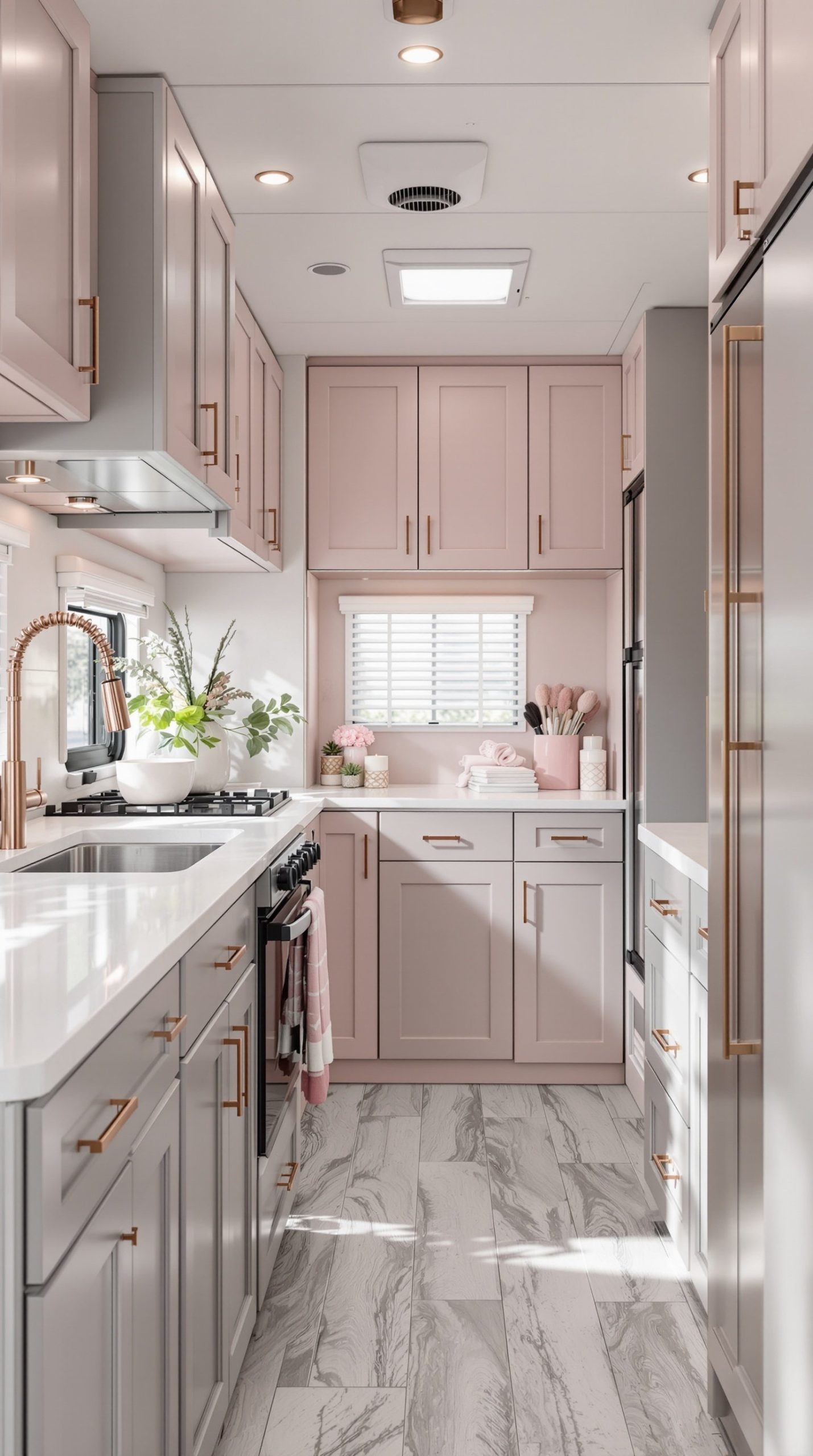
Create a modern, feminine, and sophisticated space with the elegant pairing of blush pink and gray. This contemporary color scheme combines cool neutrals with warm, soft pink tones for a balanced, polished look. Soft blush pink accents in pillows, artwork, or decorative accessories provide gentle color and warmth without being overwhelming. Gray cabinets—in a medium to charcoal tone—provide a sophisticated neutral base that makes the pink feel modern and elegant rather than overly sweet. White countertops brighten the space and provide clean contrast. Rose gold hardware adds the perfect metallic touch that bridges the pink and gray beautifully.
This color scheme has become incredibly popular in contemporary interior design because it successfully combines feminine softness with modern sophistication. The gray provides substantial, neutral grounding while the blush adds warmth and personality. Rose gold fixtures and hardware have emerged as the perfect metallic to complement this palette, adding warmth without the yellow tones of traditional gold. This combination works beautifully in RVs because it’s both calming and stylish, creating a space that feels thoughtfully designed. The palette photographs beautifully and maintains a current, on-trend appearance while being timeless enough not to look dated quickly.
PRO TIP: The success of blush and gray depends on getting the right shades. Choose a gray with warm undertones rather than cool blue-grays, which can clash with the warm blush pink. The blush should be a soft, dusty pink with gray undertones rather than a bright or coral pink. Test samples together extensively before committing. Use the 70-20-10 rule: 70% gray (cabinets, larger furniture), 20% white/cream (walls, countertops), and 10% blush (accents, textiles). This prevents the pink from overwhelming while maintaining the feminine, sophisticated vibe. Add varied textures in your pink elements—velvet pillows, soft throws, matte artwork—to create depth and interest. Incorporate some marble patterns or white and gray geometric designs to enhance the contemporary feeling.
21. Chocolate Brown and Teal
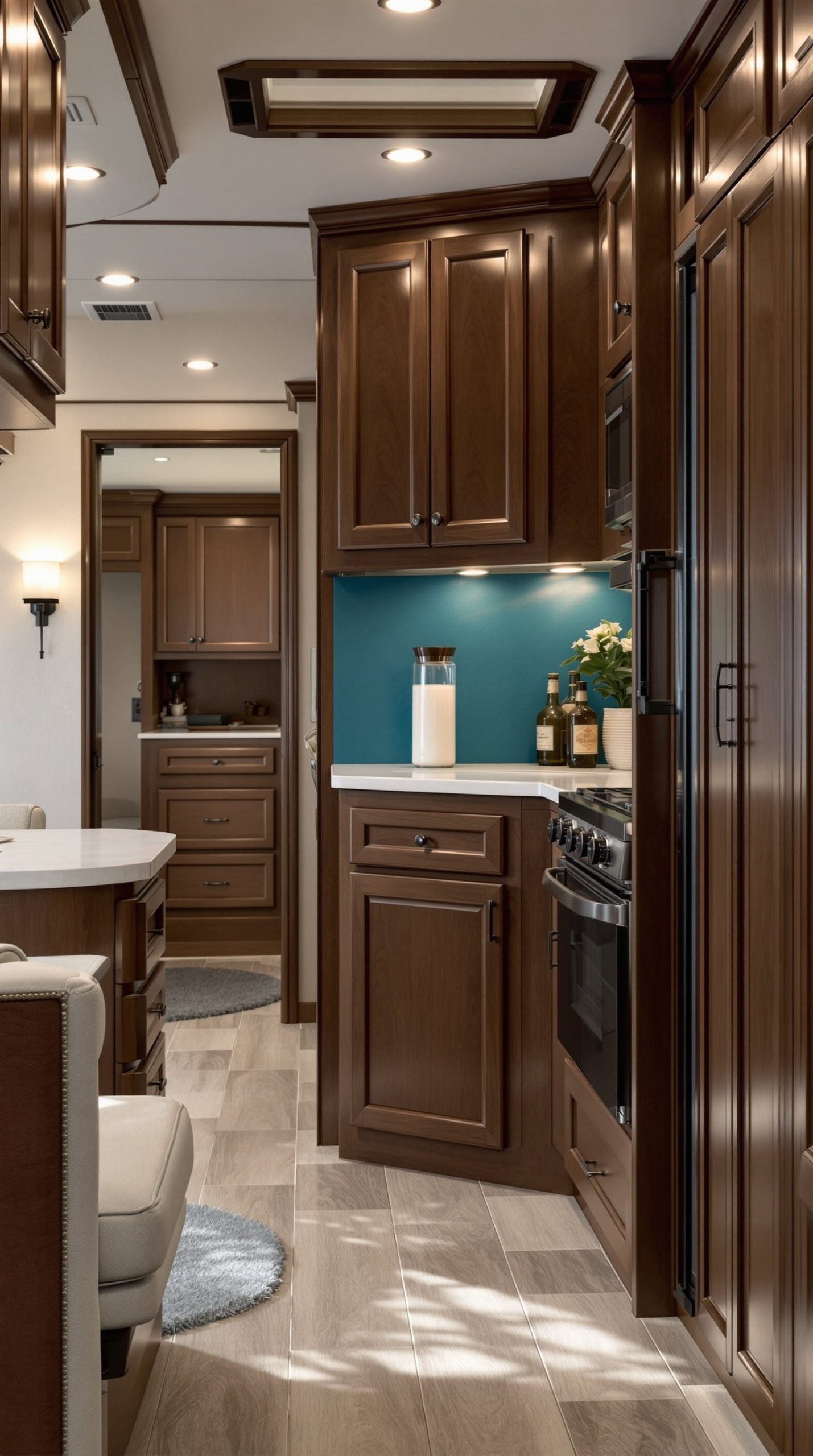
Create a rich, inviting space with the sophisticated pairing of chocolate brown and teal. This color scheme perfectly balances warm and cool tones for a harmonious, comfortable atmosphere. Rich chocolate brown wood cabinets provide a warm, substantial foundation that feels solid and well-crafted. A teal accent wall adds a dramatic pop of cool color that energizes the space and creates a focal point. Cream upholstery bridges the warm brown and cool teal, providing neutral grounding that keeps the bold colors balanced. The combination feels both comforting and invigorating.
This color pairing works exceptionally well in RVs because it creates visual interest without feeling chaotic—the warm and cool tones balance each other naturally. Teal is a remarkably versatile color that reads as sophisticated and contemporary, while chocolate brown provides timeless warmth. The combination is reminiscent of natural settings—think tropical waters meeting rich earth—creating a connection to nature. This palette also has practical advantages: darker brown surfaces hide wear and dirt effectively, while the teal provides enough color interest to keep things from feeling too neutral. The cream provides essential lightness and prevents the darker colors from making the space feel too enclosed.
PRO TIP: Teal can vary significantly from blue-dominant to green-dominant versions. For the best harmony with chocolate brown, choose a teal that leans slightly more blue than green, which creates better contrast with the warm brown tones. Use teal as an accent—on one wall, in textiles, or in decorative accessories—rather than throughout the entire space to maintain balance. Add metallic accents in oil-rubbed bronze or brushed gold, which complement both the warm brown and cool teal beautifully. Incorporate natural textures like jute, linen, and weathered wood to soften the bold color combination and add organic interest. Layer in different shades of both colors—from rich espresso to lighter tan browns, and from deep teal to soft aqua—to create depth and sophistication.
22. Peacock Blue and Emerald Green Jewel Tones
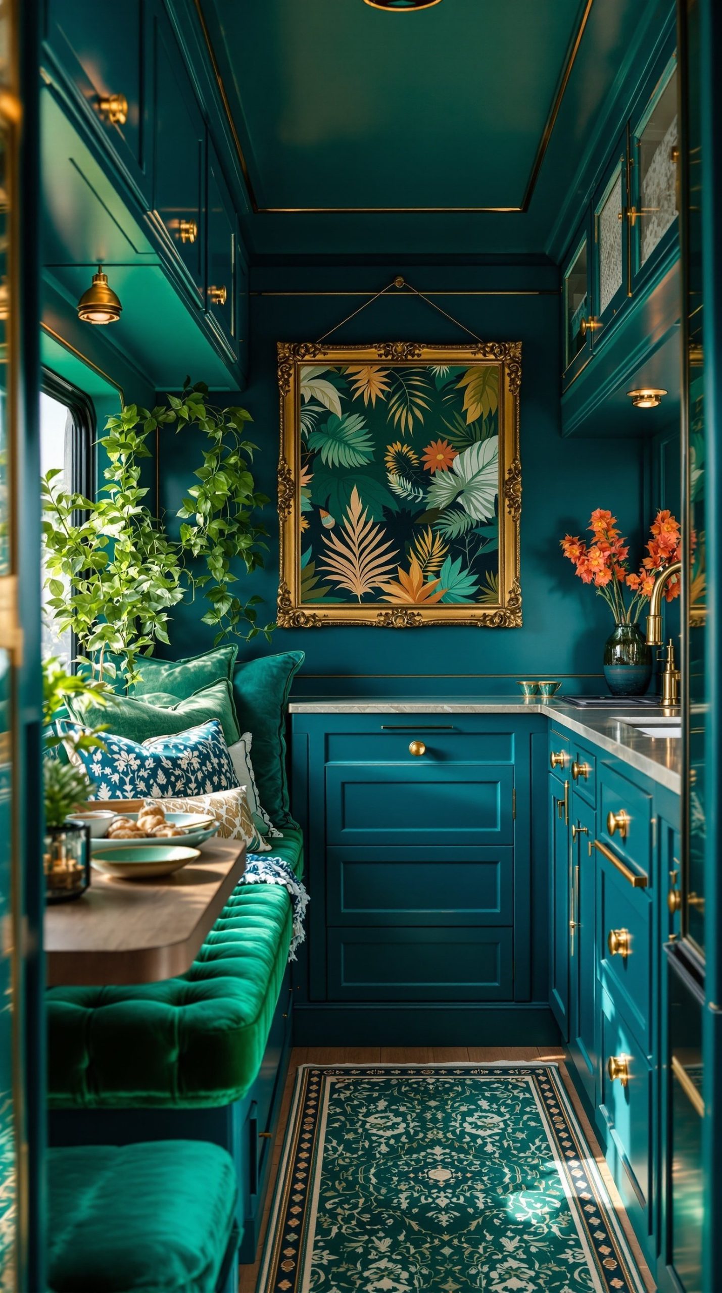
Make a bold, luxurious statement with the dramatic combination of peacock blue and emerald green jewel tones. This vibrant color scheme brings opulent, bohemian elegance to your RV, creating a space that feels rich, layered, and globally inspired. Rich peacock blue walls provide a bold, saturated backdrop that immediately catches the eye and creates dramatic impact. Emerald green cushions, upholstery, or accent pieces add complementary jewel tone color. Gold accents in hardware, picture frames, and decorative accessories add warmth and luxury, creating a cohesive jewel box effect. This luxurious bohemian style combines bold color with rich textures.
This color scheme is perfect for adventurous RVers who love bold, expressive design and aren’t afraid of saturated color. The jewel tones create a vibrant, energetic atmosphere that feels exotic and worldly—perfect for a home on wheels exploring diverse landscapes. Both peacock and emerald are cool tones, so they harmonize naturally despite being bold. The addition of gold warmth balances the cool colors and adds luxury. This palette pairs beautifully with patterned textiles—think Moroccan-inspired prints, Indian block prints, or Persian rug patterns. The dramatic colors create an intimate, cocooning atmosphere that makes your RV feel like a treasured retreat.
PRO TIP: Bold jewel tones require confidence and balance. Use the rich colors on 30-40% of surfaces maximum, with neutral cream, white, or taupe making up the rest. This prevents overwhelming the small space while maintaining the dramatic impact. Layer multiple jewel tones in varying saturations—from deep navy to bright teal, from forest to lime green—for a sophisticated, collected look. Adequate lighting is crucial; jewel tones absorb light, so install plenty of warm-toned light sources including accent lighting to make the colors glow. Mix patterns fearlessly in jewel tones—geometric, floral, paisley—as long as they share the same color family and level of saturation. Add natural elements like plants, wood, and natural fiber textiles to ground the vibrant colors and prevent the space from feeling too intense.
23. Warm Taupe and White Minimalist
Achieve serene sophistication with the calming combination of warm taupe and white in a minimalist scheme. This understated color palette creates a peaceful, zen-like atmosphere perfect for RVers seeking a restful retreat from busy travels. Taupe gray cabinets provide subtle, sophisticated color that’s warmer and more inviting than pure gray but just as versatile and timeless. White walls maximize light reflection and create an open, airy feeling crucial in smaller spaces. Natural textures in beige, tan, and taupe—linen textiles, jute rugs, raw wood accents—add depth and interest without introducing new colors.
This minimalist scheme embodies the “less is more” philosophy, creating calm through simplicity. The neutral palette serves as a peaceful backdrop that allows a few carefully chosen pieces to shine. Simple, clean lines throughout the furniture and built-ins enhance the minimalist aesthetic. This color scheme is remarkably practical for RV living—neutral tones hide dirt well, touch-ups are easy to match, and the timeless palette ensures your space won’t look dated. The serene, uncluttered atmosphere promotes relaxation and mental clarity, making your RV a true sanctuary. This palette also provides the perfect backdrop for bringing the outside in—whatever landscape you’re parked in becomes your primary “decor.”
PRO TIP: Minimalism doesn’t mean boring or cold. The key is layering textures and subtle variations in your neutral tones. Combine smooth white walls with nubby linen cushions, rough jute rugs, smooth leather accents, and raw wood surfaces. Use at least three different whites and taupes in various finishes to create depth—matte, glossy, and textured surfaces all in the same color family. Minimalism in an RV requires exceptional organization and storage solutions; invest in hidden storage, matching containers, and clever built-ins to maintain the clutter-free aesthetic. Add a few natural elements—a single striking branch in a vase, smooth river rocks, or a sculptural driftwood piece—as art to bring organic beauty without clutter. Keep surfaces clear and only display items that are both beautiful and functional.
24. Cherry Red and Black Bold Modern
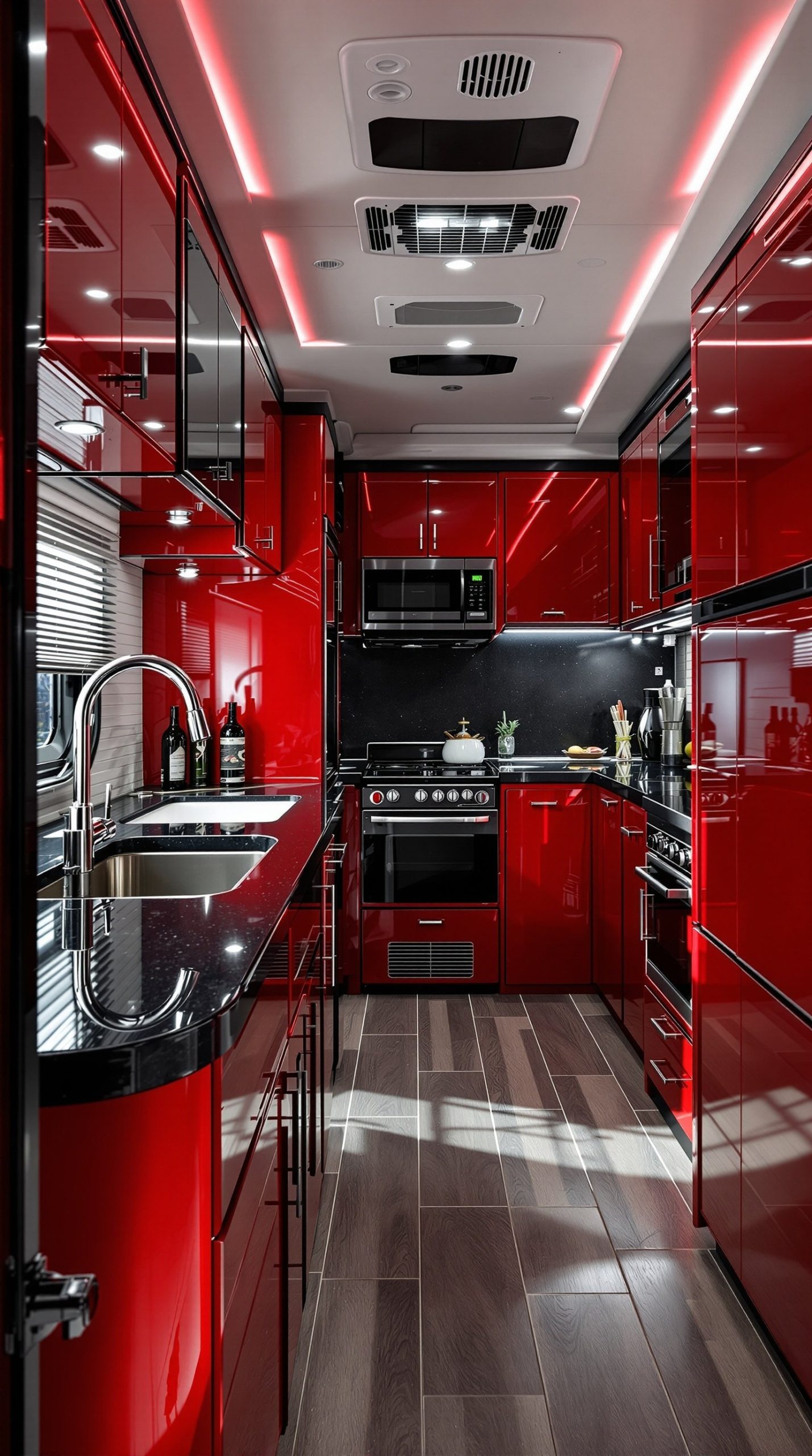
Make an unforgettable statement with the dramatic, high-energy combination of glossy cherry red and black. This bold modern color scheme brings contemporary edge and vibrant personality to your RV. Glossy red cabinets create stunning visual impact—the shiny finish reflects light and makes the bold color even more dynamic. Black countertops provide sharp contrast and ground the bright red, preventing it from feeling overwhelming. Chrome fixtures add metallic shine that complements both the red and black beautifully. This dramatic contemporary design creates a space that’s energetic, modern, and utterly unique.
This color scheme is perfect for bold, design-forward RVers who want their mobile space to make a strong visual statement. The high-contrast combination creates clear definition between surfaces, making the space feel organized and intentional despite the bold colors. Red is psychologically associated with energy, passion, and excitement—perfect for a vehicle dedicated to adventure. The glossy finish on cabinets is practical too, as it’s easy to wipe clean. This palette pairs beautifully with modern technology—stainless steel appliances, contemporary electronics, and modern fixtures feel right at home. The vibrant, energetic atmosphere ensures your RV is anything but boring.
PRO TIP: Bold colors like cherry red require careful balancing. Use red on 20-30% of surfaces—typically lower cabinets or one accent wall—and keep the rest neutral in black, white, or gray. The glossy finish is crucial; matte red can look flat and dated, while glossy red feels modern and dynamic. Ensure excellent lighting, as both red and black absorb light—install plenty of bright LED sources including under-cabinet lighting. Balance the intense colors with some neutral breathing room; a white or light gray wall or ceiling prevents the space from feeling too enclosed. Chrome and stainless steel fixtures are essential; brass or gold would clash with this modern palette. Add geometric patterns in your textiles—black and white with red accents—to reinforce the contemporary, graphic aesthetic.
25. Dusty Rose and Charcoal Sophisticated
Achieve refined elegance with the beautifully balanced pairing of dusty rose and charcoal. This sophisticated color scheme brings contemporary romance to your RV, combining warm pink tones with cool, substantial gray for a look that’s both soft and strong. Muted dusty rose walls provide gentle color that’s interesting without being overwhelming—this complex, grayed-down pink feels sophisticated and mature. Dark charcoal cabinets provide dramatic contrast and visual weight, grounding the softer pink tones. Brass fixtures add warm metallic elegance that bridges the warm rose and cool charcoal beautifully. This modern elegant blend feels both contemporary and romantic.
This color combination has emerged as a favorite in contemporary interior design because it successfully balances multiple qualities—it’s feminine yet sophisticated, bold yet subtle, modern yet timeless. The dusty rose brings warmth and softness without reading as overly sweet or traditional pink. The charcoal provides substantial presence and makes the rose feel more sophisticated and intentional. Brass fixtures have become the perfect metallic for this palette, providing warmth without the yellow intensity of gold. The romantic contemporary atmosphere created by this combination makes your RV feel like a chic urban apartment. This palette photographs beautifully and works well with both modern and vintage accent pieces.
PRO TIP: The sophistication of this scheme depends on choosing the right shades. The rose must be truly dusty—grayed down with taupe undertones, not bright or coral pink. The charcoal should be a true dark gray rather than blue-gray or brown-gray. Test both colors together extensively before committing, as they need to balance each other perfectly. Use charcoal on substantial elements—lower cabinets, one accent wall, or a statement piece of furniture—and keep upper walls and ceilings in the dusty rose or a soft cream. Add texture through velvet cushions in dusty rose, a plush rug, or matte vs. glossy finishes to create depth. Brass elements should be consistent throughout—choose brushed or satin brass rather than shiny polished brass for a more refined look. Balance the romantic colors with some modern elements like geometric patterns or contemporary art to keep the look current.

