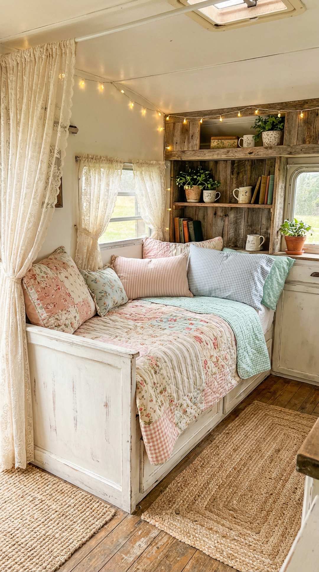
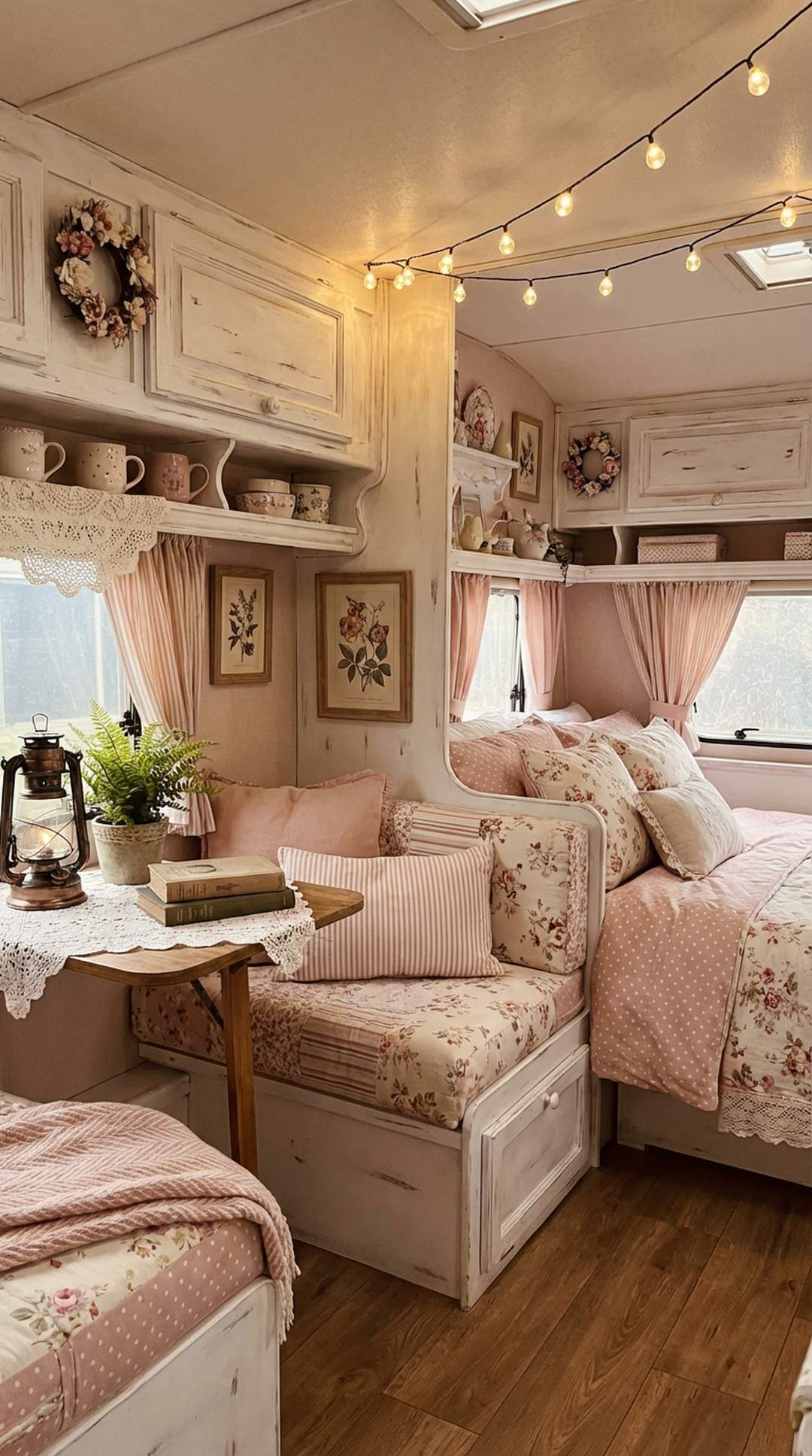
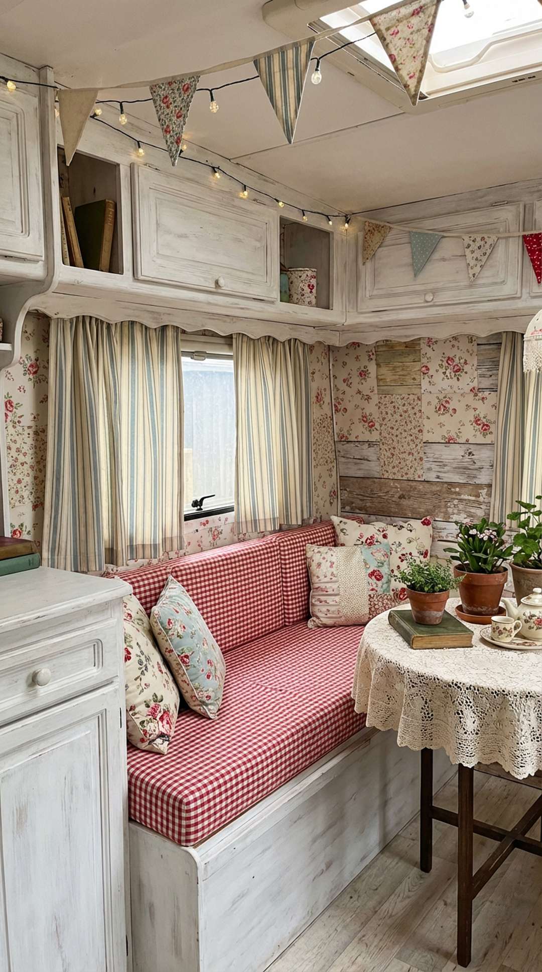
Mixing patterns in a small shabby chic camper is an art that transforms your cozy mobile retreat into a charming, personalized sanctuary. The key to successfully combining different prints and textures lies in understanding balance, scale, and color harmony. Whether you’re drawn to delicate florals, classic stripes, or vintage-inspired toile, learning to layer patterns confidently will elevate your camper’s interior from simple to spectacular.
Small spaces actually benefit from thoughtful pattern mixing, as it adds visual interest and depth that prevents the area from feeling cramped or monotonous. With these 20 expert tips, you’ll discover how to blend various patterns seamlessly while maintaining that quintessential shabby chic aesthetic that makes your camper feel like a charming cottage on wheels.
1. Start with a Neutral Base
Would you like to save this article?
Beginning your pattern mixing journey with a neutral foundation is essential for creating a cohesive shabby chic look in your small camper. Choose whites, creams, soft grays, or beige as your base colors for walls, larger furniture pieces, and foundational textiles. This neutral backdrop provides a calming canvas that allows your patterned elements to shine without overwhelming your compact space. When you establish this serene foundation, you create breathing room for the eye and make it easier to introduce multiple patterns without the space feeling chaotic or cluttered.
The beauty of a neutral base in a shabby chic camper is its versatility and timelessness. White-painted or distressed wood walls are particularly effective, as they reflect light and make your small space feel larger and more open. Layer your neutral base with various textures like weathered wood, vintage white-painted furniture, and soft linen fabrics. This textural foundation creates depth while maintaining a peaceful aesthetic that won’t compete with your carefully chosen patterned accents. Your neutral elements should comprise about 60-70% of your overall design scheme.
PRO TIP: Paint your camper’s built-in cabinets and trim in a soft white or cream color with a distressed finish to create an authentic shabby chic foundation. This technique instantly brightens your space and provides the perfect backdrop for introducing floral, striped, and checked patterns throughout your mobile home.
2. Follow the 60-30-10 Color Rule
The classic 60-30-10 interior design rule is your secret weapon for successful pattern mixing in a small camper. This principle suggests using your dominant color or pattern for 60% of the space, a secondary color or pattern for 30%, and an accent for the remaining 10%. In your shabby chic camper, this might translate to 60% neutral solids or subtle patterns, 30% medium-scale patterns like florals or stripes, and 10% bold pattern accents. This distribution creates visual hierarchy and prevents any single pattern from overwhelming your compact quarters.
Applying this rule helps you make confident decisions about where to place your patterns. Your 60% might be your neutral painted walls and solid-colored upholstery, your 30% could be floral curtains and a striped bedspread, while your 10% might be boldly patterned throw pillows or a vintage toile tea towel displayed as decor. This balanced approach ensures your space feels curated rather than cluttered. The rule works beautifully in small spaces because it creates a clear focal point while allowing for personality and visual interest throughout.
PRO TIP: Create a mood board before implementing the 60-30-10 rule in your camper. Gather fabric swatches, paint chips, and photos of patterns you love, then arrange them in these proportions to visualize how they’ll work together before making any purchases or commitments.
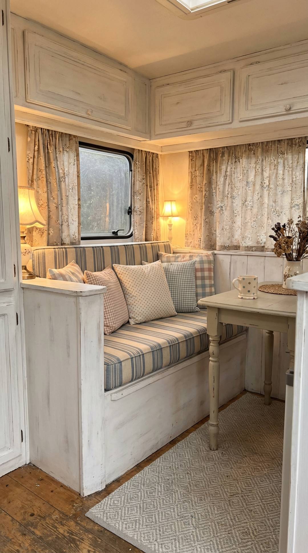
3. Vary Your Pattern Scales

Mixing patterns of different scales is crucial for creating visual interest without overwhelming your small camper space. Combine large-scale patterns (like oversized cabbage roses or wide stripes) with medium-scale designs (such as moderate florals or classic gingham) and small-scale prints (tiny ditsy flowers or pinstripes). This variation creates depth and allows the eye to travel comfortably throughout your space rather than getting stuck on competing patterns of the same size. In a shabby chic aesthetic, this might mean pairing large romantic rose wallpaper with medium polka dot curtains and small checked pillows.
The key to successfully varying pattern scales is ensuring they don’t fight for attention. Your largest patterns should typically be used most sparingly, perhaps on a feature wall or a single statement piece like bedding. Medium-scale patterns can be more prevalent, appearing on curtains, cushions, or upholstery. Small-scale patterns work beautifully as fillers and accents, tying the larger elements together. This hierarchy creates a harmonious flow that feels intentional and professionally designed, even in your cozy mobile home.
PRO TIP: Take photos of your pattern combinations in your camper’s actual lighting conditions before fully committing. What looks balanced in a store might read differently in your space, and photographs help you see the scale relationships more objectively than viewing them in person.
4. Choose an Anchor Pattern
Selecting one anchor pattern as your starting point provides a roadmap for all your subsequent pattern choices. This dominant pattern should be something you absolutely love, as it will influence every other design decision in your camper. Classic shabby chic anchor patterns include toile de Jouy, large floral prints, or traditional ticking stripes. Your anchor pattern might appear on your largest textile piece, such as bedding, curtains, or upholstered seating. All other patterns you introduce should complement and enhance this primary design rather than compete with it.
Once you’ve chosen your anchor pattern, pull colors from it to inform your other pattern selections. If your anchor is a rose-printed fabric with soft pink, sage green, and cream, look for complementary patterns featuring these same colors. This creates a cohesive color story that ties your entire space together. Your anchor pattern doesn’t need to be the boldest or largest, but it should be the most prominent and the one that best represents your overall aesthetic vision for your shabby chic camper interior.
PRO TIP: Bring a swatch or photo of your anchor pattern with you whenever shopping for additional fabrics and decor. This ensures every new pattern you consider coordinates perfectly with your foundational piece, preventing costly mistakes and creating a more cohesive final result.
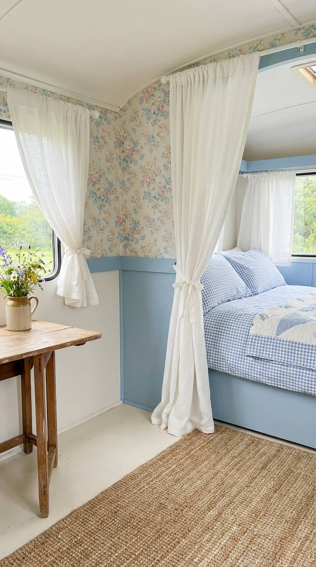
5. Stick to a Cohesive Color Palette
Maintaining a consistent color palette is perhaps the single most important factor in successfully mixing patterns in your small camper. Even when patterns are wildly different in style and scale, they’ll work together harmoniously if they share common colors. For shabby chic spaces, this typically means soft, romantic hues like blush pink, dusty rose, sage green, powder blue, lavender, and plenty of cream and white. Limit your palette to three to five colors maximum to avoid visual chaos in your compact quarters.
Your cohesive color palette acts as the thread that ties disparate patterns together into a unified whole. When every pattern in your space contains at least one or two colors from your chosen palette, the eye reads the space as intentional and harmonious rather than random and cluttered. This doesn’t mean every item must contain every color, but there should be a clear color relationship between all patterned elements. In practice, you might have floral pillows in pink and cream, striped curtains in cream and sage, and gingham accents in pink and white—all connected through your core palette.
PRO TIP: Create a color palette inspiration board using paint chips in your chosen hues, then photograph it and keep it on your phone. This mobile reference makes it easy to check whether potential new patterns fit your palette when you’re shopping at thrift stores, fabric shops, or online.
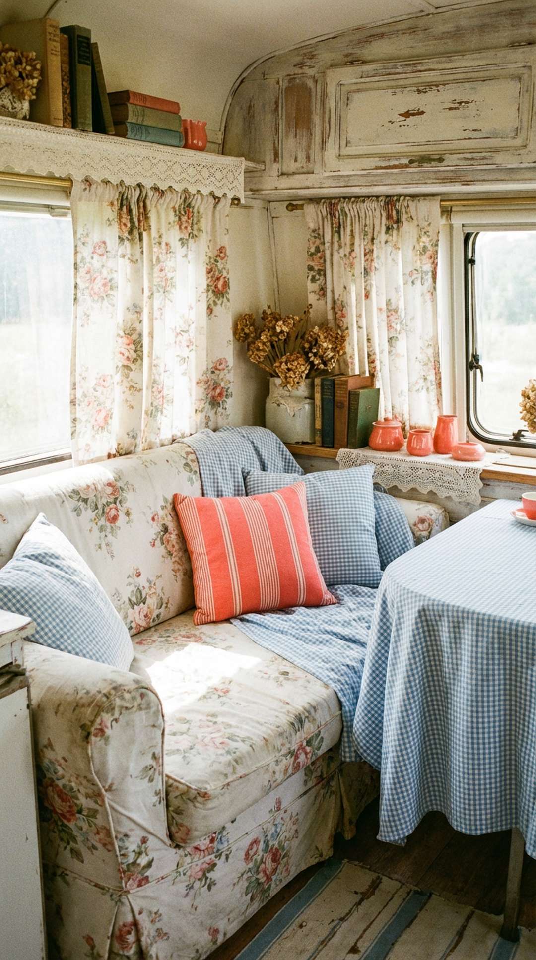
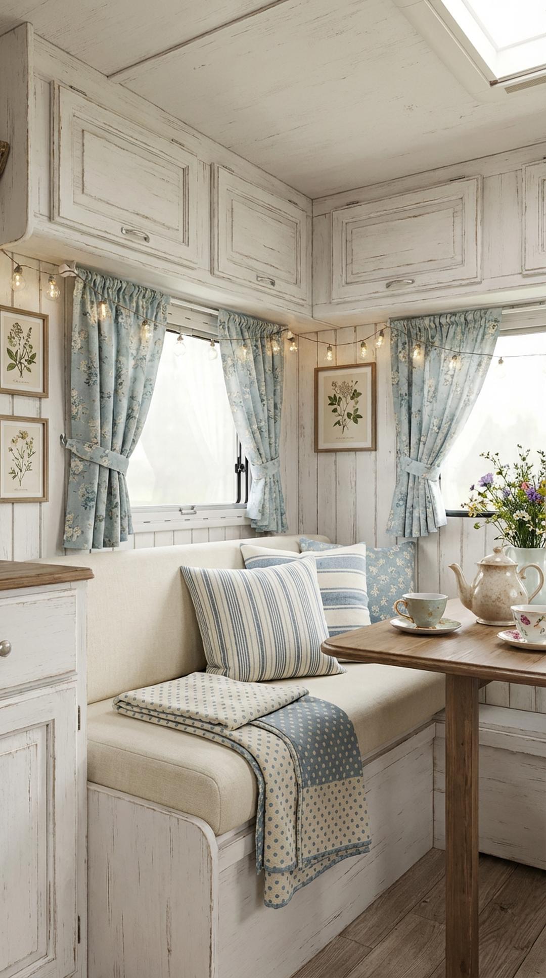
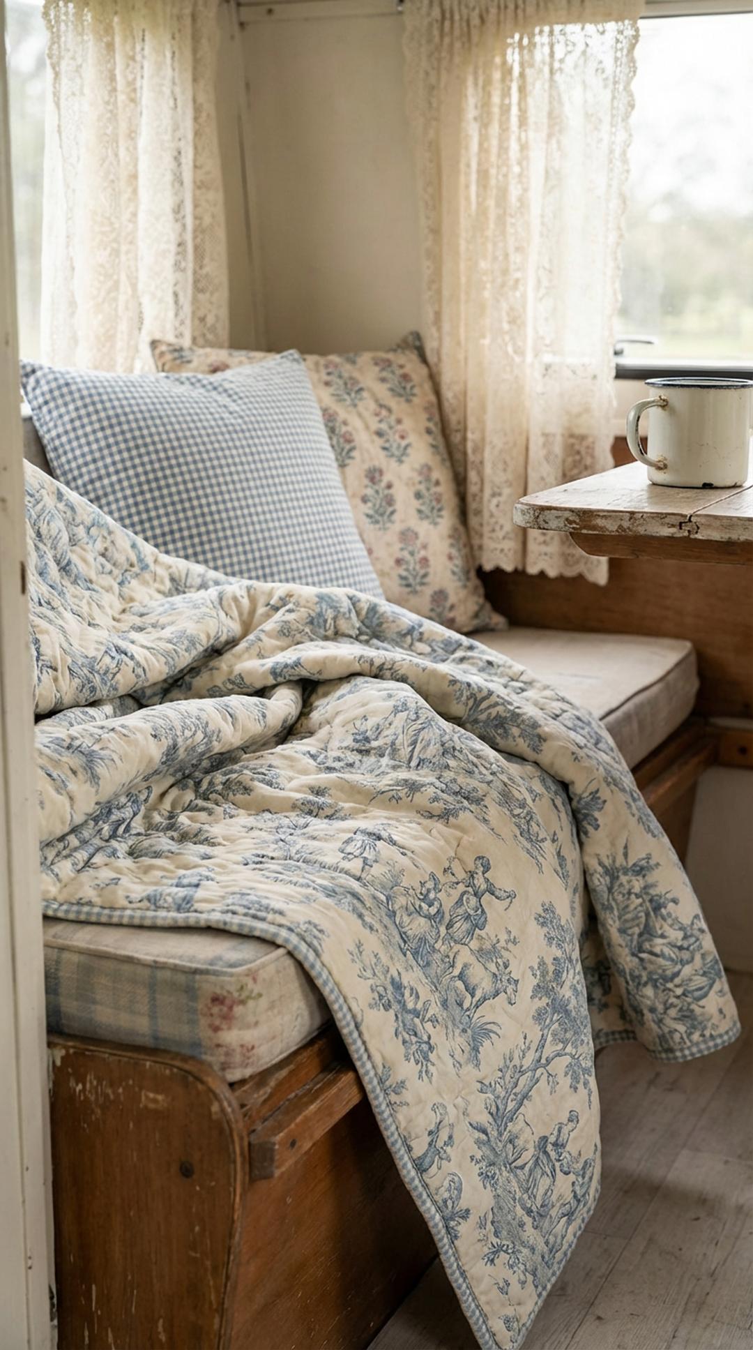
6. Pair Stripes with Florals
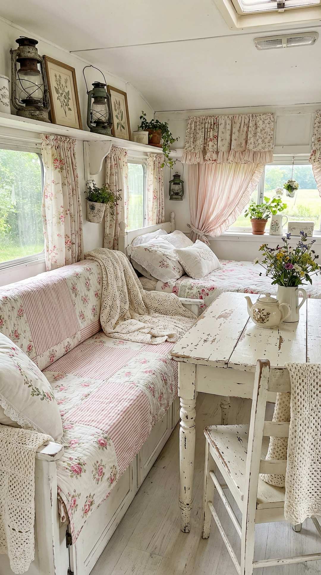
The pairing of stripes and florals is a time-honored combination that epitomizes shabby chic style and works beautifully in small campers. Stripes provide structure, order, and visual direction, while florals add softness, romance, and organic appeal. Together, they create perfect balance—the structured nature of stripes keeps florals from feeling too busy or overwhelming, while the florals prevent stripes from appearing too rigid or masculine. Classic ticking stripes in soft colors paired with delicate rose prints create an instantly recognizable cottage aesthetic.
When combining stripes with florals, consider the scale and intensity of each pattern. Wide, bold stripes pair well with large, statement florals, while narrow pinstripes complement delicate ditsy flowers. For shabby chic campers, softer, vintage-inspired florals with faded colors work best with traditional mattress ticking stripes or subtle pencil stripes. You can use stripes for larger items like curtains or bedding, with floral accents in pillows, or reverse this approach depending on your preferences and which pattern you’ve chosen as your anchor.
PRO TIP: For an authentic shabby chic look, choose slightly faded or vintage-looking versions of both stripes and florals rather than crisp, bright new patterns. The worn, loved appearance is central to the aesthetic and makes your camper feel like a cherished, collected space with history and character.
7. Use Solid Colors to Give Eyes a Break
Incorporating solid-colored elements between your patterns is essential for preventing visual fatigue in your small camper space. These solid “breathing spaces” allow the eye to rest and reset, making your pattern mixing feel intentional rather than overwhelming. In shabby chic design, these solids are typically soft, muted colors from your established palette—think crisp white linens, cream throw blankets, soft gray pillows, or pale blue towels. These solid elements provide crucial balance and help each patterned piece stand out and be appreciated individually.
Strategic placement of solids is just as important as the solids themselves. If you have patterned curtains, consider solid-colored walls or wall treatments. If your bedding features multiple patterns, add solid-colored euro shams or a plain duvet as a backdrop. A solid-colored rug can ground a space with patterned furniture, while solid dish towels provide relief in a kitchen with patterned backsplash or valances. The rule of thumb is that for every two patterned elements, include at least one substantial solid element to create visual balance.
PRO TIP: Use textured solids rather than flat, boring ones to maintain visual interest while giving eyes a break from patterns. A chunky knit cream throw, waffle-weave towels, or linen solid curtains add dimension and tactile appeal without the busyness of patterns, perfectly supporting your shabby chic aesthetic.
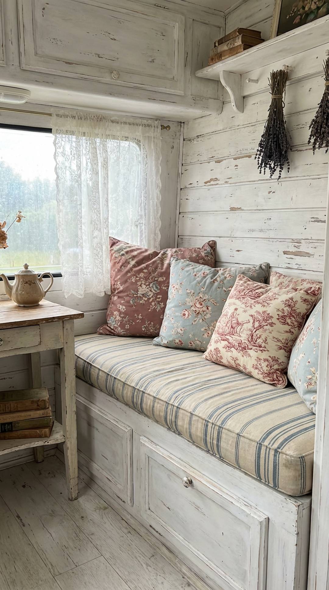
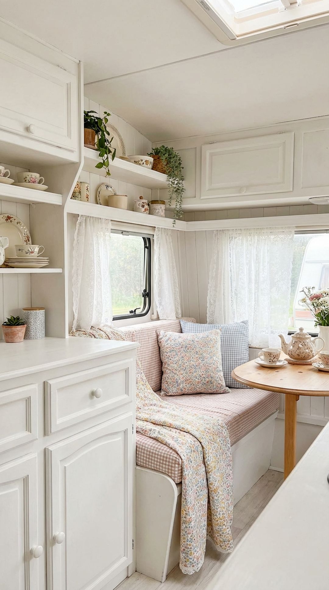
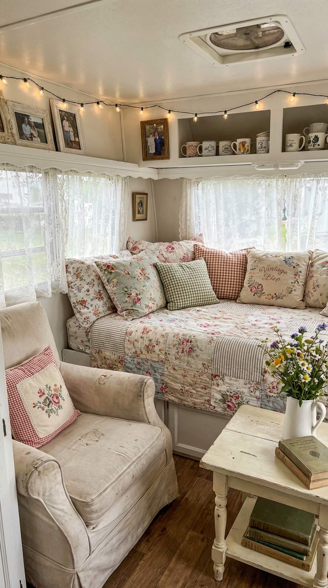
8. Layer in Vintage Lace and Linens
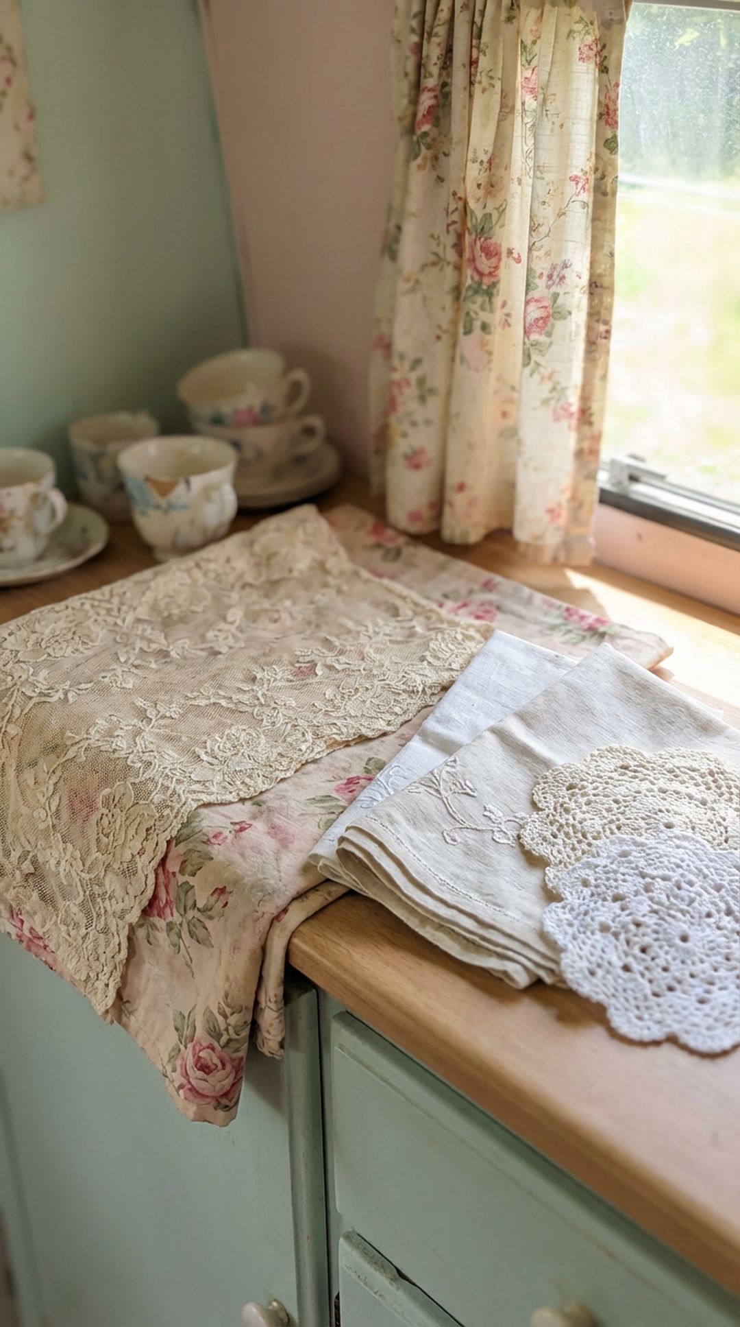
Vintage lace and embroidered linens are quintessential shabby chic elements that add delicate pattern and texture to your camper without overwhelming your space. These ethereal fabrics work as transitional pieces between bolder patterns, their openwork and subtle designs creating visual interest while maintaining a light, airy feel. Crochet doilies, lace curtain panels, embroidered pillowcases, and tatted table runners all contribute pattern in the softest possible way. Layer lace curtains over floral fabric panels or drape a vintage embroidered tablecloth over solid-colored cushions for instant romantic charm.
The beauty of lace and linens in pattern mixing is their inherent neutrality—regardless of the specific lace pattern, they read as delicate and feminine, complementing rather than competing with other patterns. Vintage pieces bring authentic character and often feature lovely imperfections that enhance the shabby chic aesthetic. Use them liberally but thoughtfully: lace valances at windows, doilies under lamps or vases, embroidered tea towels as decorative accents, or vintage crocheted blankets as textural throws. These pieces add layers of subtle pattern that enrich your space without adding visual weight.
PRO TIP: Hunt for vintage lace and linens at estate sales, thrift stores, and antique markets for authentic pieces with history and character. Small imperfections like tiny repairs or gentle discoloration actually enhance the shabby chic aesthetic, and these vintage pieces are often more affordable than new imitations.
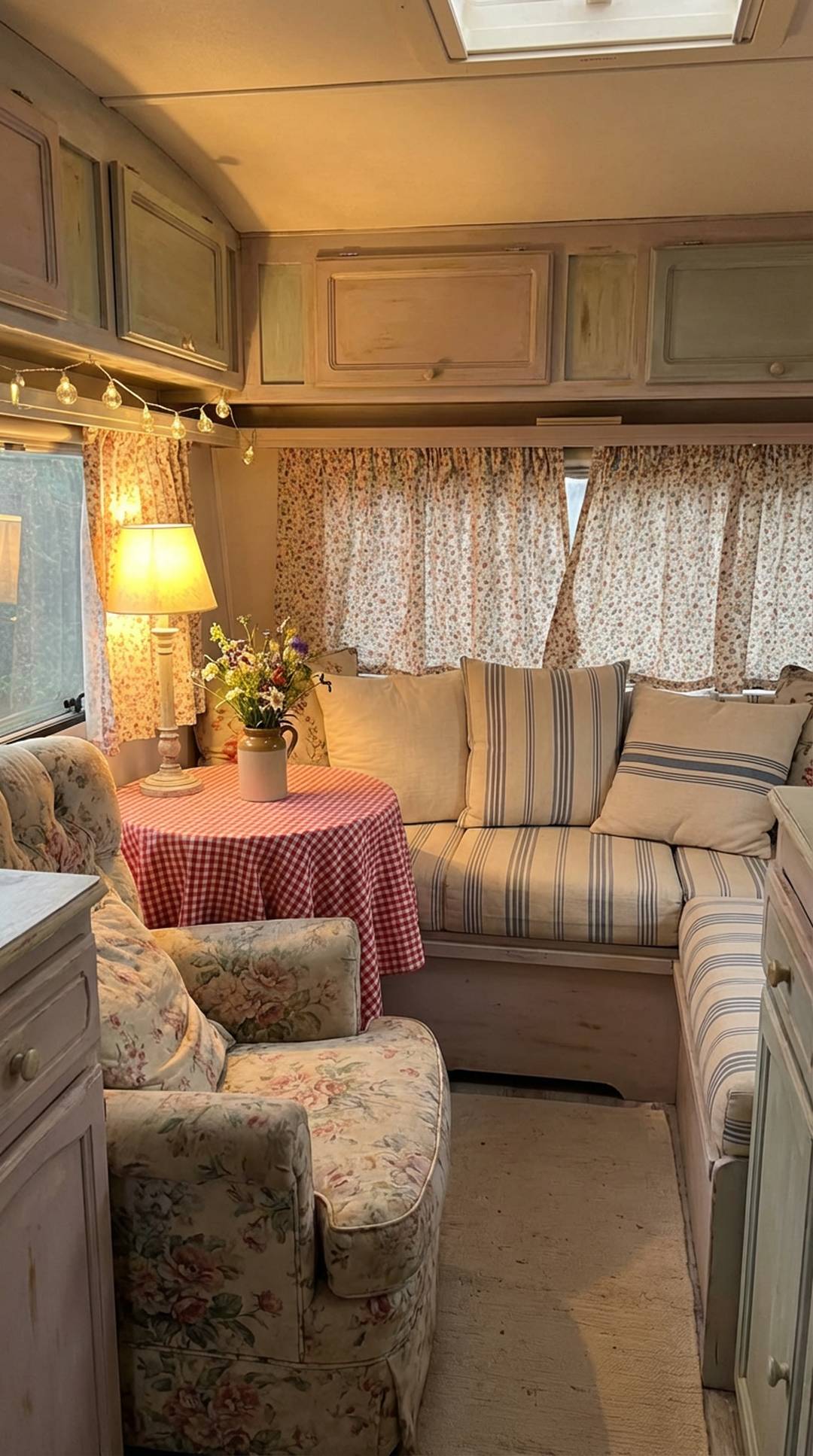
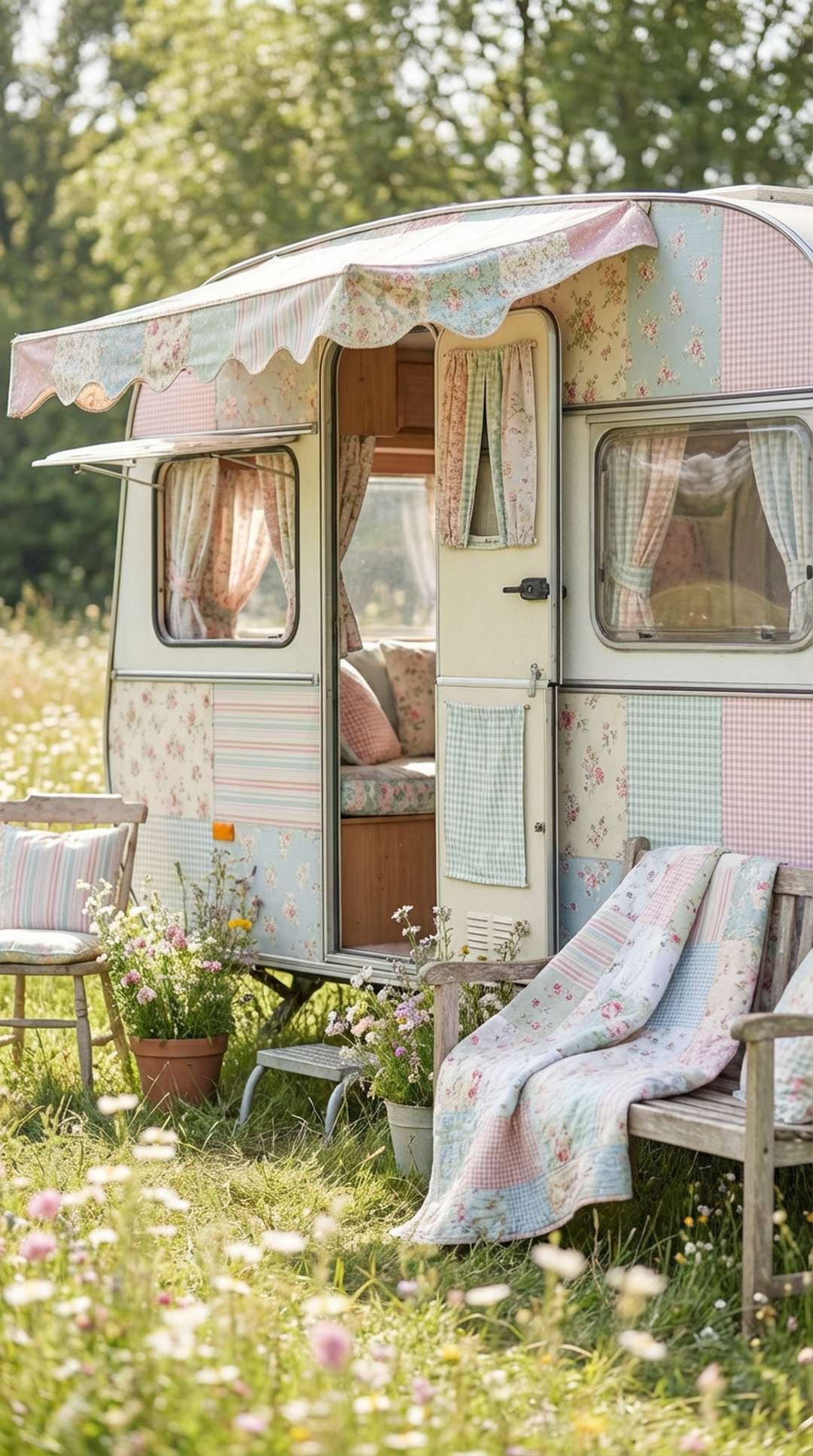
9. Embrace Mismatched Vintage Patterns
Part of the charm of shabby chic style is its collected-over-time appearance, which makes embracing mismatched vintage patterns particularly appropriate for your camper. Rather than buying coordinated pattern sets, look for vintage fabrics, dishware, and textiles with complementary but not matching patterns. This approach creates an authentic, personal space that tells a story. Mix toile with gingham, pair vintage floral china with striped linens, and combine different floral patterns that share similar colors and vintage vibes. The slightly imperfect, eclectic mix is what gives shabby chic its unique character.
The key to successfully mixing mismatched vintage patterns is maintaining that cohesive color palette we discussed earlier. As long as your patterns share colors and have a similar vintage aesthetic, they’ll work together even if they’re quite different in style. Look for patterns from similar eras or with comparable levels of fading and wear. Three floral patterns from different decades can coexist beautifully if they all feature soft pinks and greens and have that gentle, worn quality. This approach is also budget-friendly, as you can collect pieces gradually from thrift stores, estate sales, and vintage markets.
PRO TIP: Create a “collection corner” in your camper where you display your mismatched vintage patterned treasures together—perhaps a shelf of vintage floral teacups or a stack of patterned vintage suitcases. Grouping similar items highlights their patterns while their quantity creates its own cohesive statement.
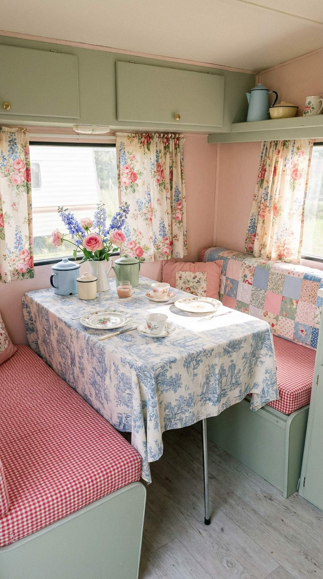
10. Repeat Colors Throughout Different Patterns
Creating visual cohesion through color repetition is a powerful technique for successful pattern mixing in your compact camper. When the same colors appear in different patterns throughout your space, it creates a sense of intentional design and flow. If your floral curtains feature soft blue and pink flowers, incorporate those same blues and pinks in striped pillows, checked blankets, and toile accents. This color thread weaving through various patterns ties everything together and helps the eye move smoothly around your space rather than getting stuck on individual elements.
Color repetition doesn’t mean every pattern must contain every color in your palette. Instead, think of it as creating color relationships and echoes throughout your space. You might have blue appearing in three different patterns, pink in four, and cream in all of them. This overlapping creates layers of visual connection that feel sophisticated and thoughtful. In your small camper, this technique is especially valuable because it makes the space feel larger and more unified rather than chopped up by competing patterns and colors.
PRO TIP: Create a simple spreadsheet or chart listing your colors down one side and your patterned items across the top, then mark which colors appear in each pattern. This visual reference helps ensure you’re distributing colors evenly and creating those important repeated connections throughout your space.
11. Mix Geometric with Organic Patterns
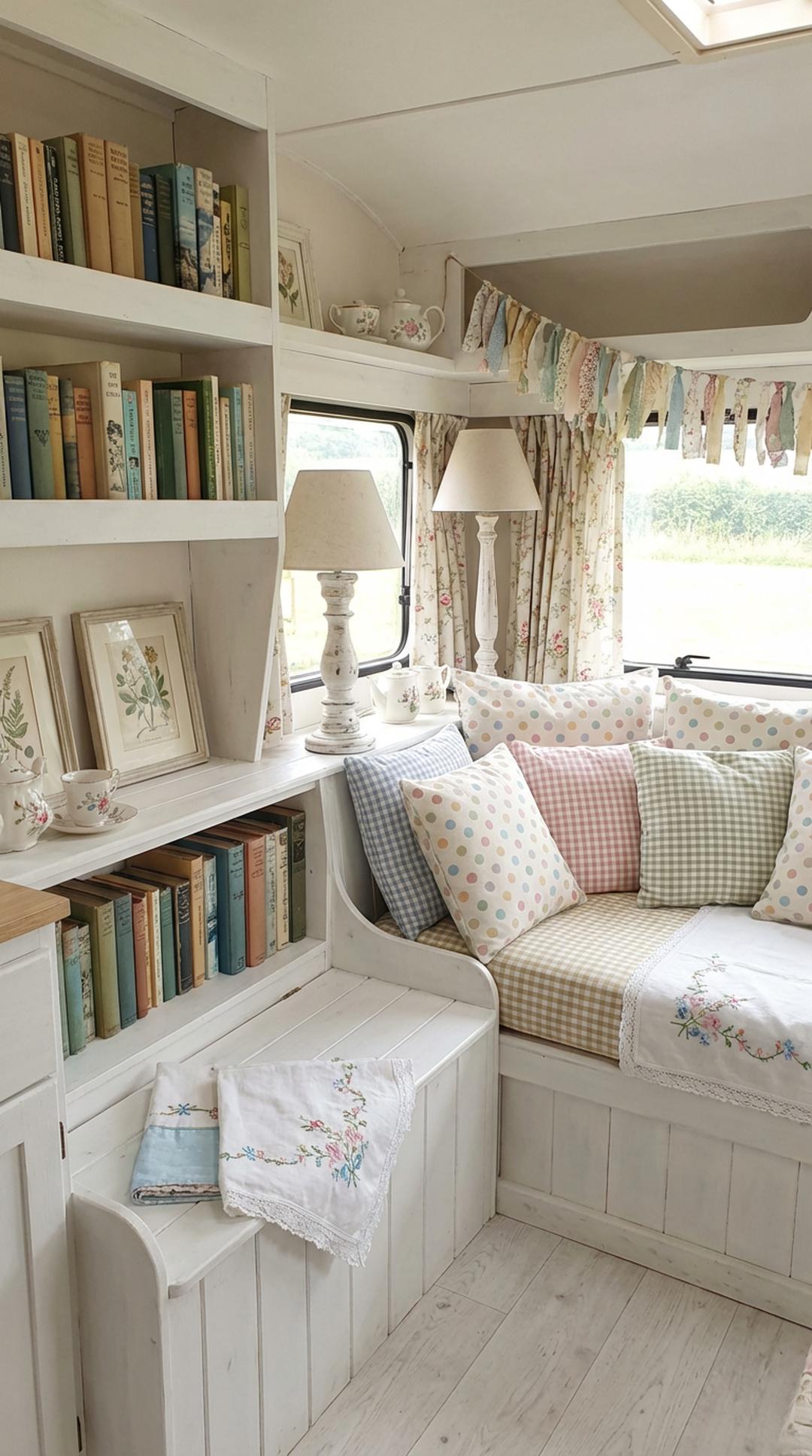
Combining geometric patterns (like checks, stripes, and polka dots) with organic patterns (like florals, vines, and nature-inspired prints) creates dynamic visual tension and balance in your shabby chic camper. Geometric patterns provide structure and order, while organic patterns add softness and natural flow. Together, they create a more interesting, dimensional space than either type alone could achieve. In shabby chic design, this might look like gingham checked curtains paired with rose-printed cushions, or polka dot accents complementing a floral bedspread.
When mixing geometric and organic patterns, pay attention to scale and intensity to ensure harmony. Small checked patterns pair beautifully with large, flowing florals, while larger geometric patterns work well with delicate, small-scale organic designs. The geometric patterns typically serve as the grounding, structured elements in your design, while the organic patterns add romance and visual interest. This combination is particularly effective in small spaces because the geometric patterns prevent the organic ones from feeling too wild or overwhelming.
PRO TIP: Use geometric patterns for items that need to feel more structured and practical (like kitchen textiles, storage boxes, or flooring), while reserving organic patterns for softer, more decorative elements (like pillows, throws, and wall art). This functional approach to pattern placement creates natural harmony.
12. Work in Odd Numbers for Visual Appeal
The design principle of using odd numbers applies beautifully to pattern mixing in your small camper. Arranging patterns in groups of three, five, or seven creates more visual interest and feels more natural and balanced than even-numbered groupings. This might mean combining three different patterns in your bedding ensemble, displaying five patterned pillows on your dinette, or using three different patterned fabrics in your window treatments. The odd-number approach creates dynamic asymmetry that feels organic and unforced, perfectly aligned with the collected aesthetic of shabby chic style.
In practice, you might layer three patterns on your bed: a floral fitted sheet, striped flat sheet, and checked duvet cover. Or create a pillow arrangement with five cushions featuring different complementary patterns. The odd number prevents the static, too-perfect feeling of paired patterns while maintaining enough variety to be interesting. This principle works at every scale in your camper, from the overall number of different patterns you use throughout the space (aim for five to seven distinct patterns) to small vignettes and displays.
PRO TIP: When selecting your patterns, choose them in odd-numbered sets with clear variation: one bold statement pattern, two medium-interest patterns, and two subtle or small-scale patterns. This distribution creates natural hierarchy and ensures your pattern mix has proper balance and variety.
13. Add Texture for Extra Dimension

While we often think of pattern mixing in purely visual terms, incorporating varied textures adds crucial dimension that elevates your shabby chic camper from flat to fascinating. Texture creates subtle pattern through light and shadow, adding visual interest without the busyness of printed designs. Combine smooth fabrics like cotton with nubby textures like chenille or linen, add chunky knit throws alongside silky florals, or pair weathered wood with soft velvet. These textural variations create depth and richness that makes your small space feel more luxurious and thoughtfully designed.
Textural patterns work particularly well as neutral elements in your pattern mixing scheme. A cable-knit cream throw adds pattern through its weave structure without competing with your printed fabrics. Weathered, distressed wood surfaces create visual interest through their worn texture. Ruffled linen curtains, quilted bedcovers, and woven baskets all contribute pattern in three-dimensional ways that complement rather than compete with your printed patterns. This layering of physical texture with visual pattern creates sophisticated depth that prevents your space from feeling one-dimensional or monotonous.
PRO TIP: Create a “texture plan” alongside your pattern plan, listing different textural elements you want to incorporate: smooth, rough, soft, nubby, shiny, matte, etc. Aim for at least five different textures throughout your camper to create sufficient variety and dimensional interest that complements your pattern mixing.
14. Keep Patterns Proportional to Your Space
Scale is particularly important when pattern mixing in a small camper space. Oversized, large-scale patterns can overwhelm compact quarters, making them feel even smaller and more cramped. Instead, favor small to medium-scale patterns that feel appropriate for your space’s dimensions. Delicate ditsy florals, small checks, narrow stripes, and petite polka dots all work beautifully in camper interiors. These smaller-scale patterns create interest and personality without dominating your limited square footage or making the space feel claustrophobic.
That said, you can incorporate one larger-scale pattern as a focal point if you use it sparingly and strategically. Perhaps a large floral print on throw pillows or a single accent wall in a bold toile. The key is balance—surround any larger-scale pattern with plenty of smaller patterns and solid breathing space. In general, the smaller your camper, the more you should favor petite patterns. This proportion consciousness ensures your pattern mixing enhances rather than overwhelms your cozy mobile home.
PRO TIP: Before committing to a pattern, hold a swatch or sample in your actual camper space and step back to evaluate how it feels. What seems perfectly sized in a big-box store or on a computer screen might read as too large once it’s in your compact quarters.
15. Incorporate Classic Toile
Toile de Jouy, the classic French fabric featuring pastoral or historical scenes, is a shabby chic staple that adds instant vintage charm to your camper. Traditional toile patterns in soft colors like blue and white, pink and cream, or sage and ivory create elegant visual interest while maintaining a relatively neutral appearance because of their monochromatic color scheme. Despite being detailed and intricate, toile patterns have a certain timeless simplicity that makes them easy to mix with other patterns. They work particularly well as an anchor pattern or medium-scale element in your pattern mixing scheme.
When incorporating toile into your pattern mix, let it shine as a focal point without overwhelming your space. Use it for curtains, a chair cushion, or as decorative accents like dish towels or pillows. Toile pairs beautifully with simpler patterns like stripes, checks, and small florals—the detailed scenes in toile provide the visual complexity, while simpler patterns offer balance. The historical, romantic quality of toile perfectly embodies shabby chic aesthetics and adds an element of Old World charm to your mobile home.
PRO TIP: Look for toile patterns with softer, more faded colorations rather than crisp, bright versions. Vintage or vintage-inspired toile with a slightly worn appearance feels more authentic to the shabby chic aesthetic and creates a more cohesive look when mixed with other weathered and vintage-inspired patterns.
16. Balance Patterns Throughout the Space
Distributing your patterns evenly throughout your camper rather than concentrating them in one area creates better visual flow and prevents any zone from feeling too busy or overwhelming. If all your patterns cluster in the sleeping area while the kitchen remains pattern-free, your space will feel disjointed and unbalanced. Instead, ensure each area of your camper features some patterned elements while also including solid-colored breathing spaces. This distribution creates unity and makes your small space feel cohesive and intentionally designed from front to back.
Think of pattern distribution as creating rhythm throughout your camper. Your eye should be able to move from space to space, finding pattern interest everywhere without any single area feeling too heavy or too sparse. This might mean floral curtains in the sleeping area, gingham seat cushions in the dinette, striped towels in the bathroom, and a checked runner in the kitchen. Each area has pattern, but no area is pattern-overloaded. This balanced distribution is especially important in open-concept camper layouts where all areas are visible simultaneously.
PRO TIP: Create a simple floor plan sketch of your camper and mark where each pattern appears. Step back and look at the overall distribution—you should see patterns spread relatively evenly rather than clustered in one zone. Adjust your plan as needed before implementing to ensure balanced pattern distribution.
17. Consider Color Temperature
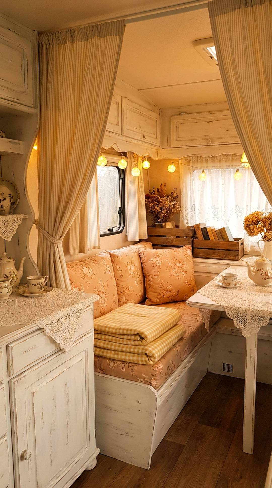
Color temperature—whether colors lean warm (yellow, orange, red-based) or cool (blue, green, purple-based)—significantly impacts how well patterns work together in your space. For the most harmonious pattern mixing in your shabby chic camper, keep your patterns within the same temperature family. If you choose warm-toned patterns featuring peachy pinks, buttery creams, and soft corals, mixing in a cool blue-toned pattern can feel jarring. Conversely, if your palette centers on cool lavenders, powder blues, and mint greens, warm golden yellows might feel out of place.
That said, you can successfully mix warm and cool if you’re intentional about it. Choose colors that bridge the temperature gap—like a pink that leans slightly purple (cooler) or a green with yellow undertones (warmer). In shabby chic design, many people gravitate toward warmer tones with their vintage, romantic quality, but cool-toned shabby chic spaces have their own serene charm. The key is consistency—choose your temperature direction and stick with it for the majority of your patterns, perhaps allowing one or two bridge colors that contain both warm and cool undertones.
PRO TIP: Test your color temperature consistency by laying all your pattern samples side by side in natural daylight. If any pieces look noticeably “off” or don’t seem to belong, check their undertones—you’ve likely mixed warm and cool temperatures. Adjust by choosing patterns with more temperature-appropriate undertones.
18. Pay Attention to Pattern Intensity
Pattern intensity—how bold, bright, and high-contrast a pattern appears—is crucial for successful mixing in your small camper. Patterns can share similar scales and colors but have vastly different intensities based on their contrast levels and visual weight. High-intensity patterns feature bold colors, strong contrasts, and eye-catching designs, while low-intensity patterns appear softer, more subtle, and gentler. For harmonious pattern mixing in shabby chic spaces, aim for patterns with similar intensity levels, typically on the softer, lower-intensity end of the spectrum to maintain that romantic, vintage aesthetic.
Mixing patterns of vastly different intensities can create visual discord in your small space. A bold, high-contrast black-and-white stripe will compete rather than coordinate with soft, faded floral prints even if they share similar colors. Instead, look for patterns with comparable visual weight and contrast levels. In shabby chic design, this typically means choosing patterns with soft, muted colors and gentle contrasts rather than bold, graphic designs. Your various patterns should feel like they belong to the same family of visual intensity, creating cohesion and harmony.
PRO TIP: Squint at your pattern combinations to blur the details and see only the overall intensity and contrast. If one pattern stands out dramatically as much darker, bolder, or more intense than the others, it likely has incompatible intensity levels and should be swapped for something more in harmony with your other choices.
19. Play with Pattern Direction
The directional flow of patterns—vertical, horizontal, or multidirectional—adds another layer of interest to your pattern mixing scheme. Combining patterns with different directional orientations creates visual dynamism and prevents monotony. Pair vertical striped curtains with horizontal checked seat cushions and multidirectional scattered floral wallpaper for a space that feels energetic and interesting. This directional variety keeps the eye moving and engaged, adding depth and dimension to your compact camper interior without requiring additional items or patterns.
Directional choices also have functional implications in small spaces. Vertical patterns draw the eye upward and can make low ceilings feel taller, while horizontal patterns can make narrow spaces feel wider. Multidirectional patterns like florals or toile create visual interest without leading the eye in any particular direction, making them perfect for accent pieces. In your shabby chic camper, you might use vertical stripes on tall cabinet doors, horizontal checks on bench seating, and multidirectional florals on throw pillows—each pattern’s direction serves both aesthetic and spatial purposes.
PRO TIP: Be strategic about pattern direction in areas where you want to influence spatial perception. Use vertical patterns in areas where you want to emphasize height, horizontal patterns where you want to suggest width, and multidirectional patterns where you simply want visual interest without directional influence.
20. Trust Your Instincts and Personal Style
While all these guidelines provide helpful structure for pattern mixing, the most important tip is to trust your own instincts and personal style preferences. Your shabby chic camper should reflect your personality and make you happy every time you step inside. If a particular pattern combination delights you even though it might bend or break conventional rules, go for it! The lived-in, collected-over-time quality that defines shabby chic style is all about personal expression and creating a space that tells your unique story. Rules are meant to guide, not constrain your creativity.
The beauty of the shabby chic aesthetic is its inherent flexibility and forgiving nature. Its emphasis on vintage finds, mismatched elements, and eclectic charm means there’s room for experimentation and personal interpretation. If you love a particular pattern combination but feel uncertain, live with it for a few days—sometimes combinations that seem risky at first become favorites once you adjust to them. Remember that creating a home, even a mobile one, is an ongoing process. You can always swap out pillows, change curtains, or adjust elements as your taste evolves. Trust yourself and enjoy the creative journey of making your camper truly yours.
PRO TIP: Keep one or two easily changeable pattern elements in your camper—like throw pillow covers or tea towels—that you can swap out seasonally or when inspiration strikes. This allows you to experiment with new pattern combinations without committing to permanent changes, keeping your space fresh and allowing your style to evolve naturally.