You can give your camper a fresh, stylish look by using two-tone shiplap to create eye-catching walls. Two-tone shiplap lets you mix colors and textures to make small spaces feel brighter, cozier, or more modern depending on your choices.
Would you like to save this article?
This article shows simple ways to pair colors and finishes so you can pick a mood that matches your camper. You’ll find ideas from calm neutrals to bold contrasts that help you personalize your space without a major remodel.
1) Classic white and natural wood shiplap combo
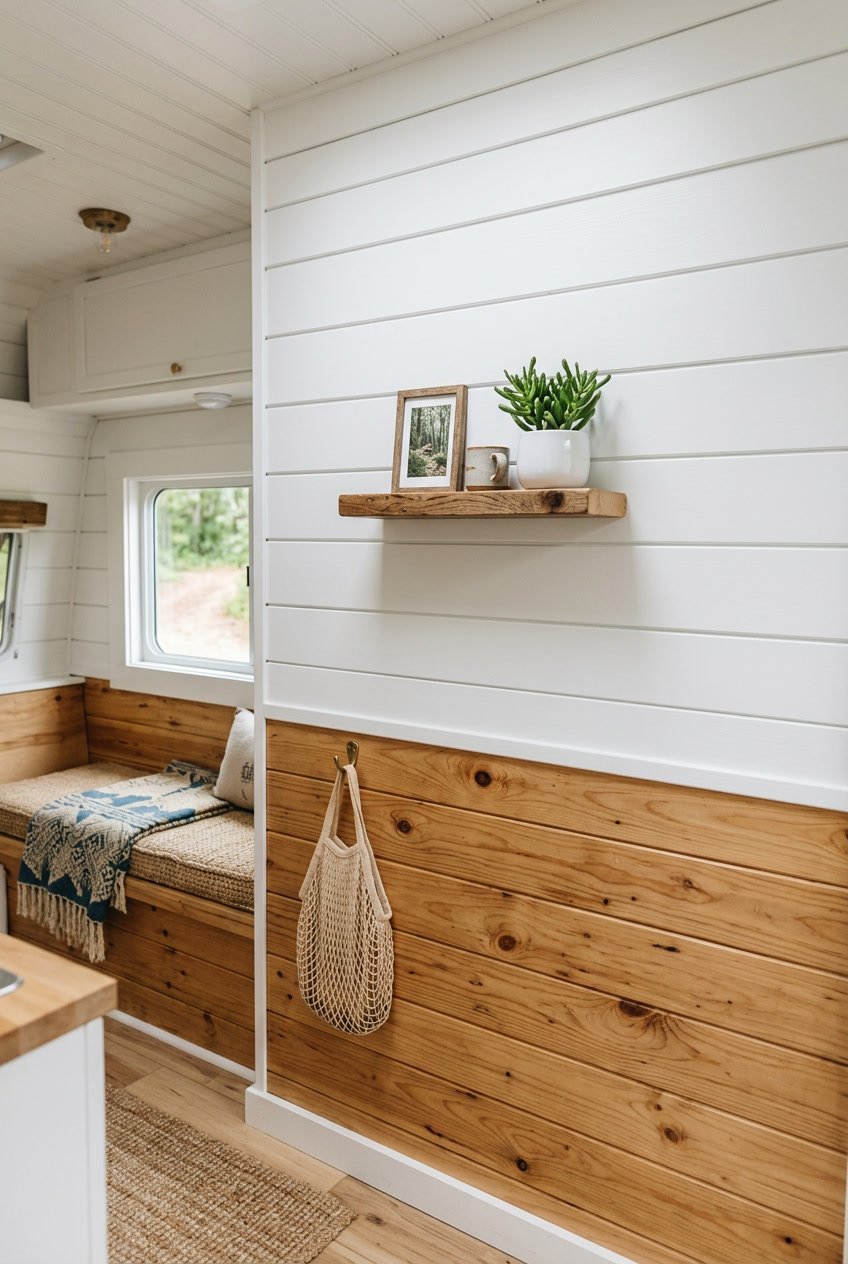
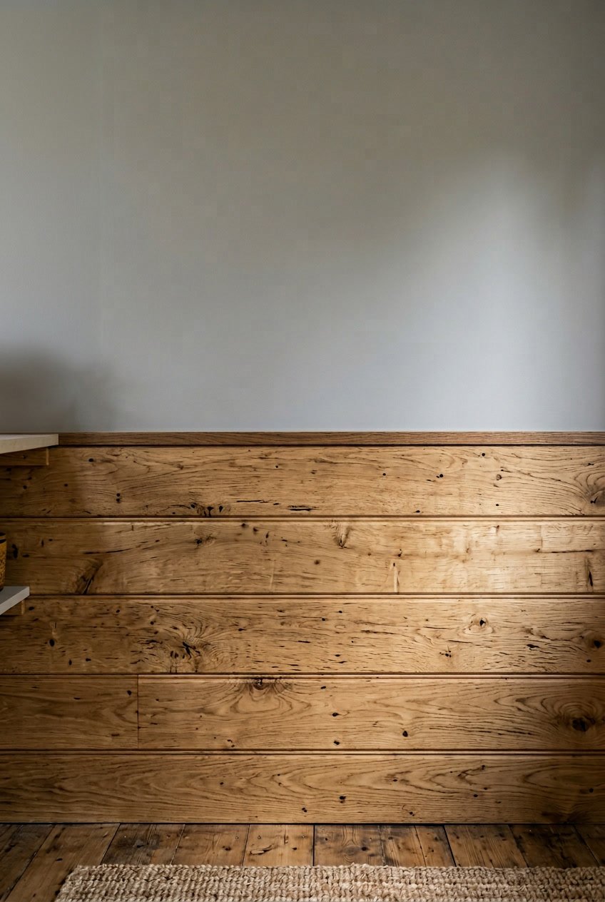
You can make your camper feel bright and cozy by pairing white shiplap with natural wood. White keeps the space open, while the wood adds warmth and texture.
Place white planks on the upper walls and natural wood below, or alternate rows for a balanced look. This simple layout keeps the design calm and timeless.
Keep finishes matte or low-sheen to reduce glare and hide small scratches. Use a clear coat on the wood to protect it from moisture and wear without changing the color.
PRO TIP
Paint the white in a slightly warm tone so it complements the wood. Small swatches help you test the pairing before you commit.
2) Navy blue and crisp white horizontal stripes
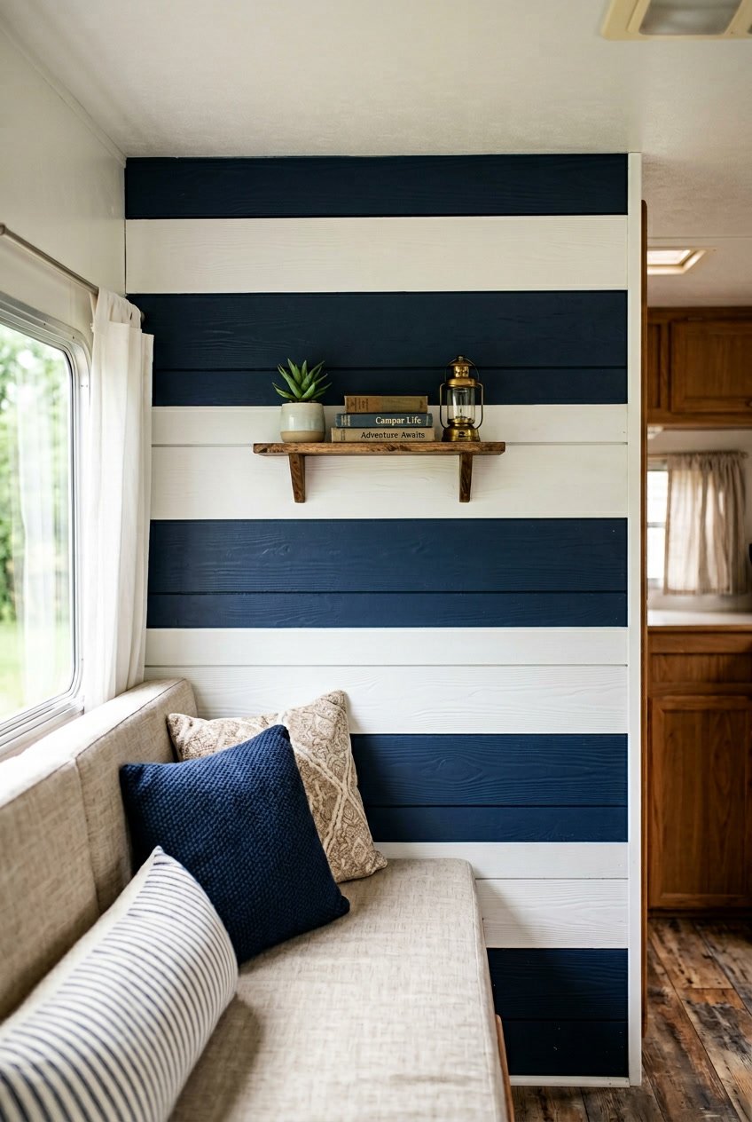
Navy and white stripes give your camper a clean, coastal feel that still looks classic. You can paint alternating shiplap boards or use wider navy bands with thinner white lines for a fresh look.
Keep the navy deep but not flat; a satin finish adds warmth and hides minor marks. Use crisp white for contrast to brighten the space and make ceilings feel higher.
Striped shiplap works well behind a dining nook or bed to create a focal wall. Balance the bold pattern with simple linens and natural textures so the room stays calm.
PRO TIP
Measure and mark each board before painting so stripes line up perfectly. Use painter’s tape and remove it slowly to keep edges sharp.
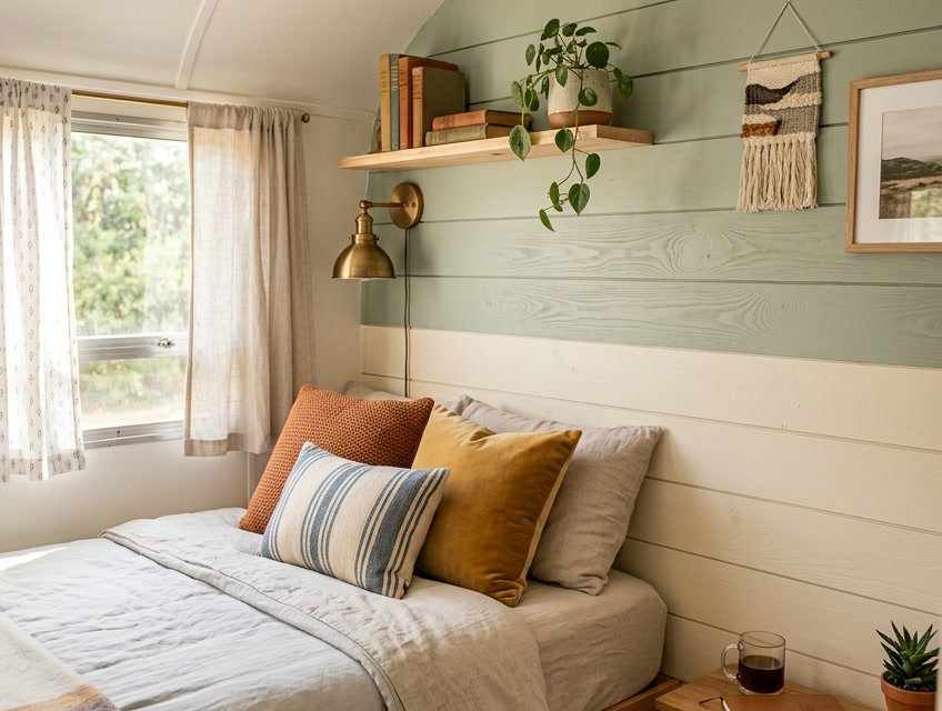
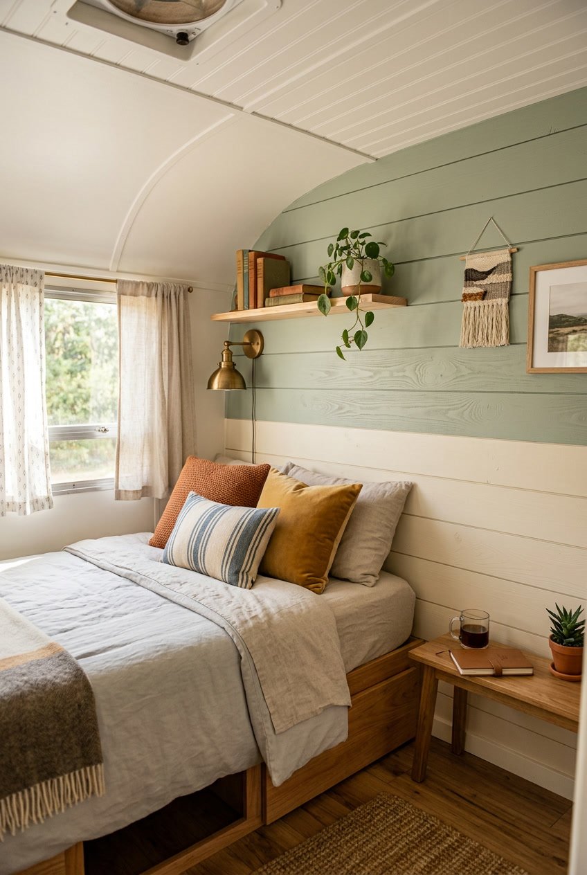
3) Soft gray top half with rustic oak bottom
A soft gray on the top half keeps your camper feeling light and calm. It reflects natural light and gives a sense of space without feeling cold.
Rustic oak on the bottom adds warmth and hides scuffs from shoes and gear. The wood grain brings texture and a cozy, lived-in look that pairs well with simple decor.
Keep the transition clean with a thin trim or a flush joint. You can paint the trim the same gray to keep focus on the two-tone effect.
PRO TIP
Test paint swatches in different light before you commit. Use satin or eggshell on the top for easy cleaning, and seal the oak to protect it from moisture and wear.
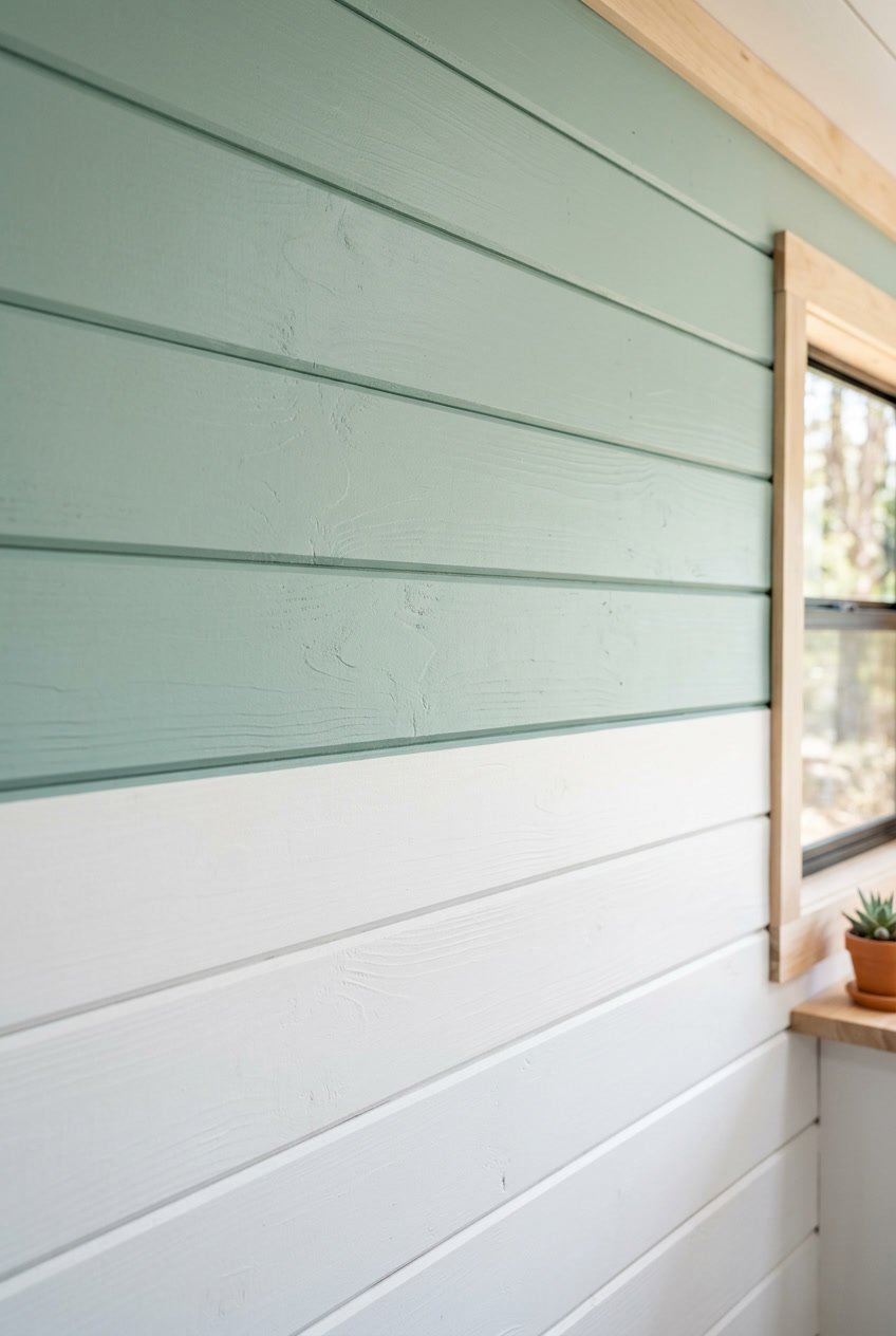
4) Mint green paired with creamy beige panels
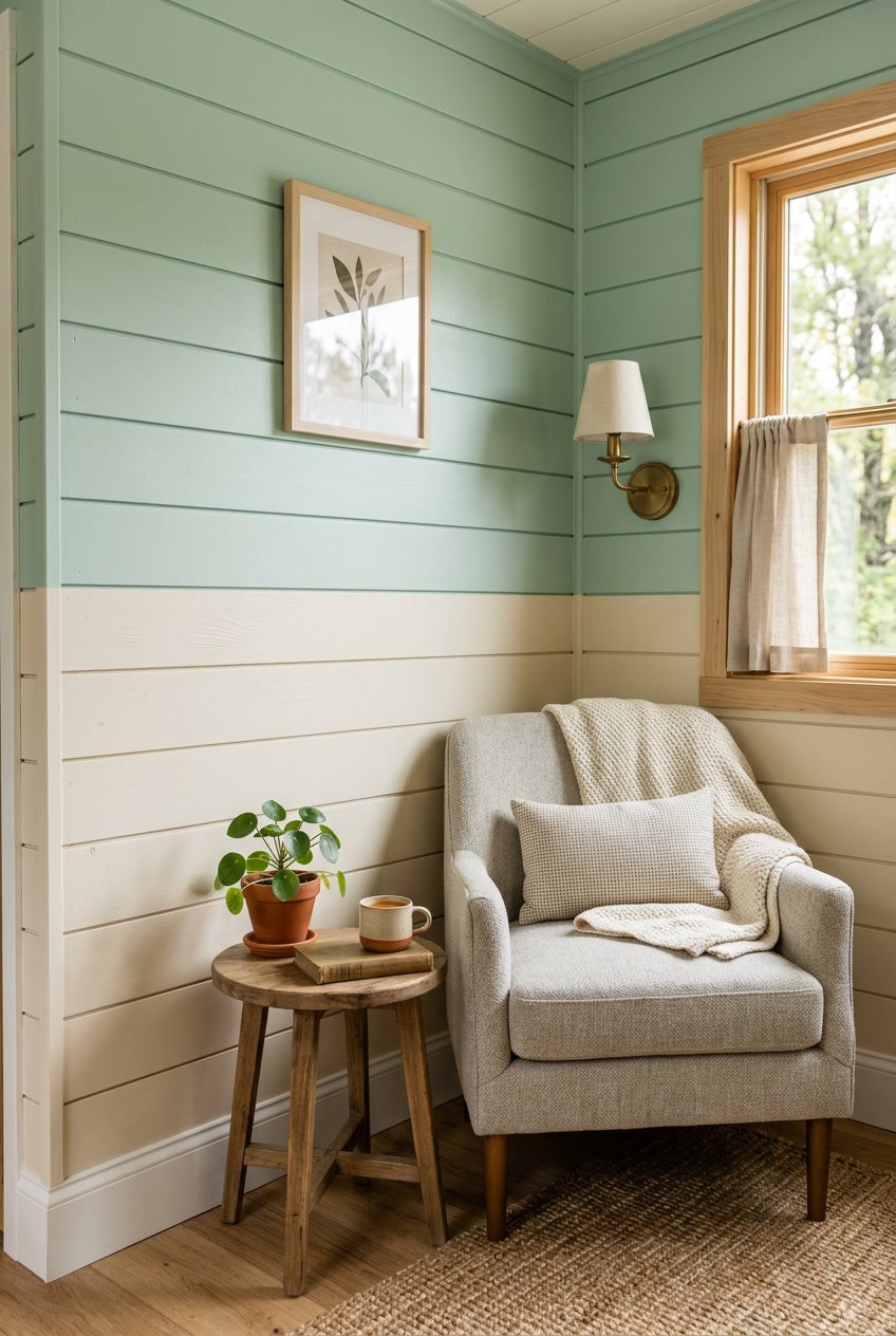
Mint green brings a fresh, calm feel to your camper. It pairs gently with creamy beige to keep the space light and cozy.
Use mint on the upper half of the wall to open the ceiling visually. Paint the lower panels creamy beige to anchor the space and hide scuffs.
This combo works well with natural wood accents and white trim. You can add woven textiles or simple brass hooks for warmth and texture.
PRO TIP
Test paint samples on your shiplap and view them at different times of day. Natural light can change how mint and beige look, so try small patches before committing.
5) Bold black and white vertical shiplap
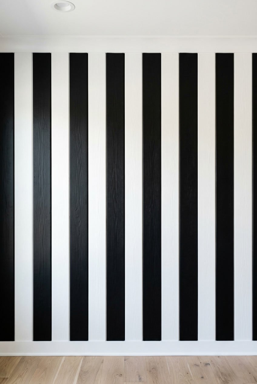
A black and white vertical shiplap look gives your camper a crisp, modern feel. The high contrast grabs attention and makes small spaces feel taller.
Paint alternating boards black and white for a striped effect, or use a white field with a single black accent wall. Vertical lines draw the eye up, which helps low ceilings seem higher.
Keep trim and trim-work simple so the pattern stays clean. Use semi-gloss paint for easy wiping after travel messes and light scuffs.
PRO TIP
If you worry the look will feel strong, start with a black accent behind a bed or kitchen area. That limits the boldness but still adds drama.
6) Warm terracotta mixed with whitewashed pine
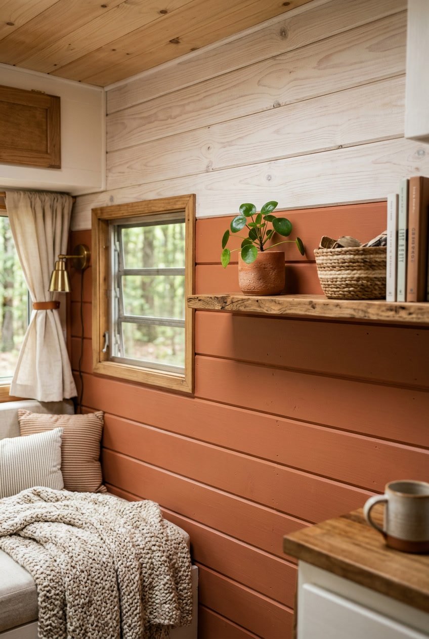
Warm terracotta brings a cozy, earthy vibe to your camper. Pairing it with whitewashed pine keeps the look light and fresh.
Paint the lower half in terracotta to ground the space. Use whitewashed pine on the upper half to reflect light and make the ceiling feel higher.
This combo works well with natural textiles like linen or cotton. Add simple brass or matte black accents for a bit of contrast without clutter.
PRO TIP
Test paint samples on a small shiplap section first. Lighting in a camper changes through the day, so view samples in morning and evening before committing.
7) Two-tone chevron pattern with navy and natural wood
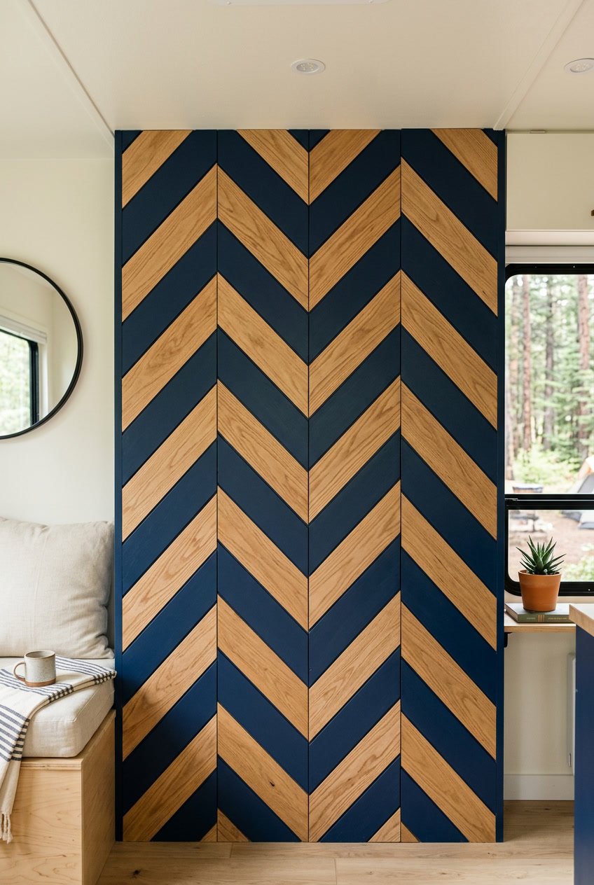
A chevron pattern gives your camper a bold, modern look. You can keep one tone navy and the other in natural wood to balance drama with warmth.
Cut shiplap boards at matching angles and fit them so the V shapes line up across the wall. Paint every other board navy and leave the opposite boards in their natural finish for a clean, repeating pattern.
This design works well behind a bed or dining nook to create a focal point. The navy adds depth, while the wood keeps the space feeling cozy and grounded.
PRO TIP
Use a level and spacer blocks to keep the pattern straight during installation. Test a small section first to confirm the paint and wood tones look good together in your camper light.
8) Dusty blue over light gray with a matte finish
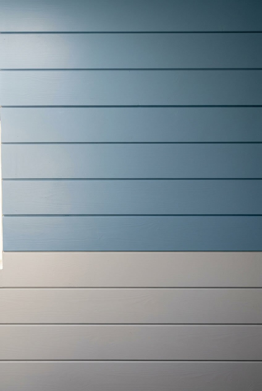
Dusty blue on the upper half and light gray below creates a calm, airy feel in your camper. The matte finish keeps reflections low and helps the colors read soft and natural.
This combo brightens small spaces without feeling stark. You still get contrast, but it’s gentle and cozy rather than bold.
PRO TIP
Paint a small test panel on a scrap board and view it at different times of day. That helps you judge how natural and artificial light change the shades before you commit.
9) Sunset orange contrasted with soft yellow
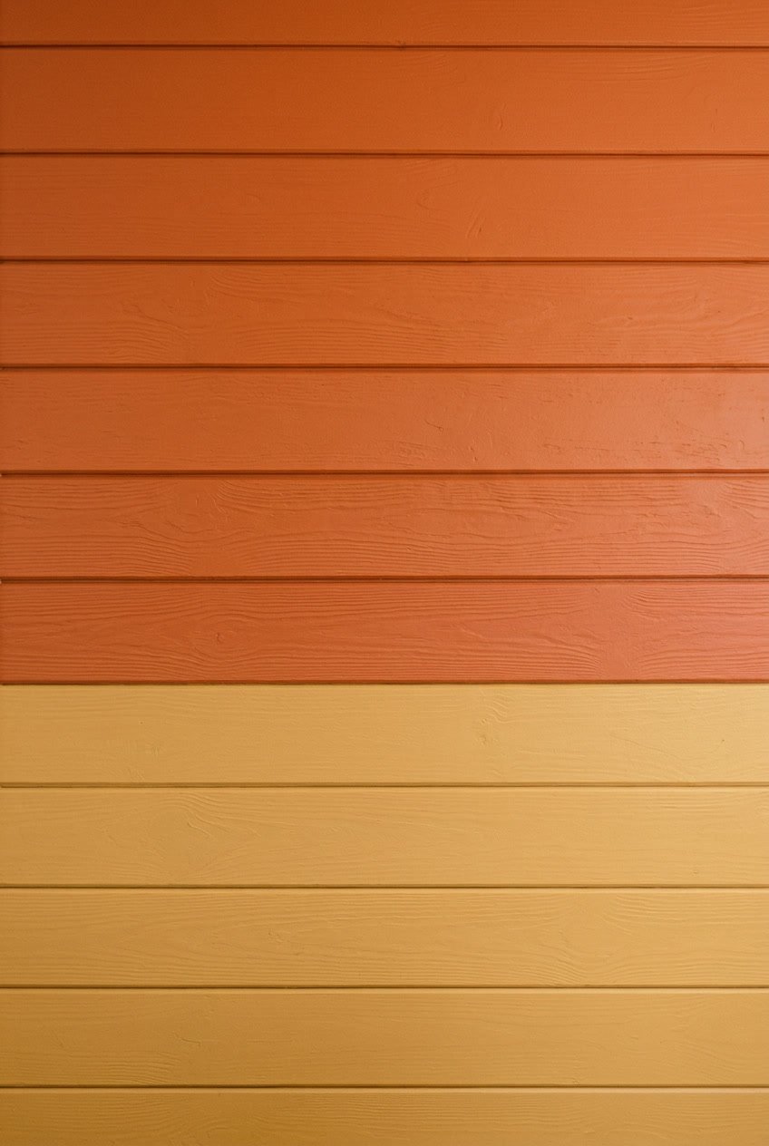
Sunset orange adds warmth and energy to your camper. Pair it with soft yellow to keep the space bright and inviting.
Paint the lower shiplap boards in sunset orange for grounding color. Use soft yellow on the upper boards to reflect light and make ceilings feel higher.
You can balance the two by using a thin white or natural wood trim between them. This small break helps the colors read clearly and keeps the look tidy.
PRO TIP
Test small paint swatches in daylight before you commit. Colors shift in different light, and a small sample helps you choose the right tones for your camper.
10) Charcoal and soft blush pink pairing
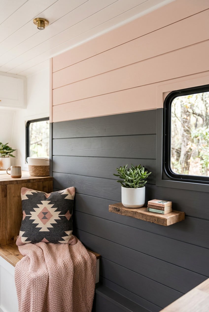
Charcoal and soft blush pink make a calm, modern mix that works well in a small camper. The dark charcoal grounds the space and hides scuffs, while the blush pink adds warmth and a softer feel.
Paint the lower half charcoal and the upper half blush to create balance and height. You can reverse that on an accent wall to make a cozy nook.
Use matte finishes for a subtle look and satin for trim to catch light. Add simple textiles in neutral tones so the colors remain the focus.
PRO TIP
Test paint swatches in natural light inside your camper before committing. Colors shift with light and can look different at dusk versus midday.
11) Seafoam green on top with white below
Painting the top half seafoam green and the bottom half white gives your camper a fresh, airy feel. The soft green reads as calm but still adds color, while the white keeps the space bright and open.
This combo works well in small spaces because the lighter lower half reflects light back up. You can paint a thin rail or chair rail between the colors to make the line crisp and tidy.
Choose a satin or eggshell finish for easy cleaning and a subtle sheen. If you like a coastal vibe, add natural wood accents and woven textiles to complete the look.
PRO TIP
Use painter’s tape and a level to get a straight dividing line, and paint the white first for cleaner edges.
12) Honey maple combined with off-white
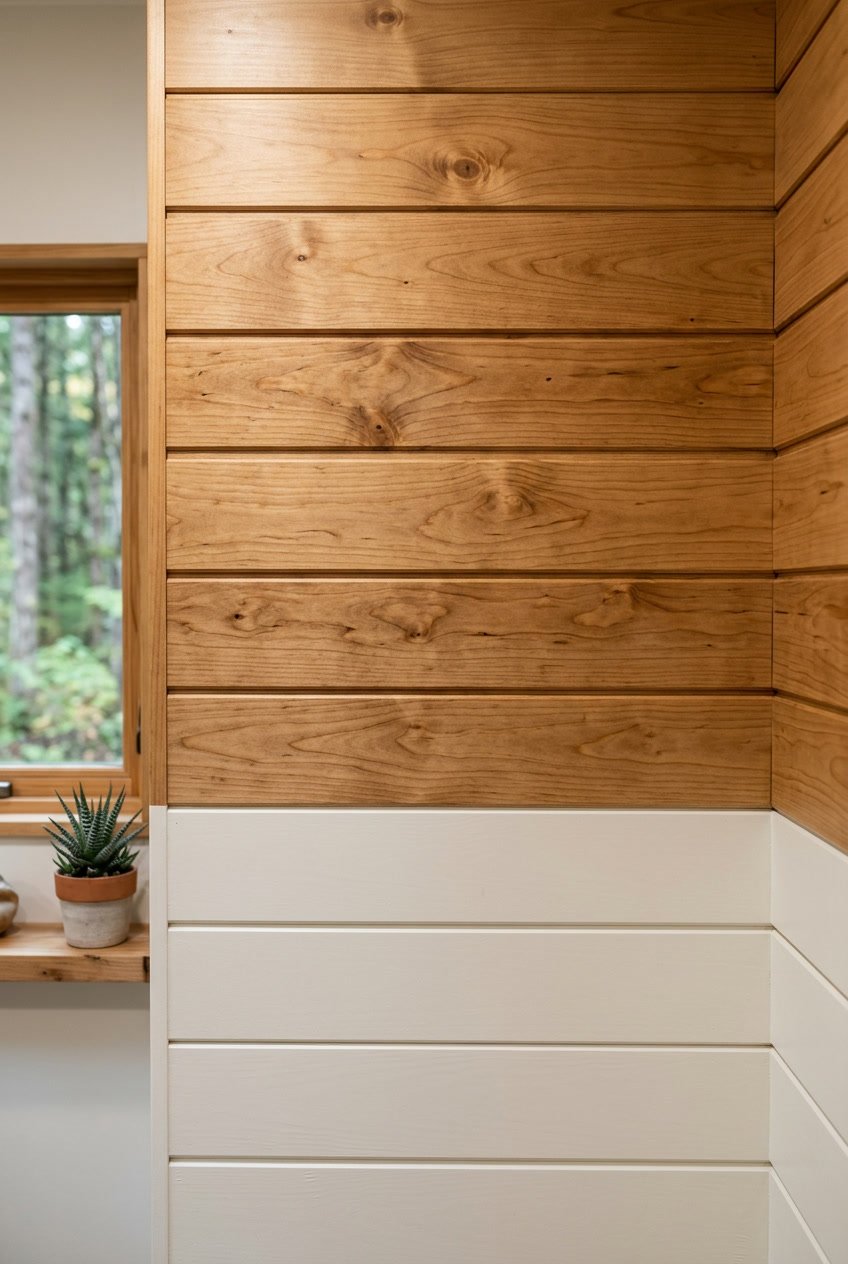
Honey maple brings warmth and a soft glow to your camper walls. Pairing it with off-white keeps the space light and airy, while the wood grain adds natural texture.
You can run the honey maple on the lower half and off-white above to create balance. That split makes the room feel grounded without losing brightness.
PRO TIP
Use a satin finish on the honey maple to highlight grain without too much shine. Paint the off-white in a flat or eggshell finish to hide small scuffs and keep maintenance easy.
This combo works well with black or matte bronze hardware for a gentle contrast. Add simple textiles in muted tones to keep the focus on the two-tone shiplap.
13) Forest green and pale gray division
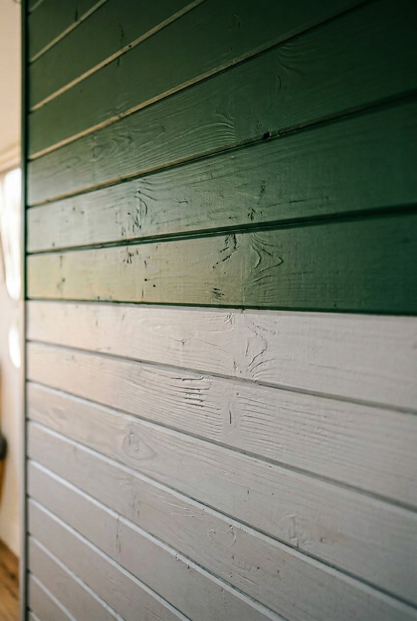
A forest green top with a pale gray bottom creates a calm, grounded feel in your camper. The dark green brings depth, while the soft gray keeps the space light and balanced.
Paint the upper boards and trim in the green to frame windows and shelves. Keep the lower shiplap pale gray to hide scuffs and reflect light from low fixtures.
You can use a thin dividing trim or let the boards meet for a cleaner look. Match cushions or a rug to the green for a cohesive touch.
PRO TIP
Test paint colors on a small plank and view them at different times of day. Natural light changes how the green and gray look together.
14) Sky blue layered over white beadboard
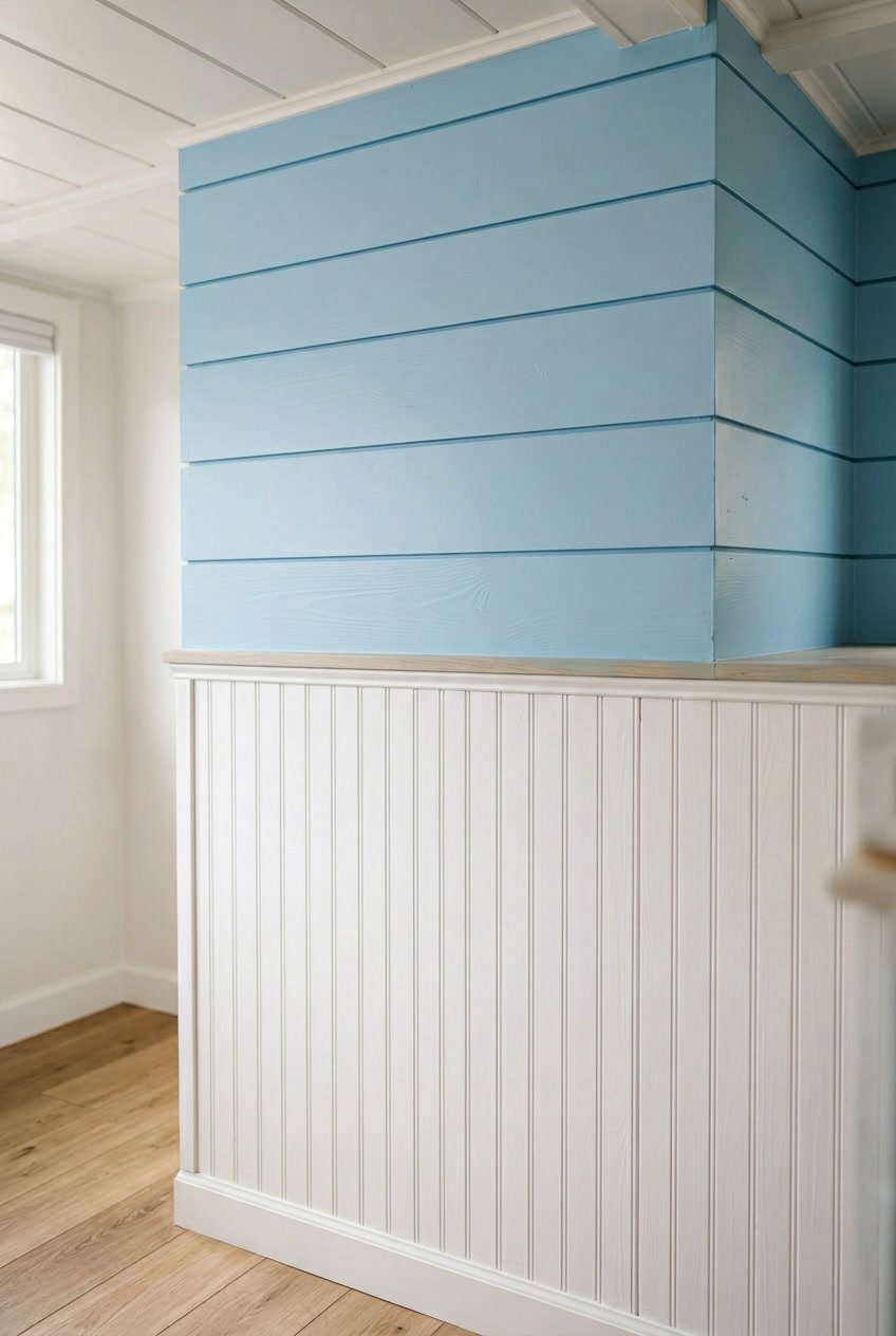
Sky blue over white beadboard brightens your camper without feeling loud. The white base keeps the space light, and the blue layer adds a calm, coastal vibe.
You can paint the lower portion sky blue and leave the beadboard white above, or reverse it for a more grounded look. Keep the line between colors clean with painter’s tape for a neat finish.
Use satin or eggshell paint so the surface wipes clean. If your walls have texture, sand lightly first to help the blue layer sit smoothly.
PRO TIP
Test a small patch of blue in natural light before painting the whole wall. Colors shift with light, and a sample helps you choose the right tone.
15) Deep purple and lavender in staggered panels
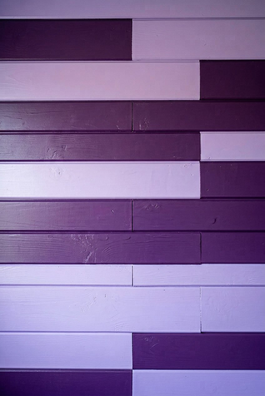
Deep purple on wider boards gives your camper a rich, cozy feel. Lavender on narrower, staggered panels adds light and contrast without being loud.
You can run the panels horizontally to make the space feel wider. Stagger the lavender boards in an irregular rhythm to create movement and a modern look.
Use satin or eggshell paint so the colors read true but don’t glare. Keep trim and hardware simple so the two tones stay the focus.
PRO TIP
Test paint samples on the actual shiplap and view them at different times of day. Lighting changes the way purple reads, so try small sections before committing.
16) Coral and cream shiplap in a horizontal split
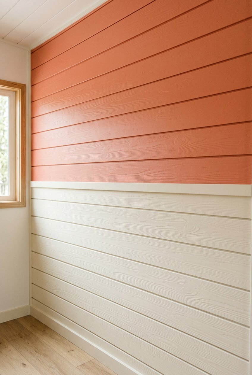
Coral on top and cream on the bottom give your camper a bright, beachy feel without overwhelming the space. The horizontal split keeps the look clean and helps the room feel wider.
You can paint the top half coral to draw the eye up, then use cream below to keep things light. Add simple trim where the two colors meet for a crisp line and a neat, finished look.
PRO TIP
Test paint swatches on the actual shiplap and view them at different times of day. Natural and artificial light change how coral and cream read, so check before you commit.


